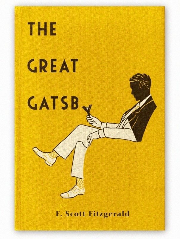
Saturday 24 December 2016

405 Study Task 04 - Excel Drawings


'beeswax'


'fire blazing'


'pastel interlocked'


'KFC'


'pastel movement'


'fire spitting'


'winter warmer'


'reduced summer'


'reduced'


'vibrant'

405 Study Task 04 - Object Lessons research

I have decided to choose a candle as my object, 'an ignitable wick embedded in wax or another flammable solid substance such as a tallow that provides light - some cases a fragance. There are many different uses for a candle:
  • to provide heat
  • to provide light
  • to fragance a room
  • to keep time
  • to fix the end of a frayed shoe lace - use the melted wax
  • writing a secret message on paper
  • rubbing on door hinges to fix squeakiness
  • to prevent eyes streaming while cutting onions
  • use as a pin holder
  • citronella candles are bug repellents
  • to celebrate a birthday - blow them out
  • a house warming gift


The original 'Standard candle' was made using whale fat and first appeared over 2,200 years ago as means of illumiation. From the 1st up to 19th Century they were made usually with beewax or tallow. Today they are made of paraffin wax and are used much more decoratively. 

Someone who manufacturers a candle is known as a 'chandler'. A 'chandlery' was an office in medieival households responsible for wax and candles, it was also where the candles were kept. In these times before electric light was availible it was an essential thing to have and was important to the running of a home - the production of candles was often done privately.

There are a lot of Chandler companies around at the moment and most of them are luxury items, some known are:
  • Yankee Candle
  • Village Candle
  • Parks
  • Culti
  • Stone Glow
  • Heyland Whittle
  • Jo Malone
Soap was a natural byproduct of candlemaking and therefore a lot of commerical chandlers by the 18th century dealt in candles and soap. The term chandelier comes from a ceiling fitting that held several candles together, they still exist however nowadays they are ornamental electrical lighting fixtures.

Guinness World Records:

  • The most lit candles on a cake is 72,585 and was achieved by Ashrita Furman and the Sri Chinmoy Centre (Both USA) at the Sri Chinmoy Centre in New York on the 27th August 2016 - the cake was created to celebrate what would have been Sri Chinmoy's 85th Birthday. 
  • The largest collection of candles belongs to Lam Chung Foon (Hong Kong) and consits of 6,360 different candles as of the 23rd December 2011. He started his collection in 1980 and his family have ran a large candle manufacturing business since 1968.
  • The most candles lit simultaneously at a single venue is 12,135 and was achieved by Art of Living Foundation in India on the 13th November 2012.
  • The most people blowing out candles simultaneously is 1,717 and was achieved by The Fellowship Fund for Employees of the Ministry of Health Muscat in Oman on the 21st November 2016.
  • The longest line of candles lit in relay is 338 and was achieved by the Scout Association of Hong Kong on 31st December 2013.

Monday 19 December 2016

404 Book Design Initial Ideas

The Great Gatsby

For one of the book covers I decided I wanted to use patterns, and believed The Great Gatsby would be the ideal choice for this. The book being set in the 1920s in New York means it was the era of Art Deco, an interesting style of visual arts, architecture and design. It was a pastiche of many different designs with the desire to be modern, influenced by the bauhaus and the bold geometrics of cubism. 


I started by drawing different patterns and ideas based on the decoration of art deco, then developing the pattern in Illustrator and exploring the colours and layout of the shapes.


I also tried a bright yellow, which I thought looked a bit too childish and vibrant for the tone of the novel, so decided on a deeper gold-like shade, which compliments the royal blue seen below.


I made the decision to use a dark royal blue as it is usually a symbol of wealth, it is also known as the colour of writing ink - which I think relevant to the style of the novel. 


Saturday 17 December 2016

404 Study Task 02 - Book option 03 (Lolita)

Lolita - Vladmir Nabokov

The book covers for this novel are often designed with the film adaptations in mind, sexualising the young character 'Lolita' as a teen-aged seductress, when if fact she is an abused 12 year old. To design a cover for a book so psychologically complex is a challenge using photography or illustration - with this in mind I believe the best option would be to go for something abstract, giving nothing away to the reader but intrigue - so that they can form their own ideas and interpretations. It is described as a postmodern novel and 'tragiccomedy'.


404 Study Task 02 - Book option 02 (Alice in Wonderland)

Alice in Wonderland - Lewis Carroll

Another book with a great history of designs for the covers, the first below in 1898. The designs are all fairly different but all include a hint of quirkiness with a lot showing the main character herself. The novel is fiction and is under the 'Children's Literature' genre - this is something to be mindful of when designing, it is likely that a parent is going to buy the book so it must be appealing to them, however also the child who will pick it off their shelf to read.


Friday 16 December 2016

404 Study Task 02 - Book option 01 (The Great Gatsby)

The Great Gatsby - F. Scott Fitzgerald

This particular book has had many different book covers, all designed by different people and in very different styles - the only real similarity I draw from a few is the use of blue and yellow, they appear most commonly. However this colour scheme is not found in the designs published Penguin - this is something I can consider. This book is fiction and the genre it falls under is 'Historical Drama' or 'Tragedy'.


Tuesday 6 December 2016

404 Study Task 02 - How Do You Read? - Grids

This task involves researching Romek Marber, a freelance designer noted for his work illustrating the covers of Crime Penguin Books in 1960s. As well as researching the grid he is noted for creating, the Marber grid and using it in my own design for 3 book slips for 3 different penguin classics of my choice. The design can be as abstract as I like and photography can be used. The inside of the slip must feature a timeline of Marber's life.


1925 Romek Marber was born in Poland
1939 Marber was deported to the Bochnia ghetto
1942 Marber was saved from being sent to the Belzec death camp by Sergeant Kurzbach
1946 Marber arrived in Britain, where he was reunited with his father and brother
Early 1950s Marber enrolled at St. Martin's School of Art to study a course in Commercial Art
1953 Marber went on to attend the Royal College of Art
Late 1950s Marber worked on a number of projects such as covers for The Economist
1961 Marber was commissioned to design covers for Simeon Potter's Our Language and Language in the Modern World
June - October 1961 Marber was asked to submit a proposal for a new cover approach for the Penguin Crime series, he was asked to do twenty titles in this time and he ended up conceiving a grid layout for Penguin book covers that became one of the most praised and recognised layouts of all time
1965 He did the trailer for "The War Game", however the impact of Marber's imagery posed a potent threat and it was banned from public broadcast until 1985
2005 Marber gave a speech about design and his own experiences to an audience a the Victoria and Albert Museum in London
2007 Marber gave a talk to the Penguin Collectors Society
2010 Marber published an autobiography of his experiences during World War Two titled 'No Return: Journeys in the Holocaust'
2013 The Minories, Colchester exhibited a retrospective of graphic work designed by Romek Marber for Penguin books, The Economist, New Society, Town and Queen magazines, Nicholson's London guides, BBC Television, Columbia Pictures, London Planetarium and others. The exhibition went on to be shown at the University of Brighton and the Gailicia Jewish Museum in Krakow
2015 Marber returned to Poland for the first time since 1945 when he was just 20 years old


This is all of the information I managed to gather from numerous sources about Marber's life, apart from the facts about his career there isn't a lot about his personal life. Of his career I would suggest the creation of the grid system to be one of the most successful points, it was applied to all of the orange and blue covers for Penguin fiction, further ending up being used for the whole list of Penguins.


The grid is quite a complicated one however I am going to have to learn how to create it in order to complete the task, the steps below describe how it is to be done properly:

  1. Divide the page in two, vertically
  2. Draw the ‘right’ diagonal, across the page
  3. Draw the ‘left’ diagonal across the page
  4. Draw a line from the top right corner so that it intersects the ‘left’ diagonal at a right angle
  5. At that intersection, draw a horizontal line across the page
  6. Draw a line from where the line from step 1 meets the top of the page to where the line from step 4 meets the left edge
  7. From the intersection of that line with the ‘left’ diagonal from step 3, draw a horizontal across the page
  8. From the intersection of the lines from steps 3, 4 and 5, draw a vertical to the top of the page
  9. Now draw a diagonal from the top left of the page to where the line from step 5 meets the right hand side of the page
  10. Now draw a vertical from the line from step 5 to the top of the page so that it passes throught the intersection of the lines from steps 3 and 7
  11. Now for a final horizontal across the full page, passing through the intersections of the lines from steps 6 and 9
  12. Then draw a final vertical from the intersection of this line with the left diagonal from step 3.
I would like to create 3 different designs for the books so therefore I'm going to carefully select the books I use - each one under a different genre. Possible design options are:
  • Photography
  • Abstract shapes
  • Line drawing
  • Patterns
  • Collage
  • Mixed media 
  • Mark making with paint and pens
  • Experimental typography
  • Scannography

Friday 2 December 2016

405 Study Task 03 - Blackletter outcome

Today we explored black letter using various tools:
  • Ink
  • Paint
  • Brushes
  • Rulers
  • Cardboard
  • Pencils
  • Pens
  • Sticks
  • Rollers
The aim was to create a coherent set of pictograms suitable for the sign system pictured below. The pictograms were to be in the style of black letter and didn't have to immediately shout out what they implied. Out of all of the tools I used I found cardboard to be the most successful - dipped into ink it soaked up a nice amount and left some behind to flow nicely across the paper, applying different pressure gave thicker and thinner, bolder and less so lines. Along with holding the cardboard in different hands and angles I was able to create a lot of interesting shapes that I manipulated into thoughtful arrangements to portray the symbols we all know. I focused on creating the different thick and thin strokes that black letter typefaces are distinctly recognised by, as well as harsh twists and curved serifs.


Above is 2 contact sheets showcasing some of the shapes and marks I made, arranged in a fashion I was able to see what I had and what I could work with; from here I started deciding what shapes would be used for each symbol, putting them in order and digitalising them into Illustrator. Below is the finished set of pictograms, in the same order as the standard sign system at the top. I believe this was a successful task and I enjoyed using tools I wouldn't usually turn to, I was really able to get out a lot of ideas in a short space of time and helped me with any creative block I had with the task.