Wednesday, 30 November 2016

404 Study Task 01 - Pantone Research 02

Playing with food
I came across an article on creative boom whilst searching through pinterest to create a mood board about a designer who matches food and plants etc to pantone shades as a hobby and has built up quite the following. 


I found this really interesting and the end results show great colour matching, I thought this could be useful for creating a colour palette for say a doughnut shop, having all of the doughnuts matched with specific set of colours.

Matching to skin tone
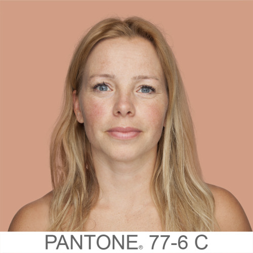
I also came across a photographer (Angelica Dass) who is currently working on a project called "humanæ" in which she is matching people's skin tones to Pantone colours.


Colour of the year
For the first time Pantone has chosen two colours to be the colour of the year. One of their reasons for the colour choices is because of the gender blur in relation to fashion. There is a more unilateral approach to colour with movements toward gender equality and fluidity. The consumer more often now uses colour as a form of expression, a generation that has less concern about being judged.


404 Study Task 01 - CYMK vs RGB

CYMK

Used to describe the four inks used to print - Cyan, Yellow, Magenta & Key (Black). The ink is usually applied in the same order as the abbreviation. It was first used in 1906, when the Eagle Printing Ink Company incorporated the four colour wet process inks for the first time - discovering the 4 colours can be combined to produce a vast and almost unlimited number of rich colours.

RGB

Used to describe red, green and blue light that are added together to reproduce a broad range of colours. The main purpose of RGB is for use in digital screens, such as laptops and televisions, the colours we see on the screen are dependent on how our device interprets the colour model. Colour printers do not use this colour model as it relies on emitting light, if all three colours are mixed together at the same quantity you get pure white.

CYMK vs RGB

CYMK is used for printing onto materials and lacks the brightness of RGB because they are missing the bonus of a lighted screen. When starting a project it is essential to think about what the output will be, if it will be print based then it is better to design in CYMK because you don't want any nasty surprises if you design in RGB and then try to print. However if the work you are creating is going to be all digitally based then the better option is definitely RGB.

404 Study Task 01 - IKB in use

All of the examples I have come across use IKB with a monochrome palette, or including just one other colour, usually red.

Jewish Museum Rebrand - Sagmeister & Walsh
http://sagmeisterwalsh.com/work/all/jewish-museum-identity/

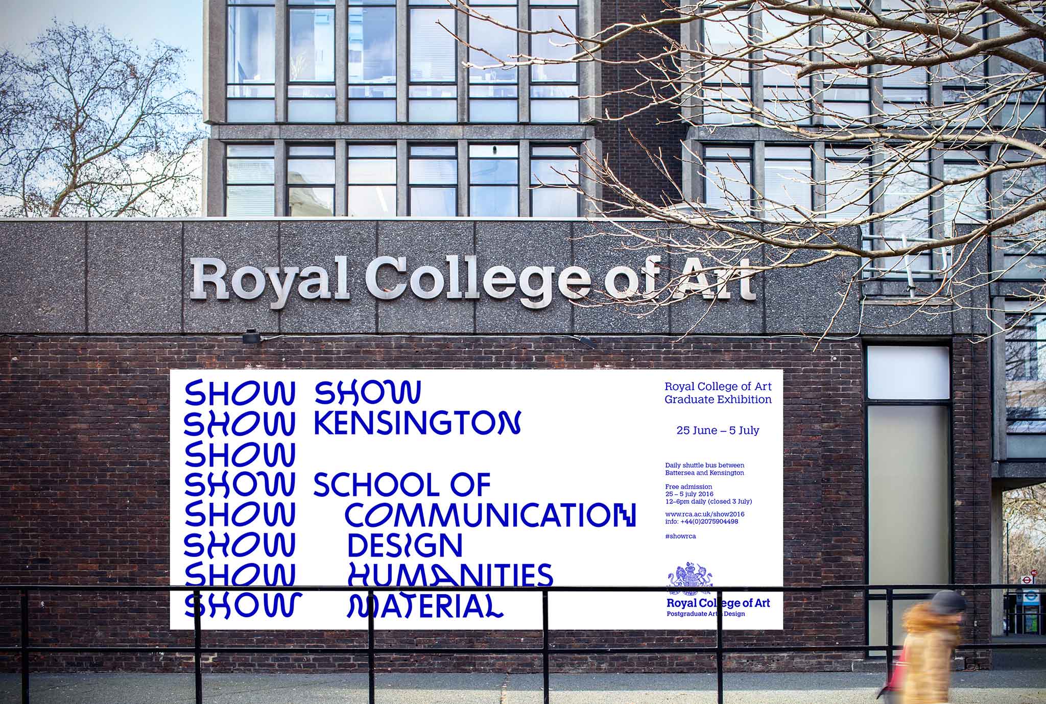
As shown below the branding heavily uses IKB as it's primary colour, the use of blue is highly relevant to the Jewish Museum as the Star of David is regularly seen in blue, and the use of IKB really makes it stand out of the crowd, adding a new lease of life to the museum. 


Beyonderground Helsinki - Ronny Duquenne 
https://www.behance.net/gallery/21374683/Beyonderground-Helsinki


Addrn identity redesign - Call Me Papa 
http://appellemoipapa.fr/projet/addrn/


Margot Leveque - Personal business cards and stationary 
https://www.behance.net/gallery/35369457/Business-card-ICU-MargotLveque


Aloa Input - Moby Digg
https://www.behance.net/gallery/28078517/Aloa-Input-Mars-etc


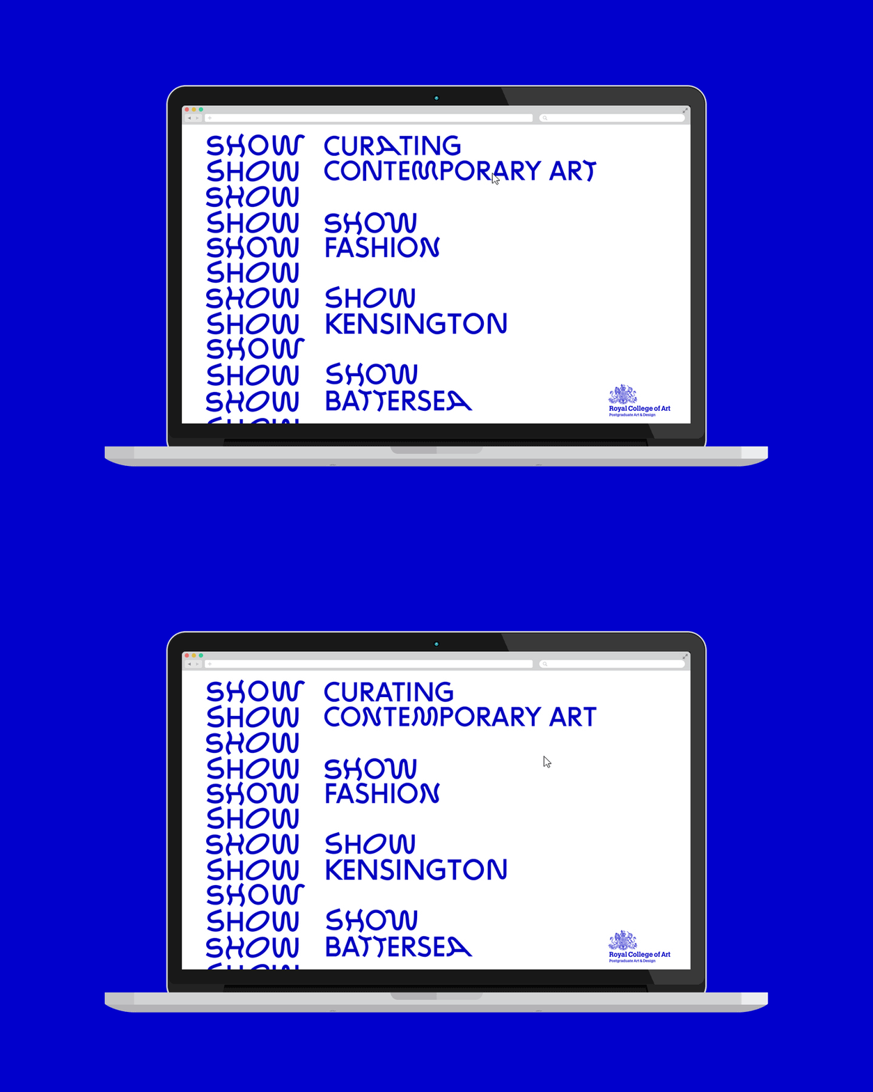
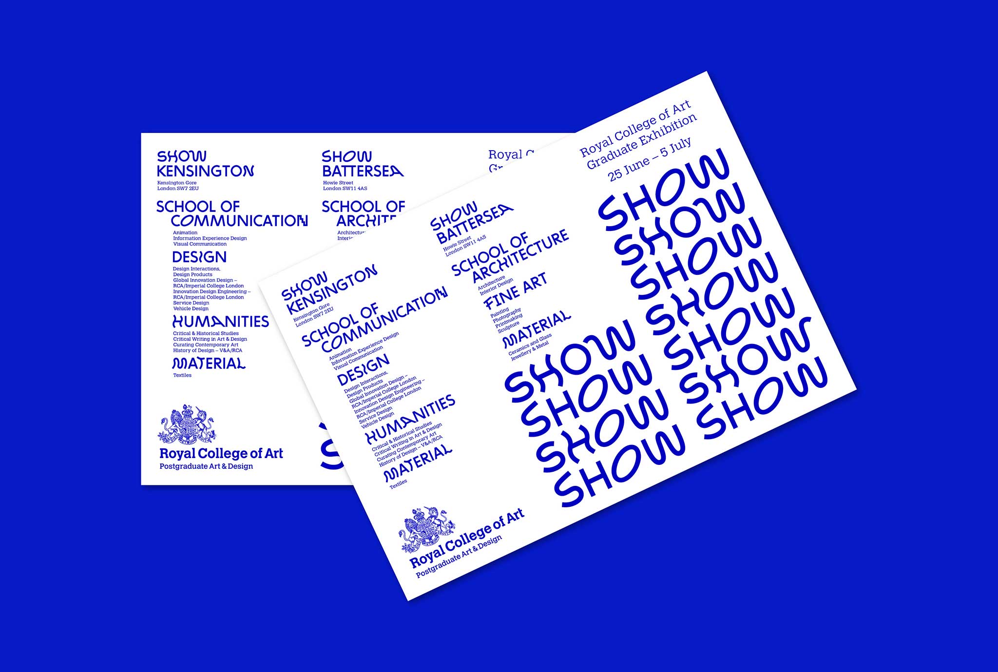
RCA Graduate Exhibition 'Show' - Summer Studio
http://summerstudio.co.uk/royal_college_of_art_SHOW_2016/


Overall I do think in recent years the colour has been used a lot more simply because it is on trend and can give a strong visual impact with just a handful of other colours if any, however this doesn't mean that the designers don't appreciate the depth of the colour. The reason it has come back into fashion is the fact that it does the job, it is vibrant and gets peoples attention.


404 Study Task 01 - Klein Blue

Klein Blue
"The man who invented colour"


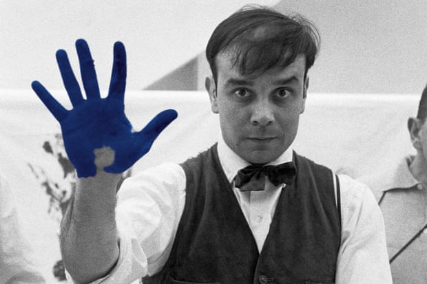
Yves Klein was a monochromatic contemporary artist known for being influential in the modernism of art, post World War II - he helped the world see and enjoy colour again after it had truly been darkened by the tragedy of war. Klein was born on 28th April 1928 in Nice, France and both of his parents were artists so it wasn't surprising that he became one. He started painting monochromes as early as 1949 - associating them with freedom from ideas of representation or personal expression; he held his first private exhibition in 1950, though not publicly showing his work until 1954. Yves Peintures featured a series of intense monochromes linked to several cities he had resided in over the past four years - the art either came from an idea he had whilst in the relevant city, or the work was his abstract representation of the city's atmosphere.


International Klein Blue


A deep blue hue first mixed by the french artist in collaboration with a Parisian art paint supplier. The visual impact is down to a heavy reliance on Ultramarine (A deep blue colour and pigment - the most expensive blue used by Renaissance painters) but the uniqueness does not come from this pigment, rather the matte, synthetic resin binder in which the colour is suspended. The colour was first created in 1957 and the Klein continued to use it in almost of all his art work until he died in 1961. Klein considered the colour "had a quality close to pure space" and he associated it with "immaterial values beyond what can be seen or touched". The popularity of IKB has recently surged and it is being used in all sorts of ways around the design world - from fashion design to graphics. Some say this could be down to needing a vibrant and exciting colour in a sea of blue hues; the use of bright blues, greens and white could be down to the need for a unified global cause as we hear about issues such as global warming and sustainability. Neither RGB nor CYMK are able to accurately reproduce the intensity of this colour on screen or in print however there are close matches: CYMK - 1.00, 0.72, 0.00, 0.35 & RGB - 0, 47, 167.

404 Study Task 01 - Pantone

Pantone was found in 1963 with Lawrence Herbert creating an innovative system of identifying, matching and communicating colours - this solved problems in the graphic design community of accuracy in colour. He saw that people interpret the spectrum differently and this led to the making of the pantone matching system; a largely standardised colour reproduction system. The purpose is to enable manufacturers around the world to match colours without direct contact with one another. There are only a special few colours that can be reproduced using CMYK, with the rest of Pantone’s colours being simulated with 13 base pigments mixed in specific amounts. The system allows for special colours to be produced such as metallics and fluorescents. Screen based translations are created using the RGB colour model. Colours are described by their allocated number, for example “PMS 130”. They are used the majority of the time in branding and have also been used by government’s and military to describe the colours of flags etc. You can actually buy devices that match any surface with a pantone colour from the price of $649.00.


405 Study Task 01 - Wayfinding Research 02

After getting the first study task and briefed on what the module will be based around to start with I decided to get out around Leeds and do some primary research. I looked at the train station, in shops, out and about on the streets and at road signs. Each of the different way finding systems have a slightly different purpose, although they are all used to help people navigate their way and find specific things, they will be seen by and used by different people depending on where they are.


Here are some examples of signage in shops such as Next and John Lewis, I believe both of these shops are for everyone, all of their advertising and brand identity is quite neutral and suitable for people of all ages as well as gender. Therefore all of their way finding is in an easy to read sans serif type and shows consistent design. 


Above are examples of way finding in Trinity shopping centre, as with the above shops this centre is used by everyone and the signage must be easy to follow. There is use of colour coding with the different floors to distinguish quickly what floor you are on. The signs include useful information such as where toilets, cash machines and cafes are; along with exits to streets.


The examples above show shops that have a smaller range of target audience, the majority of their advertising and brand identity is aimed towards the younger demographic. Therefore they can be a little more adventurous and creative with their way finding for example the use of neon lights and simple vinyl plastered on the wall, the signage is more decorative and fun as it doesn't have to necessarily be read by everyone or understood, however it is all still legible.


The signs in the train station are a very different story to those above, they have to be plain, easy to read and suitable for every demographic - they couldn't be more boring if they tried but this is their purpose. The use of arrows is a big part as people are inclined to follow them, and realise the signs are directions to be followed rather than just shop names etc.


I believe the road signs to be the most interesting of them all, they have to be quickly identified as people are driving, cycling and walking past, they can't include much text as there isn't time to read. In this manner I believe it to be the most successful way finding system I saw whilst out getting research. This is partly down to the same ones being used nationwide and anyone who can drive has to have a theory test including the signs, but none the less the use of circles, triangles and rectangles are effective.


Tuesday, 29 November 2016

405 Study Task 03 - Subjective symbols of objective things research

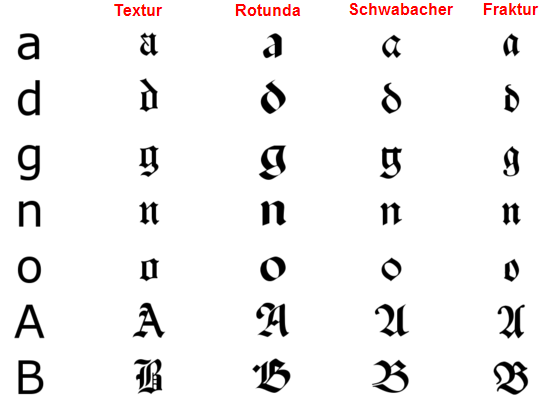
The main focus of this task is 'black letter' a typeface used in the Guthenburg Bible, one of the first books printed in Europe; black letter is also sometimes referred to as Gothic, Fraktur or Old English. It is recognisable by it's dramatic thin and thick strokes, and in some fonts elaborate swirls on the serifs. The typefaces are based on early manuscript lettering.


Four major families of black letter can be identified, they were evolved in Western Europe from the mid twelfth century: Textura, Rotunda, Schwabacher and Fraktur. You can really see the difference in the separate typefaces if you consider the 'O'. Blackletters are difficult to read as body text and Roman and Italic faces were easier to print with movable type, for these reasons it became less popular in 1500's with the exception of Germany still using it along with German speaking countries.


Use in modern day

As there were advances in technology and advertising, there were improvements in fonts and blackletter became a lot more eligible and therefore can now be used digitally very easily. It is seen a lot in alcohol brands such as Steinlager below,  I believe it used to associate the beverage with german heritage as they are well known for their quality beer. The typeface is also seen a lot in band logos for heavy music, as well as gang style tattoos - revealing a dark side to the typeface.


405 Experimental Jetset Research

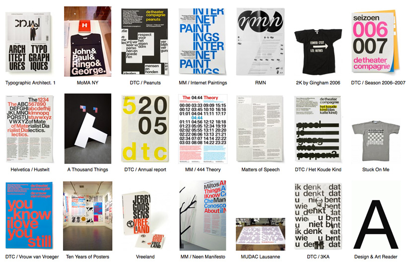
Experimental Jetset is a small, independent graphic design studio based in Amsterdam, it was founded in 1997 by Marieke Stolk, Erwin Brinkers and Danny van den Dungen, and still consists of these members today. They have described their methodology as "turning language into objects" and have worked on projects for a variety of institutes. Focusing on printed matter and site-specific installations, their work has been featured in group exhibitions such as 'Graphic Design: Now in Production' (Walker Art Centre, 2011). In 2007 a large selection of work by Experimental Jetset was acquired by the Museum of Modern Art in New York, for inclusion in the MoMA's permanent collection.


For Erwin and Danny the concept of being a graphic design was unknown to them as children, they were interested in putting images and text together, creating small comic books and drawing rockets and robots however they didn't know such a job existed. They put this down to the fact that they didn't have computers, very different to the world we live in today where children have access to the internet from an early age and so know what is on offer to them. However Marieke was slightly more aware of graphic design because her father was a well-known printer in Amsterdam and her uncle is actually a well-known graphic designer, however a young age she didn't dream of becoming one herself.


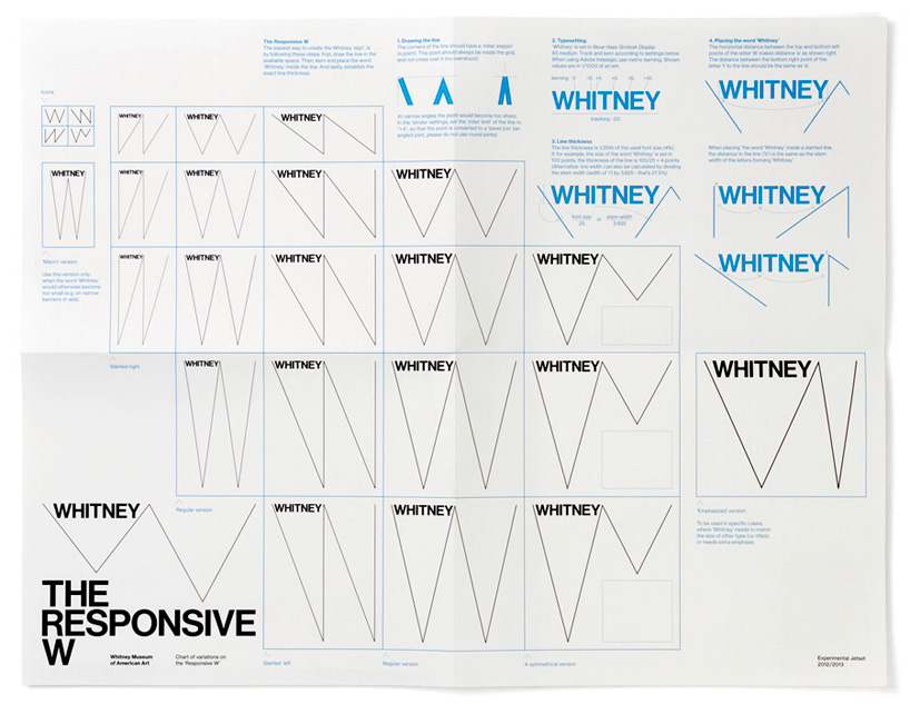
The studio describe the Whitney rebrand as one of their most satisfying projects to date as it required them to function to full ability - writing, reading, researching, designing for printed matter and signage, as well as working with sound and moving image. Developing the graphic identity for the Whitney was a very strict process, involving dozens of meetings and presentations. The project was very city-specific, very much grounded in the city of New York "in the sense that, during the design process, it became clear to us that the shape of the ‘zigzag’ could refer to things such as the ziggurat-shape of the architecture (of both the current and future building of the whitney), or the iconic fire-escape stairs in the streets of new york, or the zigzag-like path of the whitney museum through manhattan, throughout the years. also, we did a lot of research into the history of the whitney museum, and the history of american modernism in general – the specific moment that europe stopped being the center of modern art, and new york became the new capital. so, in the whitney project as well as in ‘two or three things’, we really tried to explore this notion of ‘city-specificity’."

Monday, 28 November 2016

404 Study Task 01 - Development

I really like this photograph, it is of a street in Liverpool, at the back of night clubs and restaurants, it is a very grim and gloomy looking street yet the colours here are vast and vibrant. The street art in the bottom right shows some hope for the area, it isn't ready to go yet and bricks still have their colour, with moss over some of the flagstones showing growth. 

Although the task asks for a street in Leeds I thought I would look at one in Liverpool for contrast and so I can work out what kind of colour palette I want to work with. With these colours and scene in mind I decided to try and capture the beauty of Autumn in Leeds, with all of the warm reds, browns and oranges.


I believe this photograph accurately represents the change in the seasons, with the leaves on the floor and some trees with more foliage than others. The colour palette I have drawn from the photograph shows a great spectrum of colour, I wanted this as supposed to the Liverpool photograph containing mainly dull tones. The colour of autumn leaves is a phenomenon that effects normally green leaves for a few weeks in Autumn and something I am really interested in, similarly like when the blossom comes out. It gives us something different to look at and admire for a while in the natural world, where man made buildings rarely change their appearance.


Friday, 25 November 2016

405 Study Task 01 - Wayfinding Video

The aim of this research task was to create abstract ways of getting people to take a pause in their day and be confused by what we had created or cause a diversion for people to deal with. After a bit of brainstorming we decided to use 3 different ideas, the first idea we had ended rather shortly after we tried to create it, a security woman from the shopping centre approached us and said we weren't able to use this space for our project; and so we moved on.


Deciding on an area less manned by security we headed to one of the old arcades and put some tape on the floor in the hope that people would take note of it and walk around to avoid. At first we just used tape to create an X shape across the flagstone, then adding another, eventually adding an arrow to direct around the diversion. This wasn't as successful as we would have liked and from it we learnt that most people don't even look down at where they are walking, if they are used to the route then they won't stop to look - which is actually quite concerning as our tape could be a sign of hazard, say for perhaps a loose flagstone. 


The second thing we decided on as the use of things on the floor to divert clearly wasn't working was to tape up a door way leaving a small gap at the bottom, people could either take part and go underneath or simply use the other door. You can see the results in the video below, I think it says a lot about the personality of people and perhaps what kind of mood they're in; as I know myself if I were having a bad day I wouldn't be in the mood for an annoying diversion! This is something to consider when looking at wayfinding even if this is extremely abstract, they must be very neutral and nowhere near provoking. 


The final experiment was adding a zebra crossing to a quiet road around the corner from university, this further cements the idea that people don't tend to look down as they're walking, the only person to walk by before the paper flew away wasn't responsive to our connection.


Tuesday, 22 November 2016

404 Study Task 01 - Palettes Research

Before deciding on what street photograph I wanted to use I decided to use some photographs I already had to practise with the colour picker, as well as getting inspiration for the kind of colour palettes I like. These photographs are very vibrant in colour and given the time of year it is now I don't think I would get such vibrant colours in nature as everything is on its last legs however I am going to search for some trees and bushes that still have their green colour and some autumnal leaves.


404 Study Task 01 - How Do You Read? - Colour Theory & Relativity

Pantone Your Street
We were introduced to our new module today and told about the study task we will do to start - it is a two week project due in on the 6th December however isn't an official submission. I really like the sound of this task as I am interested in colour and layout and have done colour picking from photographs in the past out of interest. One of the first things I need to look into for this task is the history and present use of Pantone, whether it is a good system or not, people's opinions of it and how it actually works. I will also research grid systems and book layouts to aid the design of my finished product which will be a folded book in a design of my choice, the book will include:
  • colour swatches
  • 250 words on joseph albers use of colour
  • 250 words on klein (blue)
  • 6 examples of kliens blue in graphic design
  • 100 words on pantone
  • 100 words on rgb v cmyk
  • 500 words on the use of colour in graphic design
  • research + images + evaluation of the colour group/harmonies/contrasts.
The first thing I will do though is look at interesting photographs I already have and how the colour palettes work and then take a photograph here in Leeds to use.

Friday, 18 November 2016

Jo Blaker Talk

Today we had Jo Blaker visit us and discuss her thought processes and how she conducts her studio practice through her sketchbooks. She offered many different shapes and sized sketchbooks with different types of paper in on each table full of her work for us to look at. All of the sketchbooks were from different times in her life and she spoke about how looking back on each one really enables her to feel what she felt back then and where she was when she did them. She spoke about how when she was studying at degree level the main use of her sketchbook ended up being for the sake of having a sketchbook and to show her process rather than actually exploring ideas and her self; what she wanted to do. Jo was forced to do digital work and they tried to shake her of her ways but she came in to let us know it is okay to do more work outside of the digital, and that we should use our sketchbooks to record anything and everything, carry one with us aswell as documenting things we find interesting with photography.

Monday, 14 November 2016

Module OUGD403 Evaluation

I have learnt an awful lot in a short time with this module, I believe it has been a really good way to start the course. I have an interest in typography now when I didn’t think or know much about it before hand, I know basic terms, rules and facts about some common typefaces such as when and why they were designed. One of the most substantial things I have learnt throughout this module is skills on Illustrator which has really boosted my confidence, I now know how to develop my work digitally and manipulate type to a certain extent, as well as using shapes and the pen tool effectively in the logotype brief.

I enjoyed both briefs and found them challenging at different stages, for the typeface brief I struggled the most with the manipulation and creating of the end product however had the idea solid from early on, with the help of a lot of research and visual aids I knew what I wanted to do; however with the logotype I struggled to get ideas out and feel my final designs are too similar. I think this is down to my lack of sketching before hand, however I will learn from this now knowing that the best way to start off is definitely using my sketchbook to get out as many ideas as I possibly can, both wacky and practical as you never know where your final idea could stem from. I used sketching a lot more in the typeface brief and therefore had multiple ideas and routes I could take, although some where unsuccessful for this particular brief they could always come into use in my future as a designer. 

So far I think my amount of research has been okay however feel it should be more in the direction of design theories and concepts rather than just finished products and history. I want to expand my horizons on the research front, rather than searching the internet I need to look at more books and watch documentaries and interviews with relevant people.

Something I have found really helpful is having a critique every week, allowing fresh eyes to see my work and pointing things out I couldn’t see myself and to give me new ideas when you’re at a bit of a brick wall, another interesting aspect is being able to see other peoples work and appreciating their approach to the same brief as yourself, they might have a different word or adjective but the process and end product take the same line. The type of critique I have enjoyed most is walking around and leaving feedback as I feel this is the way to get most honest opinions, people aren’t afraid to give constructive criticism because it is anonymous.


I am happy with my final designs for both briefs although would work further on brief 01 if given the chance to have some more diverse ideas as in the real world the client would want more however I do feel my final solution communicates the brand. I believe the subtlety of the adjustments made to create my typeface is key and that it communicates the majestic look I wanted. I have really grown as a designer throughout this module, with the way I think and approach a task, making important design decisions with reason, everything must have meaning and substance to be worth it.

Sunday, 13 November 2016

Studio Brief 02 - Evaluation


The brief was to design a bespoke typeface based on one of Müeller-Brockmanns classic and lead typefaces using an adjective of our choice. I was quite intimidated by this task at first as I had never done anything of the sort and was still relatively new to typography however knew that it did interest me. So after a fair bit of research into the different typefaces I settled on Bodoni, with the aim of creating a majestic edition; the context I had in mind was high end luxury brands and magazines so I designed it as a display typeface rather than being suitable for a body of text. This task most definitely pushed me to build on my Adobe Illustrator skills, and I have seen a massive improvement myself since the start of this module from for example the ligature task I didn’t even try to use it, rather tried my best on Photoshop. I have enjoyed playing around with the glyphs as individuals, with their different  shapes and strokes as well as on a whole with the characters adding up to an alphabet. I really enjoyed using sketches to show what I wanted to do with this one and be able to explore possible options with out going straight into digital and being stuck around the same idea with just slight variations; this has really helped me recognise how useful a sketchbook can be and will definitely continue to use one in the future - this was further enforced by an interview I saw with Rudd studio. The final decision was to create a font in upper-case as I thought this most appropriate for display, I believe the letters flow well next to one another and are interesting to look at; as well as being majestic and something to be trusted, followed and admired. I named the font ‘Bodoni Bracket’ as fundamentally you could still tell it is Bodoni, it is already quite a regal and majestic font so the brackets are the main difference and I believe that subtlety is the key in some cases. I have learnt during this project it is okay to experiment with the characteristics of a typeface in a subtle or drastic way, whatever fits what you’re trying to achieve, this will allow me in the future to adjust typefaces to fit a specific purpose. In terms of what I could have done differently, I would research more other designers who have changed and manipulated typefaces and see how they did it, what tools they used.

Friday, 11 November 2016

Studio Brief 02 - Final Design & Type Rationale

So this is the final design for my Majestic typeface, as you can see some of the glyphs are the same as the digital development 03 however some have been further edited such as the A, D, O and Q as I felt they needed more work. I am pleased with my final result and believe that the subtle changes actually make a big difference in conveying the adjective I chose. The words I used to describe the typeface in the end were regal, sublime and decorative I chose these because they relate well to majestic and decorative describes what I have added to the original Bodoni typeface. The added brackets and different weights in the letters make for a more interesting and decorative display font.


Above is the final design I decided on to showcase my typeface, I laid out the alphabet so all is visible and then spelt out the word majestic below with the personality traits on top the low opacity adjective. I used black and grey as I feel these are suitable colours for the context I described - high end brands and magazine titles are usually in tame colours such as black, grey or white. 
Rationale

Majestic is a typeface perfect for use in high end brands and magazines that want something more than your typical serif typeface. This typeface features strong bracketed serifs and interesting curves in the letter forms. Derived from the typeface Bodoni Oldstyle it takes that classic and elegant look and builds on it, extending the cap height in cases such as the T and I to allow a better flow with the other letters. All of the small changes make for a softer and more inviting typeface. The typeface was designed with display font is mind, the letters are decorative and won't necessarily work as a body of text for this reason.

Monday, 7 November 2016

Studio Brief 02 - Digital Development 03

Here you can see the first changes I made are in pink with the second ones in a light grey, I believe the second changes made a real difference for example the brackets added to the crossbar of the 'H' and 'A'.