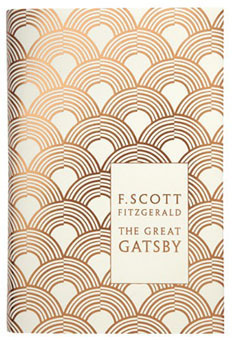
The book covers for this novel are often designed with the film adaptations in mind, sexualising the young character 'Lolita' as a teen-aged seductress, when if fact she is an abused 12 year old. To design a cover for a book so psychologically complex is a challenge using photography or illustration - with this in mind I believe the best option would be to go for something abstract, giving nothing away to the reader but intrigue - so that they can form their own ideas and interpretations. It is described as a postmodern novel and 'tragiccomedy'.
Saturday, 17 December 2016
404 Study Task 02 - Book option 03 (Lolita)
Lolita - Vladmir Nabokov
The book covers for this novel are often designed with the film adaptations in mind, sexualising the young character 'Lolita' as a teen-aged seductress, when if fact she is an abused 12 year old. To design a cover for a book so psychologically complex is a challenge using photography or illustration - with this in mind I believe the best option would be to go for something abstract, giving nothing away to the reader but intrigue - so that they can form their own ideas and interpretations. It is described as a postmodern novel and 'tragiccomedy'.
The book covers for this novel are often designed with the film adaptations in mind, sexualising the young character 'Lolita' as a teen-aged seductress, when if fact she is an abused 12 year old. To design a cover for a book so psychologically complex is a challenge using photography or illustration - with this in mind I believe the best option would be to go for something abstract, giving nothing away to the reader but intrigue - so that they can form their own ideas and interpretations. It is described as a postmodern novel and 'tragiccomedy'.
404 Study Task 02 - Book option 02 (Alice in Wonderland)
Alice in Wonderland - Lewis Carroll
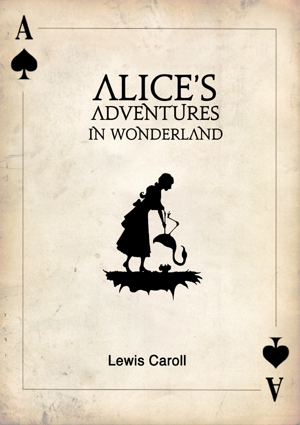
Another book with a great history of designs for the covers, the first below in 1898. The designs are all fairly different but all include a hint of quirkiness with a lot showing the main character herself. The novel is fiction and is under the 'Children's Literature' genre - this is something to be mindful of when designing, it is likely that a parent is going to buy the book so it must be appealing to them, however also the child who will pick it off their shelf to read.
Friday, 16 December 2016
404 Study Task 02 - Book option 01 (The Great Gatsby)
The Great Gatsby - F. Scott Fitzgerald
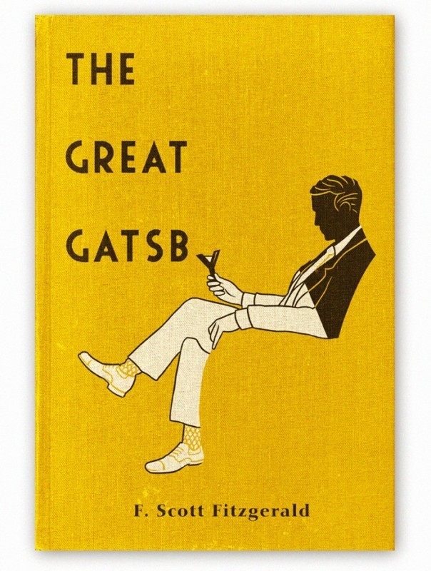
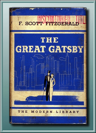
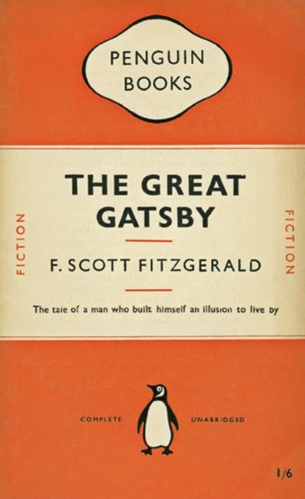
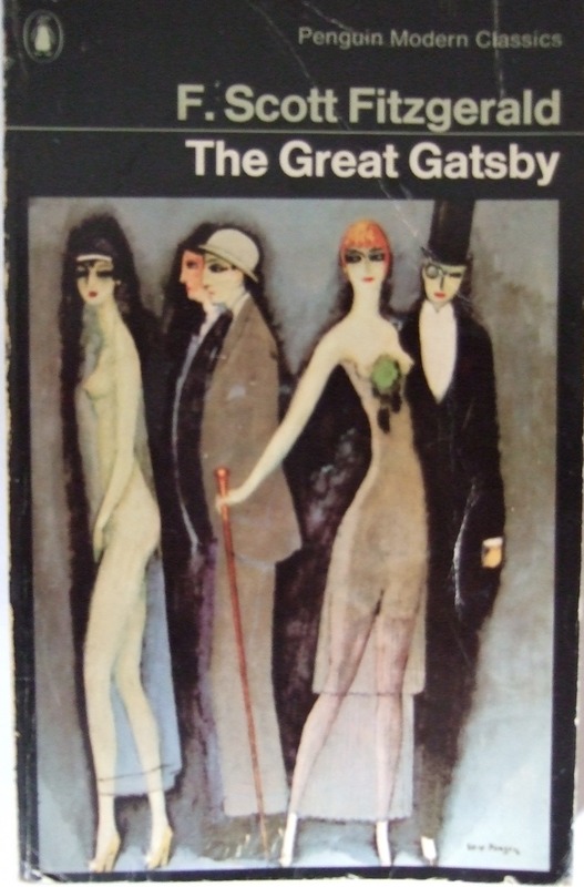
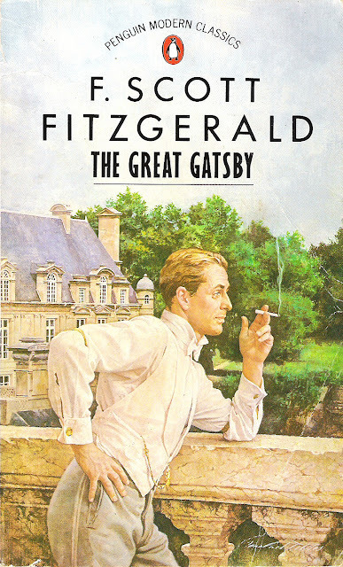
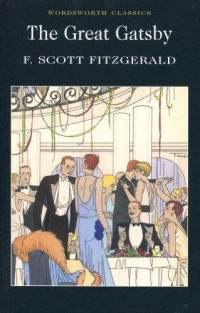
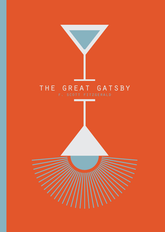
This particular book has had many different book covers, all designed by different people and in very different styles - the only real similarity I draw from a few is the use of blue and yellow, they appear most commonly. However this colour scheme is not found in the designs published Penguin - this is something I can consider. This book is fiction and the genre it falls under is 'Historical Drama' or 'Tragedy'.
This particular book has had many different book covers, all designed by different people and in very different styles - the only real similarity I draw from a few is the use of blue and yellow, they appear most commonly. However this colour scheme is not found in the designs published Penguin - this is something I can consider. This book is fiction and the genre it falls under is 'Historical Drama' or 'Tragedy'.
Tuesday, 6 December 2016
404 Study Task 02 - How Do You Read? - Grids
This task involves researching Romek Marber, a freelance designer noted for his work illustrating the covers of Crime Penguin Books in 1960s. As well as researching the grid he is noted for creating, the Marber grid and using it in my own design for 3 book slips for 3 different penguin classics of my choice. The design can be as abstract as I like and photography can be used. The inside of the slip must feature a timeline of Marber's life.
1925 Romek Marber was born in Poland
1939 Marber was deported to the Bochnia ghetto
1942 Marber was saved from being sent to the Belzec death camp by Sergeant Kurzbach
1946 Marber arrived in Britain, where he was reunited with his father and brother
Early 1950s Marber enrolled at St. Martin's School of Art to study a course in Commercial Art
1953 Marber went on to attend the Royal College of Art
Late 1950s Marber worked on a number of projects such as covers for The Economist
1961 Marber was commissioned to design covers for Simeon Potter's Our Language and Language in the Modern World
June - October 1961 Marber was asked to submit a proposal for a new cover approach for the Penguin Crime series, he was asked to do twenty titles in this time and he ended up conceiving a grid layout for Penguin book covers that became one of the most praised and recognised layouts of all time
1965 He did the trailer for "The War Game", however the impact of Marber's imagery posed a potent threat and it was banned from public broadcast until 1985
2005 Marber gave a speech about design and his own experiences to an audience a the Victoria and Albert Museum in London
2007 Marber gave a talk to the Penguin Collectors Society
2010 Marber published an autobiography of his experiences during World War Two titled 'No Return: Journeys in the Holocaust'
2013 The Minories, Colchester exhibited a retrospective of graphic work designed by Romek Marber for Penguin books, The Economist, New Society, Town and Queen magazines, Nicholson's London guides, BBC Television, Columbia Pictures, London Planetarium and others. The exhibition went on to be shown at the University of Brighton and the Gailicia Jewish Museum in Krakow
2015 Marber returned to Poland for the first time since 1945 when he was just 20 years old
This is all of the information I managed to gather from numerous sources about Marber's life, apart from the facts about his career there isn't a lot about his personal life. Of his career I would suggest the creation of the grid system to be one of the most successful points, it was applied to all of the orange and blue covers for Penguin fiction, further ending up being used for the whole list of Penguins.
The grid is quite a complicated one however I am going to have to learn how to create it in order to complete the task, the steps below describe how it is to be done properly:
- Divide the page in two, vertically
- Draw the ‘right’ diagonal, across the page
- Draw the ‘left’ diagonal across the page
- Draw a line from the top right corner so that it intersects the ‘left’ diagonal at a right angle
- At that intersection, draw a horizontal line across the page
- Draw a line from where the line from step 1 meets the top of the page to where the line from step 4 meets the left edge
- From the intersection of that line with the ‘left’ diagonal from step 3, draw a horizontal across the page
- From the intersection of the lines from steps 3, 4 and 5, draw a vertical to the top of the page
- Now draw a diagonal from the top left of the page to where the line from step 5 meets the right hand side of the page
- Now draw a vertical from the line from step 5 to the top of the page so that it passes throught the intersection of the lines from steps 3 and 7
- Now for a final horizontal across the full page, passing through the intersections of the lines from steps 6 and 9
- Then draw a final vertical from the intersection of this line with the left diagonal from step 3.
I would like to create 3 different designs for the books so therefore I'm going to carefully select the books I use - each one under a different genre. Possible design options are:
- Photography
- Abstract shapes
- Line drawing
- Patterns
- Collage
- Mixed media
- Mark making with paint and pens
- Experimental typography
- Scannography
Friday, 2 December 2016
405 Study Task 03 - Blackletter outcome
Today we explored black letter using various tools:
- Ink
- Paint
- Brushes
- Rulers
- Cardboard
- Pencils
- Pens
- Sticks
- Rollers
The aim was to create a coherent set of pictograms suitable for the sign system pictured below. The pictograms were to be in the style of black letter and didn't have to immediately shout out what they implied. Out of all of the tools I used I found cardboard to be the most successful - dipped into ink it soaked up a nice amount and left some behind to flow nicely across the paper, applying different pressure gave thicker and thinner, bolder and less so lines. Along with holding the cardboard in different hands and angles I was able to create a lot of interesting shapes that I manipulated into thoughtful arrangements to portray the symbols we all know. I focused on creating the different thick and thin strokes that black letter typefaces are distinctly recognised by, as well as harsh twists and curved serifs.
Above is 2 contact sheets showcasing some of the shapes and marks I made, arranged in a fashion I was able to see what I had and what I could work with; from here I started deciding what shapes would be used for each symbol, putting them in order and digitalising them into Illustrator. Below is the finished set of pictograms, in the same order as the standard sign system at the top. I believe this was a successful task and I enjoyed using tools I wouldn't usually turn to, I was really able to get out a lot of ideas in a short space of time and helped me with any creative block I had with the task.
Thursday, 1 December 2016
404 Study Task 01 - Use of colour in graphic design
In my own opinion the area of graphic design that colour is the most important to is branding and advertising, designs that are being put out there to encourage people to buy a product or service. The right use of colour is essential and specific to the consumer whose attention the designer is trying to gain. According to the way our natural senses function, colour is the most influential, followed by shapes, symbols and finally words. The colour used has a significant impact on the way a brand is perceived by the public, it is essential to look at other brands to get an idea of how colour schemes play a part on brand perception. If a company with a strong brand recognition altered their colour scheme where it is expected to be maintained, there could be dangerous consequences.
Colour meanings vary from culture to culture and the impact that a brand has on the targeted audience, there are a few different words used to describe colour: Hue is the primary value of a colour and how it is perceived through the eye. Saturation is the overall intensity or brightness of the colour, any colour that appears dull is referred to as desaturated. Value is the lightness or darkness of overall colour schemes.
Designers look at colour theory before choosing what colour schemes to go for, there is a scientific backing behind how we see colours and what they mean to us based on psychology. As I have looked at different brands and companies in the past for research I noticed that a lot of the time, companies in the same business use similar colours for their brand logo - for example Twitter, Facebook and Tumblr, all social media platforms using different shades of blue to represent themselves. The colour blue is described with many words: security, trust worthy, stability, loyalty, wisdom, confidence, trust, friendliness, courage and science. I couldn't link all of these to the social media outlets however the majority are definitely things that they would want to convey, for example you would want a social media site to be secure, if you are going add a lot of personal details you don't want anyone on the internet to be able to access, you also want stability, rather than the site crashing and you loosing all of your photographs and virtual memories you have made.
In a design project there is usually one dominant colour, either because of how much is appears in the design or because it stands out in comparison with other colours - and one or more accent colours. There are various ways to get colour palettes for a project from the colour wheel 'Colour Harmony'. Monochromatic is the word used to describe a collection of various shades, tones or tints of one colour - for example a range of greens varying from light to dark ; this type of scheme is subtle and rather conservative. Analogus is hues that are side by side on the colour wheel, this type of scheme is versatile and easy to apply to design projects. Complementary colours are those that are opposite eachother on the wheel, Split complementary being any colour with the two that flank its complement. Triadic is any three colours that are evenly spaced on the colour wheel. Finally Tetradic/double-complementary is two complementary pairs, very eye-catching but often more difficult to balance which means it is wise to choose a dominant colour.
404 Study Task 01 - Josef Albers
Albers was born on March 19th 1889 in Germany. He was an artist, poet and printmaker; as well as being an educator known for his colossal presence in the classroom and iconic abstract paintings. His work formed the basis in both Europe and the United States of the most influential as well as far-reaching art education programmes known to the twentieth century. He published his book 'Interaction of Colour' in 1963, a book offering his theory that colours were 'governed by an internal and deceptive logic'. The original print run was 2000 and therefore a first edition of this book is very rare. He produced a series 'Homage to the Square' from 1949 until his death in 1976. It used a single geometric shape to systematically explore the vast range of visual effects that could be achieved through colour and spatial relationships alone.
From his chapter 'A colour has many faces - the relativity of colour' he effectively explains that colours are relative to what they appear next to, for example if you place a square of the same colour paper on top of 2 different shades no normal human eye can see the small squares the same colour.
Albers also talks about the after effect of an image, caused by interdependence of colour. If you stare at the left square, then shift quickly to the right you see the square manifest as yellow diamond shapes where you usually see a colour-based afterimage that would compliment the yellow circles with blue.
Subscribe to:
Posts (Atom)
