Garamond:
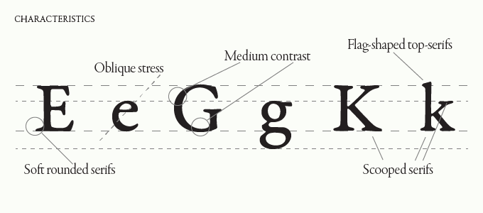
Traditional, readable, timeless, delicate and elegant. The garamond we know in modern times is interpretations of fonts that were inspired by drawings which were modeled after the punches of Claude Garamond (In traditional typography, punchcutting is the craft of cutting letter punches in steel from which matrices were made in copper for type founding in the letterpress era.) Prior to Garamond's work, the practise of type face design was to try and achieve a replica of a scribe's handwriting; making him the first to make letters that would read better when printed.
Some popular books have been set in Garamond - Harry Potter novels and Dr. Seuss books, as well as being used for Googles original logo and Abercrombie & Fitch's logo. Obviously a very interesting typeface with a rich history and still very relevant to this day however can't say it fits my adjective very well, a big thing that it is so widely used as body text typeface which isn't what I want to create.
Caslon:
Credible, homely, friendly and pleasing. Designed by William Caslon in the 1700's one of many Caslon typefaces but often referred to as Caslon Old style. Caslon's typefaces were popular in his life time and beyond, and after a brief period of eclipse in the early nineteenth century remain common, particularly for setting printed body in text and body. This could be an option as it is has potential with the serifs used and the Q for example does look quite majestic, the rest can be manipulated.
Baskerville:
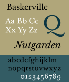
Classic, transitional, delicate and traditional. Baskerville is the resuly of John Baskerville's intent to improve upon the types of William Caslon. Increasing the contrast between thick and thin strokes which made the serifs sharper. The typeface was the culmination of a larger series of experiments to improve legibility which also included paper making and ink manufacturing. Baskerville is also an option for me to consider.
Bodoni:
Modern, classic, elite and high attention to detail. Designed in the late 18th Century, Bodoni was hired by Duke Ferdinand of parma, a noted patron of the arts, to establish a premiere royalty press. The concern - printing of the highest quality not for the masses, but for the aristocracy. He relied heavily on the recent designs of Didot, creating a revolutionary Roman style which was very different to anything seen before. The attention to detail in the typeface is really something to take in and the quality was not something that could be matched by anyone else in his day. Modern typefaces aren't perhaps the most readable of styles, they are most visually distinct making them perfect for Display type design.
Clarendon:
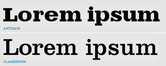
Graceful, striking, hand craftsmanship, slab serif. It was created by Robert Besley in 1845, inspired by the typeface Antique - one of the original slab serifs.
Besley added bracketed serifs giving it the ability to work better inline of a body of text. It also gave it a more approachable and soft feel. It became very popular in its time period and because of that we quickly associate it with turn of the century England and the old west in the USA; for this reason I don't think it would be suitable for a Majestic Display font.
Times:
Traditional, trustworthy, serious and legible. Times New Roman gets the name from British Newspaper 'Times of London'. In 1929 Monotype were hired to create a new text font. Monotype had to license the design to it's rival Linotype because it used their typesetting machines. Since then Monotype has sold the font as 'Times New Roman' and Linotype has marketed its version as 'Times Roman'. Seen as this type was specifically made for body text I don't think it would work with my adjective as a display font design.
Helvetica:
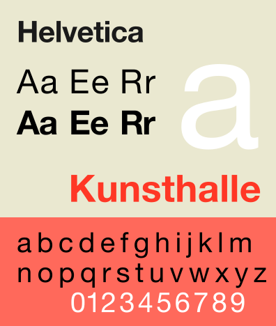
Neutral, adaptable, serious and aesthetic. Helvetica is a sans serif grotesque typeface and is one of the most popular typefaces in the modern world. It was based on Akzidenz-Grotesk created by Berthed around 1898. Original typeface was designed by Max Miedinger and Eduard Hoffman in 1957 Switzerland.
It is used for many famous logotypes and as a brand identity typeface - in many variations as the typeface is so neutral it can be manipulated to give out any kind of message you want and is good for companies with broad target markets and range - this was the aim, for the typeface to give out no meaning at all itself. It’s original name was Die Neue Haas Grotesk however it was renamed in 1960 to Helvetica (Latin for Swiss) so it was more marketable worldwide. Fun fact: it remains legible when in motion, one reason it’s popular for signage and automaker and airline logos. I think that this choice for majestic could be a good challenge, to take something so neutral and transform it would be interesting and seen as it is used for display type design a lot it would work.


No comments:
Post a Comment