Tuesday 28 February 2017

SB1 Previous Winners

I decided to look at the previous winners and runners up for the Adult Fiction Prize to get a feel for what the judges are looking for. As well as the previous covers there is a brief on the website: 

Come at it from a fresh perspective and to avoid repeating the obvious iconography from the many previous editions in print. The cover should feel timeless and confident, and appeal to a whole new generation of readers.


This design pulls from the language used in the novel and serves as a sort of glossary. You can get a feel for the kind of book it is by seeing what words are used a lot - the idea is unique and focuses on the language used to deliver the content, giving context and themes rather than illustrating a scene in the novel.


SB1 Book Design Development

I have decided to go with the second initial idea to develop as I feel it is the strongest idea in terms of the meaning behind the design.


The first change I made was redrawing the illustrations to be more detailed and precise, also using a specific flower mentioned in the book for inspiration - Azaleas. A staple flower of the south and are symbolic of Miss Maudie. I kept with the yellow and grey however changed it to be more stylistic using bold rectangle shapes contrasting each other.


Going forward with this design I decided that the above is a bit too messy and you wouldn't know where to look. The layout needs a lot of work but I think the type and illustrations themselves go together well. I also believe that the yellow and grey could do with a rethink so I am going to try out black and white to show the coexistence of good and evil in the novel.


I decided to strip back with this design and see if it could work with just the bird on the front with the small typeface below reading the author and book title. The back features the flower illustration I drew without any text as I wanted to focus on the design mainly before adding type. 


Another variation of the design without type to see what works best colour wise and layout - the main focus being on the flower symbol which I believe to be more effective and relevant to this brief than the cliched mocking bird.

SB1 Penguin Initial Ideas

Building on the typographic/ layout designs below I produced 3 initial designs using the different layouts and opting for different illustrations and styles.


For this cover I illustrated a tree as seen in some over the other covers that the tyre swing hangs off. I chose the green as thought it was relevant to the illustration, sticking to one colour keeps the cover looking professional and classic. The relevance of the tree is there is one in front of Boo Radley's place and it is significant to the novel as alot happens around it such as Jem and Scout finding two pennies in the hole of the tree one day.


For this cover I drew from a lesser known symbol in the book - flowers. I illustrated some flowers beside a bird as I thought the two together would work well. The colours I chose reflect the coexistence of good and evil in the book, I used yellow and grey as I didn't know if black and white would be too bold. 


For this design I used the shape of Alabama - the state in which the novel is based repeatedly to create a pattern whilst using the quote from the lawyer to emphasise the name of the novel. I wanted to create something different to the standard mockingbird image and this obscure looking pattern does this.

Feedback:
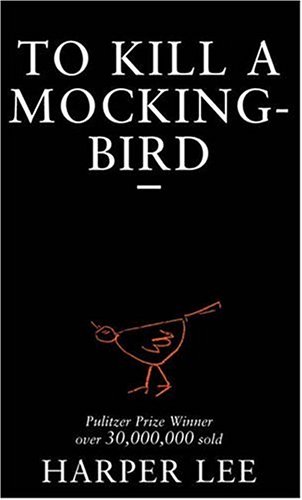
They're really cool, maybe change the spine writing on the red one to white though so it would be more noticeable on a shop shelf?
I like the second one best I think the colours work best
The quote on the third one you use for the title may need to be moved to the back as it is part of the paragraph

Taking this advice on board I am going to go forward with the 2nd design as it holds the most potential rather than wasting time on fixing the others or trying to make them something they aren't.

Monday 27 February 2017

SB1 Book Cover Typographic Treatment


Typeface used: Gill Sans

I believe Gill Sans to be a very versatile typeface, it suits most needs you could have and brings elegance to the design even though it is a sans serif.


Typeface used: Adobe Caslon Pro

This is focusing on a purely typographic design, there wouldn't be much space for any illustration or photographs however it could work well if done properly.


Typeface used: Orator Std & Garamond

I tried out a few different typeface combinations but believed these to compliment each other well with the simplicity of the design.


Sunday 26 February 2017

SB1 Book Cover Analysis


This design is the first used for the novel back in 1960 - cover design by Shirley Smith and features the tree where the gifts are found left mysteriously for the Finch children rather than the more known images associated with the novel such as the mockingbird and the tyre swing.


This is a design that was for mass market paperback, published by Grand Central Publishing and also features the tree incorporated with the title of the novel. The colours used here are very dark and portray the book to be dark and I'd say almost spooky.


To me this design portrays inequality - the large type is almost shouting whilst the small illustration of a bird is compressed and without a voice.

This is the book on display for sale in Waterstones bookstore and it really stands out to me, against all of the other busy looking and colourful book designs. It makes me curious about the book and want to read the back to get a feel for the contents as it doesn't give much away.  


A lot of the other books in the Adult Fiction book section feature bright colours and photographs to grab the attention of the readers and I will consider this when drafting my initial ideas by trying out bright colours along with just black backgrounds. This cover draws from the 'Mockingbird' quote from the book and obviously relevant to the title so therefore an obvious design for those who haven't read the book to understand.


406 Studio Brief 01 - Live Brief: Penguin Random House Student Design Award

Adult Fiction Cover: To Kill a Mockingbird

'A black man charged withe the rape of a white girl. Through the young eyes of Scout and Jem Finch, Harper Lee explores with exuberant humour the irrationality of adult attitudes to race and class in the Deep South of the 1930s. The conscience of a town steeped in the prejudice, violence and hypocrisy is pricked by the stamina of one man's struggle for justice. But the weight of history will only tolerate so much'

Main points
  • During the great depression
  • They are well off as their father is a lawyer
  • Protagonist Scout Fincha
  • Set in a town in Alabama called Maycomb
  • The town has a racist white community
10 Adjectives to describe the book
  1. Timeless
  2. Informed
  3. Inquisitive
  4. Youthful
  5. Touching
  6. Mysterious
  7. Intriguing
  8. Courageous
  9. Conflicting
  10. Compassionate
Context
  • Lee was born on April 28 1926 in Monroeville, Alabama - a small town in many ways similar to Maycomb.
  • Lee's father was also a lawyer
  • She drew inspiration from her friend Truman Capote for the character of Dill
  • Lee maintains that the novel does not portray her own childhood home but rather a nonspecific Southern town
  • Second book wasn't released until 2015
  • During Lee's childhood in 1931, 3 black men had been accused of raping white women, and were eventually convicted despite the knowledge that the women were lying. 
  • Instances like this were common within a highly racist South America
  • The book was published just before the peak of civil rights movement 1960 
Themes
  • The coexistent of good and evil
  • The importance of moral education
  • The existence of social inequality
  • Racism and prejudice
  • Societal gender roles and conditioning
  • A child's transition from innocence to experience
Motifs
  • Gothic details
  • Small town life
Symbols
  • Mockingbirds
  • Boo Radley
  • The mad dog
  • The Radley Place


Friday 10 February 2017

405 Module Evaluation

I learnt a lot throughout this project which surprised me because at first glance the way finding system brief seemed a bit dry; I was able to add my own style to it with choosing a client and writing our own rationale. I think the most successful part of the way finding brief was the design section, I did do a lot of research for the project however some of it proved useless and I could have done without, I need to learn how to sort through research to get the information I need. After the research stage came the initial ideas and I used some primary research in the form of photographs taken around the city, I took inspiration from the architecture of the buildings both new and old to draw rough sketches and ideas to think about and get feedback on from my peers in critiques. I find these really helpful as a fresh set of eyes is exactly what you need sometimes, and seeing other peoples work is inspiring, often giving me the little push I need. I think I could have explored my initial ideas a little more adding more variation rather than just using the architecture, I could have looked into the background of the places or played with the history of the Capital of Culture more. The design development was my favourite part of the brief as I experimented to ensure the option I chose in the end was the most appropriate. The final designs for my pictograms and arrows were a success and convey what the rationale set out to, however when it came to production there was an issue with the pictogram designs, saying this it could be easily resolved on Illustrator.

I didn’t enjoy the object project as much as I felt it was all a bit rushed and the study tasks we were set as research didn’t end up being relevant to what I produced. However in terms of practical skills I learnt a lot - bookbinding, indesign pagination, mono printing and to not be afraid to try new techniques. It made me really want to utilise the facilities on offer in future projects rather than being wary of things going wrong. This module was all about process and experimentation before settling on an idea and I did do this significantly for the object project, I had 4 initial ideas thought out and mocked up. This way of working takes a lot of time however the finished result is worth it, seeing something printed and working out how it will fold and look in real life is much more useful than the whole process being on a Mac. I think I have really developed as a designer in the last module looking back at the work I had produced prior makes me realise my way of thinking has changed and the process I use is a lot more efficient and produces more work.