
This design is the first used for the novel back in 1960 - cover design by Shirley Smith and features the tree where the gifts are found left mysteriously for the Finch children rather than the more known images associated with the novel such as the mockingbird and the tyre swing.

This is a design that was for mass market paperback, published by Grand Central Publishing and also features the tree incorporated with the title of the novel. The colours used here are very dark and portray the book to be dark and I'd say almost spooky.
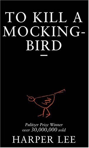
To me this design portrays inequality - the large type is almost shouting whilst the small illustration of a bird is compressed and without a voice.

 This is the book on display for sale in Waterstones bookstore and it really stands out to me, against all of the other busy looking and colourful book designs. It makes me curious about the book and want to read the back to get a feel for the contents as it doesn't give much away.
 A lot of the other books in the Adult Fiction book section feature bright colours and photographs to grab the attention of the readers and I will consider this when drafting my initial ideas by trying out bright colours along with just black backgrounds. This cover draws from the 'Mockingbird' quote from the book and obviously relevant to the title so therefore an obvious design for those who haven't read the book to understand.
No comments:
Post a Comment