Tuesday 27 February 2018

503 - SB1 - Tea/Coffee Research

To design and develop a new, exciting and eye-catching range of at least three tins for either teas or coffees. Students will need to create a fictitious brand targeting the quality retail sector, including duty free areas at airports and the higher-end retailers such as John Lewis, Selfridges and M&S. This new range is to be designed primarily for purchase as a luxury gift pack. Metal offers great potential for creative design solutions with not only embossing and debossing but also the high quality of print finishes that can be achieved with colour, varnishes and bare metal. Consider when designing your range (minimum 3 in range) marriageability as a set of three and that the labelling, graphics and overall presentation ensure they are a family of luxury products. When developing your designs consider re-usability of the tins for a secondary use within the home. To meet food standards, the contents (tea, coffee or infusions) would, if going into production, be sealed separately in foil bags and presented in the secondary pack.

I have to consider the material that will be used, the limitations and possibilities of a tin, and also what else it could be used for once the contents had gone, it should be desirable to keep in the home after this, or perhaps I could incorporate a recycling aspect into the luxury gift set for after use:

"Tin cans are 100% degradable, Eco-friendly packs, which do not cause any environmental imbalance. Steel packaging is totally recyclable - it can be recycled for infinite number of times without ever changing the properties of steel. Thanks to its magnetic properties - which makes it the easiest type of material to be collected and sorted for recycling.Tinplate packaging is the best recyclable packaging material - perfectly suited for an age in which commercial success can depend on sound environmental credentials."

Tin plate


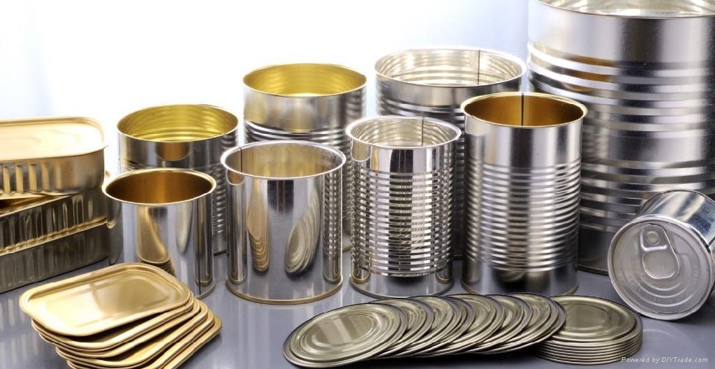
  • Tinplate is steel with a thin coating of tin for rust protection. A layer of white enamel is added to some food cans produced from this materials to protect the contents.
  • Low weight and high strength - making tinplate packaging easy to ship and store.
  • Optimum protection of food products - from impurities, bacteria, moisture, light, and odours.
  • Tinplate is an eco-friendly packaging material offering 100 percent recyclability - any number of times, and without quality loss.
  • Direct printing, embossing and new shaping techniques increase the material's marketing potential: tinplate packaging attracts consumer attention and favourably influences purchasing decisions. As a result, it is increasingly used for packaging up-market or trendy items such as watches, perfumes, and mobile telephone cards.
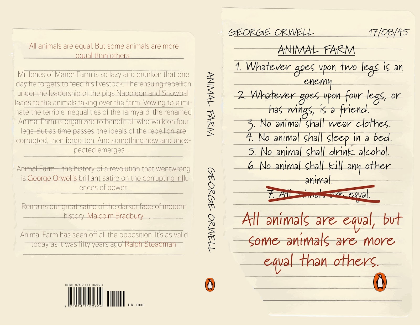
I'm not much of a coffee drinker myself and also believe that there are alot more creative possibilities with tea packaging as there are endless flavours and mixtures so i'm going to research tea packaging to get a feel for what is already out there. 

Williamson Tea Packaging


"Williamson Tea is a fifth generation tea farming business committed to growing the highest quality sustainable teas to the benefit of Kenya, its communities, wildlife and environment. With over 140 years of experience in the art of growing, selecting and blending fine teas we are unlike other tea brands. As tea farmers all of our teas are grown on our own farms, which means we control the quality of the product all the way from bush to cup. Produced for over 25 years our iconic herd of Limited Edition Elephant tea caddies contain 40 teabags from our own farms. Famous as collectors items or as the perfect gift whatever the occasion."


T2 Tea Variety


T2 isn't falling short of a wide selection of flavours and experiences of teas, with 2 different sizes available for purchase - 100g and 250g in a box, foil and a tin. As there are so many flavours available I may use this as inspiration for when choosing my 3 different products, rather than thinking about standard earl grey or english breakfast. I also feel I could be really illustrative with some of the ingredients in these teas.

I am going to select three different flavours that compliment each other, and work together well as a set so I am going to choose from the 'perfect for iced tea' section. These flavours can be consumed hot or cold so the target audience range will be wider. 

Peach Loose Leaf


Enjoy with: Perfect on its own. Store in a cool, dry place. Ingredients: Apple, white hibiscus, papaya cubes (papaya, sugar), sweet blackberry leaves, peach, chicory root roasted, flavouring, marigold petals, acidifier (E330). 

1 tsp per cup 3-5 mins 100 degrees Celsius

Green Rose Loose Leaf


Enjoy with: Perfect on its own. Store in a cool, dry place. Ingredients:Green tea, currants (currants, anti-caking agent: sunflower oil), papaya bits (papaya, sugar), rose petals, mango bits (mango, sugar, acidifier: E330), flavouring, cornflower petals.

1 tsp per cup 2-3 mins 80 degrees Celsius

Strawberries & Cream Loose Leaf


Enjoy with: Perfect on its own. Store in a cool, dry place. Ingredients: Apple, hibiscus, rosehip, strawberry granules (glucose syrup, strawberries, fructose, modified starch: E1414, thickener: E401), sweet blackberry leaves, yoghurt crispies (skimmed milk yoghurt, sugar, maltodextrin, modified starch E1412, acidifier: E330) flavouring CONTAINS MILK. 

1 tsp per cup 3-5 mins 100 degrees Celsius

Iced Tea Packaging


All of the above packaging is very vibrant in colour and bold in imagery and text, which is good for standing out in a supermarket or corner shop however the range I will be developing is to be sold in more upmarket shops such as Harvey Nichols, John Lewis and Selfridge's and therefore needs to appeal to people who are familiar with tea and have expensive taste. The packaging I create therefore needs to be subtle and classy. As the range is also being promoted to be used in the household and not on the go it has to add to the environment it is going to be kept, most probably the kitchen.

There are a couple of reasons why you should consider switching to loose leaf tea for making iced tea:
  • It tastes better: Loose leaf tea is higher quality than most tea bags. Tea bags use fannings and dust, the leftover bits of tea once the good stuff is used.
  • More Variety: When you buy tea bags, you’re limited to a few selections. With loose leaf tea, you have a wider selection. Plus you can blend teas yourself to make you own specialty
How to make iced tea with loose leaf 

Place 2 teaspoons loose leaf tea into a glass (or more, scaling up if you’re making a pitcher’s worth), add cold water, cover, and let it sit in your fridge overnight (or 4-6 hours if you’re impatient). In the morning, you’ll have a nice, cold glass of tea that you can strain out over ice and enjoy. Don’t worry about the tea getting bitter from steeping too long — a special side-effect of cold brewing is that it doesn’t draw the bitterness out of the leaves the way hot water does.

Monday 26 February 2018

503 - SB1 - Student Starpack Awards Luxury Family Range of Cans for Teas or Coffees

Introduction

In the UK, we drink over 60.2 billion cups of tea every year and some 55 million cups of coffee every day. The UK tea industry alone provides 0.02 per cent of the entire country’s annual turnover. However, we have come a long way since instant coffee or straight-up builder’s tea were our go-to choices. Tea infusions with exotic ingredients and additional health benefits are increasingly popular and with the cafĂ© culture boom, nearly a fifth of the population visits a coffee shop on a daily basis. Consumers want that premium tea and coffee experience in their homes. The purchase of premium, organic, ethically-sourced and rare varieties of teas and coffees by UK homeowners is on the rise.

A wide range of teas, coffees and infusions from every corner of the world are now sold as gift items or decorative containers for the home. Rare blends, single origin mixes and infusions are presented and kept fresh in beautiful produced speciality tins.

The Brief

To design and develop a new, exciting and eye-catching range of at least three tins for either teas or coffees. Students will need to create a fictitious brand targeting the quality retail sector, including duty free areas at airports and the higher-end retailers such as John Lewis, Selfridges and M&S. This new range is to be designed primarily for purchase as a luxury gift pack. Metal offers great potential for creative design solutions with not only embossing and debossing but also the high quality of print finishes that can be achieved with colour, varnishes and bare metal.

Consider when designing your range (minimum 3 in range) marriageability as a set of three and that the labelling, graphics and overall presentation ensure they are a family of luxury products.

When developing your designs consider re-usability of the tins for a secondary use within the home. To meet food standards, the contents (tea, coffee or infusions) would, if going into production, be
sealed separately in foil bags and presented in the secondary pack.

Points to consider

Creative use of tin
Marriageability as a set of three luxury tins
Innovative use of decorative and graphic elements
Re-usability as a secondary pack
Shelf impact
Consumer appeal as luxury gift packaging

Materials to be used

The set of tins must use tinplate as the core element but your models can be made of any
appropriate material to represent the metal components. Similarly, any appropriate material can be used to represent the tin contents.

I am going to carry this brief out as my main one as I believe it involves enough substantial work. Another reason for choosing this to be my big project is that I am highly interested in packaging design and hope to go into that area of design when I graduate.

Saturday 10 February 2018

503 - SB1 - Penguin Final and Evaluation


I have decided to develop the above design as I felt it was the strongest, it was an original idea and uses all type rather than illustrations which are so commonly seen on Animal Farm existing covers. To improve and strengthen this design I will change the typeface used as I feel this looks a bit unprofessional, as well as adding a background and reconsidering the colour palette.


I had a look on Typekit to see what was available and tried these two out, Marydale worked the best and looked quite authentic. As I was going with the handwritten style I decided to scan in a page of lined paper to see how it would work as a background. 


I then changed a few minor details such as the authors name and title adding them although the cover was an essay, I also added the date the book was published for extra effect.


Evaluation

Overall this brief has been a success in terms of what I set out to achieve in the design of the cover. I wanted to create a cover that was original compared to the covers that are already on the shelves in shops, the majority are similar and focus on the pig imagery, I didn't want to use this as it has become generic and doesn't intrigue the reader. By using all type it straight away tells the reader it is a read worth it, something to be studied rather than something that can be illustrated with a pretty picture. The front cover gives some of the story away however leaves the potential buyer intrigued about what these 'rules' are for or who they are put forward by. This brief taught me that it is sometimes essential to explore a few different ideas before settling on one as you never know what will work the best, also a simple change in typeface could make all the difference. I think that the cover would stand out in a shop as it is different to most book covers you see having the hand made feel/look. One part of the book that I would further develop if I had the opportunity would be the back cover, it holds the essential information and has the same background as the front however it isn't the most exciting and I'm sure I could find a typeface that matched the front cover more. Another change I would make is to outline the spine so that it would stand out more on the shelves.

Thursday 8 February 2018

503 - SB1 - Penguin Development


For the first design I went really simple to get a feel for what goes with the title itself and blurb, as well as the size of art board I have to work with and shape, as well as the compulsory placement of the penguin logos and barcode/price. The colour palette used in the following designs is based from the pig illustration used above. I think this design is successful in it's simplicity however I would like to go for something a bit more in your face so that it stands out on the bookshelf and also gives you an insight into the book itself.


The above design illustrates two of the seven commandments - with the legs hanging from the top of the page - whatever goes upon four legs (or has wings) is a friend and whatever goes upon two legs is an enemy. I did consider using a tick and cross to illustrate but didn't think it went with the simplicity of the cover. 


The cover above uses only typography to illustrate the seven commandments, incorporating the famous quote - "all animals are equal, but some animals are more equal than others" - "The ultimate example of the pigs’ systematic abuse of logic and language to control their underlings, this final reduction of the Seven Commandments, which appears in Chapter X, clothes utterly senseless content in a seemingly plausible linguistic form. "


The final design shows an image of Stalin looking towards the front cover, with the blurb on top. The two pigs on the front on either side represent Stalin's character Napoleon and Trotsky's Snowball.

Wednesday 7 February 2018

503 - SB1 - Penguin Initial Ideas


Above are three different layout and content options. The first lists the seven commandments that are mentioned in the book, also seen below in the stye they could be written - with a cross through the last and that famous quote either underneath or over the top in a bolder font. The thumbnail underneath shows a half pig half Stalin face as that is who the pig represents in the story, the back of the cover features a collage of Stalin - this would be a very politic based cover. The thumbnail to the right plays on another one of the commandments - whatever goes upon two legs is an enemy and whatever goes upon four legs or wings is a friend.


List of things that could be included in the book cover:
  • the seven commandments
  • a famous quote from the book
  • illustration of the different characters
  • photographs of Joseph Stalin and Leon Trotsky
  • a pig
  • symbolism for Russian Revolution

Tuesday 6 February 2018

503 - SB1 - Penguin Adult Fiction Cover Award (06.03.2018)

ADULT FICTION COVER AWARD

I have decided to give myself a day to complete this competition brief as part of my smaller Studio Brief 1 - Individual Practice.

The Brief
‘In a hundred ways Animal Farm triggers our modern intelligence and persists in its relevance, and its seemingly simple yet subtle fable still belongs to us as we try to find our way through the changing political and moral labyrinths of twentieth-century history.’ - Malcolm Bradbury

We are looking for a cover design which will reflect the book’s status as one of the great modern political allegories of our time, as relevant today as it was when it was first published over 50 years ago.  It is rich with ideas, characters, allegory, political and moral philosophy – read it and decide for yourself how best to showcase the content of this remarkable novel through your cover design and bring it to a new generation of readers.

Your cover design needs to include all the cover copy supplied and be designed to the specified design template – B format, 198mm high x 129mm wide, spine width 8 mm, incorporating the Penguin branding and all additional elements such as the barcode. Please refer to the Submissions Details page for full details of the spec and how to submit your entry.

What the judges are looking for

We are looking for a striking cover design that is well executed, has an imaginative concept and clearly places the book for its market. While all elements of the jacket need to work together as a cohesive whole, remember that the front cover must be effective on its own and be eye-catching within a crowded bookshop setting. It also needs to be able to work on screen for digital retailers such as Amazon.

The winning design will need to:
  • have an imaginative concept and original interpretation of the brief
  • be competently executed with strong use of typography
  • appeal to a contemporary readership
  • show a good understanding of the marketplace
  • have a point of difference from the many other book covers it is competing against
Copyright must be cleared for all images used in your cover design and you must include a credit line on the back cover of your design for any third party images used. For example: ‘Cover photograph by Joe Bloggs’.

The book is Animal Farm by George Orwell so I am going to start by reading up on what the book is about, it's major themes, characters and symbolism. As well as looking at existing covers to gain inspiration but also avoid having something very similar.

Existing Covers:


All of these covers focus on the literal main characters of the book - the pigs, Snowball and Napoleon as well as one of the most famous quote from the book - I would like to use this, however with some of my ideas stray from the use of pigs so those who read the book who never have aren't focusing on the animals but the deeper meaning of the book.