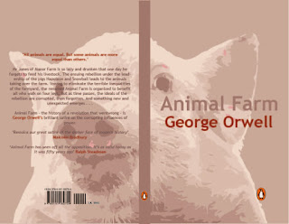
For the first design I went really simple to get a feel for what goes with the title itself and blurb, as well as the size of art board I have to work with and shape, as well as the compulsory placement of the penguin logos and barcode/price. The colour palette used in the following designs is based from the pig illustration used above. I think this design is successful in it's simplicity however I would like to go for something a bit more in your face so that it stands out on the bookshelf and also gives you an insight into the book itself.
The above design illustrates two of the seven commandments - with the legs hanging from the top of the page - whatever goes upon four legs (or has wings) is a friend and whatever goes upon two legs is an enemy. I did consider using a tick and cross to illustrate but didn't think it went with the simplicity of the cover.
The cover above uses only typography to illustrate the seven commandments, incorporating the famous quote - "all animals are equal, but some animals are more equal than others" - "The ultimate example of the pigs’ systematic abuse of logic and language to control their underlings, this final reduction of the Seven Commandments, which appears in Chapter X, clothes utterly senseless content in a seemingly plausible linguistic form. "
The final design shows an image of Stalin looking towards the front cover, with the blurb on top. The two pigs on the front on either side represent Stalin's character Napoleon and Trotsky's Snowball.


No comments:
Post a Comment