
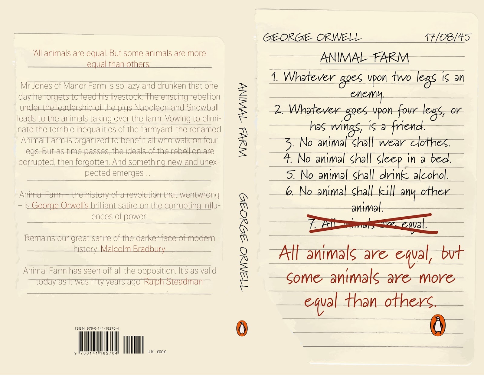
I have decided to develop the above design as I felt it was the strongest, it was an original idea and uses all type rather than illustrations which are so commonly seen on Animal Farm existing covers. To improve and strengthen this design I will change the typeface used as I feel this looks a bit unprofessional, as well as adding a background and reconsidering the colour palette.


I had a look on Typekit to see what was available and tried these two out, Marydale worked the best and looked quite authentic. As I was going with the handwritten style I decided to scan in a page of lined paper to see how it would work as a background.

I then changed a few minor details such as the authors name and title adding them although the cover was an essay, I also added the date the book was published for extra effect.
Evaluation
Overall this brief has been a success in terms of what I set out to achieve in the design of the cover. I wanted to create a cover that was original compared to the covers that are already on the shelves in shops, the majority are similar and focus on the pig imagery, I didn't want to use this as it has become generic and doesn't intrigue the reader. By using all type it straight away tells the reader it is a read worth it, something to be studied rather than something that can be illustrated with a pretty picture. The front cover gives some of the story away however leaves the potential buyer intrigued about what these 'rules' are for or who they are put forward by. This brief taught me that it is sometimes essential to explore a few different ideas before settling on one as you never know what will work the best, also a simple change in typeface could make all the difference. I think that the cover would stand out in a shop as it is different to most book covers you see having the hand made feel/look. One part of the book that I would further develop if I had the opportunity would be the back cover, it holds the essential information and has the same background as the front however it isn't the most exciting and I'm sure I could find a typeface that matched the front cover more. Another change I would make is to outline the spine so that it would stand out more on the shelves.

No comments:
Post a Comment