Friday, 9 November 2018
SB1: Evaluation
This brief was a quick creative challenge, I intended for it to be completed start to finish in a matter of days whilst also working on other briefs and I managed to stick to that. Although it was research based to begin with, it wasn't so much about the context of design at the time, but more about basing a response purely on visual research. After finishing the design, I showed it to a few of my peers, as well as friends, along with the posters I used for research, and they struggled to tell which were the authentic. I see this as a success, as the brief was to design a poster to pay homage to the style of the 90s. My usual way of working involves a lot of research and I usually get stuck on that for quite a while before getting into the actual designs, this brief allowed me to come out of my comfort zone and start designing on the first day. I don't have much experience with designing posters up to now, and really enjoyed working with layout and the confides of a4/a3 paper dimensions. The fact you only have one side and the set dimensions up and down mean you really have to think about text hierarchy, and what information you want the viewers eye to go to first. Another area I really pushed myself in was the use of different typefaces, I usually play it quite safe with my choices. However this brief allowed me to play around with fun typefaces, as well as grouping very different types together and seeing what works, and what doesn't. If I had more time, and could focus on this as more than a quick/ small brief I would've liked to create a series of posters - and even get them printed out and display them in context. The reason I didn't do this was that I have to prioritise other briefs and styles of work that are more relevant to my practise, I saw this as a brief an exercise to get out of my comfort zone, and to compliment other bigger briefs.
Thursday, 8 November 2018
SB1: Final Design


Above is the finished design, I decided to change the skyline of Chicago colour to the shade of red I initially used for the sticker, so that the poster wasn't confused for being New York related. I kept the disc illustration off the poster and stuck with the different positioning for the price and venue info - it is a better position for important info, whilst the text is a smaller size the fact it is at the top shows the info is still important. I also changed the wording of some of the content to work better with the layout and overall feel of the poster.

Wednesday, 7 November 2018
SB1: Poster Development
The content for the first poster will be:
- youre all invited
- "party at ours"
- friday 22nd march, 9pm onwards
- spring opening
- ticket price and venue addres
- lineup and venue name
I opened Adobe Illustrator and started to experiment with the content and layout. The posters below are rough ideas of what the poster could look like, before colour and different typeface choices were added. I played around with the skyline of Chicago and checkered prints, as well as a record disc illustration.


Out of all of the different layouts, the one I think is strongest and could be developed further is number 5. Below is number 5 developed, adding a checkered pattern as a border for the information as well as a circle around the spring opening to imitate a sticker.

From this initial design, I decided to make the poster stand out more and be a lot more interesting to look at, whilst keeping with the Chicago house theme. I did this by adding some colour for vibrancy and some different typefaces. Colours I will play around with are reds, yellows and blacks - these were most popular through research on the posters and record designs.


Helvetica, Marker Felt, Roboto Slab. After making the changes in Adobe Illustrator, I saved the poster as a png and imported to Adobe Photoshop - in here I added a crumpled paper effect to give it the authentic poster feel.

I asked for feedback from my peers on the poster design and received the following:
- try the disc illustration at the bottom of the poster or perhaps remove it all together
- change the spring opening sticker to either just black and white - there is a bit too much going on in comparison to the posters in your visual research
- the typefaces all work really well together and the sizes you've chosen produce a good design hierarchy
Upon getting this feedback I further experimented with the areas mentioned.


I tried a few different colours for the circle and for the text above, and decided the best option is to keep it simple with a white background and black text - the checkered pattern and orange could be mistaken for New York style.


Above is experimentation with moving the disc illustration and also adjusting the position of the ticket info and venue address.
Tuesday, 6 November 2018
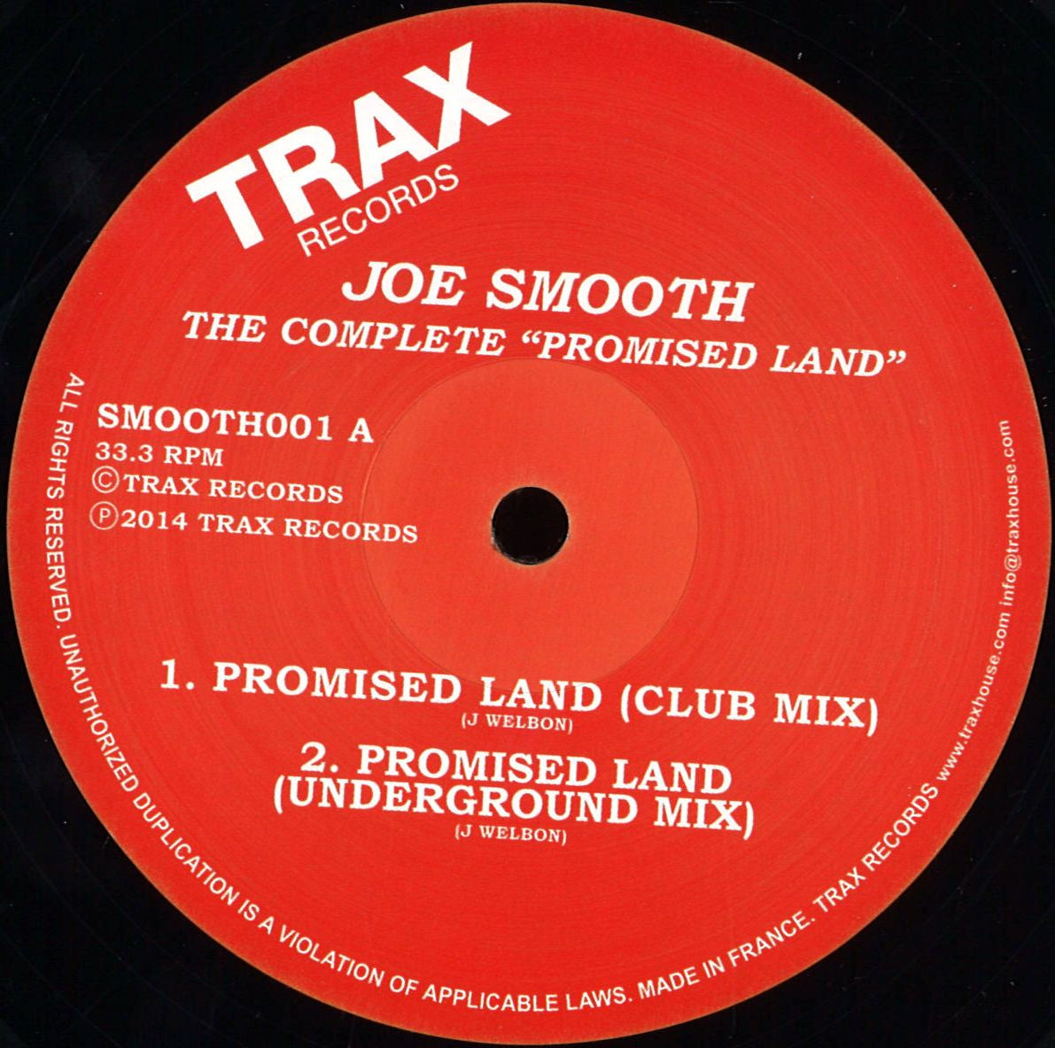
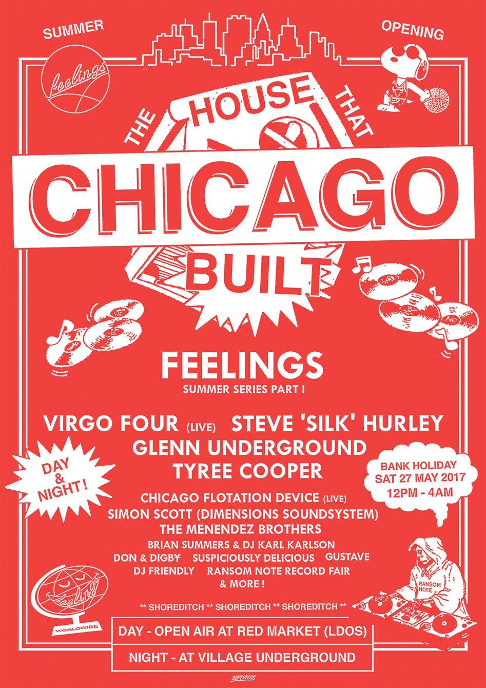
SB1: Visual Research (Chicago House)
Below are examples some of the most well known Chicago house tracks, the images are of the records they came on, to be used by both the general public personally and disc jockeys.
:format(jpeg):mode_rgb():quality(90)/discogs-images/R-176575-1366789785-3891.jpeg.jpg)

:format(jpeg):mode_rgb():quality(40)/discogs-images/R-4351477-1457558970-1438.jpeg.jpg)
:format(jpeg):mode_rgb():quality(90)/discogs-images/R-1949-1386101789-9488.jpeg.jpg)
:format(jpeg):mode_rgb():quality(90)/discogs-images/R-7303-1254170276.jpeg.jpg)

:format(jpeg):mode_rgb():quality(90)/discogs-images/R-1169046-1198849441.jpeg.jpg)

The main record labels of this period in Chicago were: Trax Records, Dance Mania Records and Jes Say Records. One thing that links all of these record designs is the colours used, a lot of yellow and reds.
Monday, 5 November 2018
SB1: Research
Techno is a form of electronic dance music that emerged in Detroit, Michigan, in the United States during the mid-to-late 1980s. The first recorded use of the word techno in reference to a specific genre of music was in 1988. Many styles of techno now exist, but Detroit techno is seen as the foundation upon which a number of sub-genres have been built.
- detroit techno
- hardcore techno
- acid techno
- hard trance
- minimal techno
- tech house
- chicago house
Following Chicago's Disco Demolition Night in mid-1979, disco music's mainstream popularity fell into decline. In the early 1980s, fewer and fewer disco records were being released, but the genre remained popular in some Chicago nightclubs and on at least one radio station, WBMX-FM.
In this era, Chicago radio jocks The Hot Mix 5, and club DJs Ron Hardy and Frankie Knuckles played various styles of dance music, including older disco records, newer Italo disco and electro funk tracks, B-boy hip hop music by Man Parrish, Jellybean Benitez, Arthur Baker and John Robie as well as electronic pop music by Kraftwerk and Yellow Magic Orchestra.
Some of these DJs also made and played their own edits of their favourite songs on reel-to-reel tape, focusing on the portions of songs which worked well on the dance floor. Some even mixed in effects, drum machines, and other rhythmic electronic instrumentation in an effort to give songs more appeal. These edits and remixes were rarely released to the public, and even then were available only on privately pressed vinyl records or on mixtapes.
Sunday, 4 November 2018
SB1: Poster Research
Bold sans serif uppercase
Red and white
Acts in smaller type, event name larger type

More playful sans serif, lowercase
Event name similar size to the acts
fun illustration relating to the event name
red and black

red and yellow
chunky slab serif uppercase
off centre
awards name larger than the nominees

black, grey and white
bold serif uppercase
iconic skyline as background

black and white
chunky slab serif uppercase
venue and date larger than the headliners

yellow and black with an orange fade
checkered border
uppercase sans serif
small illustration surrounded by small text acts, larger event name

a mix of upper and lower case
black and brown
very simple

yellow and black with an orange fade
illustration to draw attention
a mix of fonts - sans and serif
upper and lowercase
price, acts and venue large

blue and white
marker pen style typeface, uppercase
date and event name largest

mix of typefaces to make an illustrative poster
brown and blue
Saturday, 3 November 2018
SB1: Micro-genre
I am giving myself around 1 week to work on this brief, however this will be alongside other briefs so I am only considering it a small brief as the deliverable is just a single poster.
I am going to start by looking at sub-genres that fall under the dance/electronic umbrella, I thought this best as the final outcomes will be posters promoting dance events in clubs. I approached the brief last year a lot more open with where it could lead, however with this I want to decide what the finished product will be before I start research so I can focus in more on relevant research.
Brief: The task is to thoroughly research a micro-genre of music. This research should be extensive, with the intention that you become an expert in the genre. This micro-genre will become the focus for the design and production of a new piece of work.
Design a poster that will promote a night for the chosen genre and use their specific aesthetic and audience demographic. How will the poster promote the product that is the genre.
Background/Considerations: How does the design appeal to the target audience (people who listen to the genre).
Mandatory Requirements: Blog the process, print the poster, and design boards.
Deliverables: Poster design
Studio Deadline: 5th February
Friday, 2 November 2018
SB1: Revisit Micro-genre
The original brief:
Your task is to thoroughly research a micro-genre of music from this website. This research should be extensive, with the intention that you become an expert in the genre. This micro-genre will become the focus for the design and production of a new piece of work to be publicly exhibited.
Design an object that celebrates (or critiques) an aspect of genre's specific characteristics: political, aesthetic, production methods, audience demographic, key intentions or its connection to place.
In what sense do these micro-genres help us understand some wider issues about the society that created them?
I have decided that it would be most interesting for me and I could produce the best outcomes by looking at music genres that I listen to myself. The main genres I listen to are:
dance/ electronic
hip hop/ rap
techno
disco
alternative r&b
neo soul
lofi house
Out of these genres I believe the most interesting would either be:
disco it has tonnes of history and stories, and it has recently made a come back with the younger generations
lofi house it is an upcoming genre with a lot of exciting new djs
I also believe both of these genres are correctly defined and any artist described as either would be accurate and you would know what to expect. Whereas with genres such as hip hop, or dance/ electronic the genre is so broad and artists so many they could be falsely defined and what you hear doesn't sound anything similar to the next artist. Disco is defined by the movement and the time in which the music came out - like a trend, and lofi is defined by the actual production and sound of the music.
I focused on and became an expert in Disco, creating a user guide to the genre. Below is the finished product:


The manual was printed on a3, with a poster on the reverse side that people could hang on their walls. Although I was happy with the finished design of the manual, I could've improved the printing. This was down to not leaving enough time for this aspect of the design process.
For this new brief, I am going to look at a different genre of music and produce a final piece strong in both design and production.
Thursday, 1 November 2018
SB1: Micro-genre Brief
BA (Hons.) Graphic Design
|
LEVEL
|
||||||
STUDIO BRIEF: Micro-genre
|
|||||||
Module Brief
|
|||||||
Semester
|
Outcomes Assessed
|
Module Tutors
|
|||||
Brief
|
The task is to thoroughly research a micro-genre of music. This research should be extensive, with the intention that you become an expert in the genre. This micro-genre will become the focus for the design and production of a new piece of work.
Design a poster that will promote a night for the chosen genre and use their specific aesthetic and audience demographic. How will the poster promote the product that is the genre.
|
Background/Considerations
|
How does the design appeal to the target audience (people who listen to the genre).
|
Mandatory Requirements
|
Deliverables
|
Blog the process and design boards.
|
Poster design
|
Studio Deadline
|
Module Deadline
|
12/02/19
|
07/05/19
|
Subscribe to:
Comments (Atom)