Before I went any further with the design process I thought it would be best that I got out into the city centre and saw the places that I am going to produce pictograms for. Seeing the buildings in real life is a lot more helpful than simply on google images or maps. It allows you to see the scale, and how it is seen by the public, what features stand out and where the detail is. It also allowed me to think about where I could place the pictograms and directions to each place.
The thing that stood out the most to me on this building was the signage that becomes an architectural feature in my opinion - none of the actual features are unique to the building as it is quite underwhelming for an art gallery.
The museum building is a lot more interesting than the art gallery, featuring detailed carving into the stone.
Above is something that a lot of gig venues share, the 'now showing' tab above the doors let's people walking by know what is taking place in the venue in the near future. Always changing however never in design I believe this has potential as people will link the design to entertainment.
The window in this building is really interesting and would be good to experiment with, however I believe it may be too complicated for the pictograms I'm going to produce.
The most obvious choice for Trinity shopping centre and I'm going to go with it, the amazing roof structure that displays a lovely pattern above the main section of the centre.
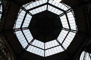
The market building is fascinating, both outside and inside it shows detailed design and there are two options for the pictograms, the tower from the outside as a silhouette, or from below inside you can see the shape and light coming through.


No comments:
Post a Comment