I started off developing the pictograms by taking the architecture from the buildings I was going to use and doing quick continuous line drawings. I took the most recognisable feature from the buildings so that the pictograms would be accurate representation.

I then decided to use a constraint in my designs - the use of a circle is the first step for consistency. I tried to do at least 2 variations for each attraction and later refined the ideas down to one per place.


After having an experiment with the architecture using a quick method I went into illustrator to try and make the designs more professional and understandable.
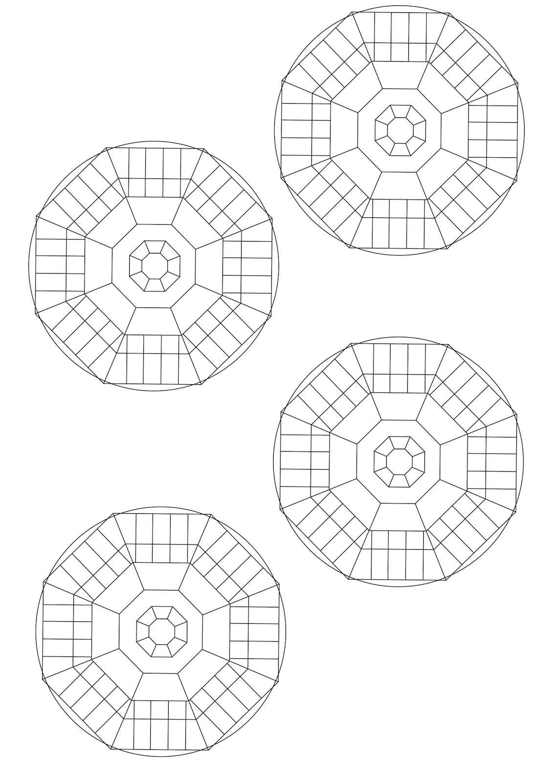
This was the design I produced for the Kirkgate Market, based on how the roof looks from the inside as you look up, for locals this will be recognisable as it is a very old building with prominent features.

I then decided to experiment with this finished pictogram to see whether the plain design is the best option. I used scannography, cutting and collaging as well as water colours and pastels to add some vibrancy to the design.


I believe the pattern created with the cutting and collaging is really interesting and could become a super graphic for this sign system however for the pictograms think it be best if I leave the designs plain black lines. Once I have the full set of designs I will consider the use of colour to differentiate the sections of attractions.

Above is a set of designs I created using the constraint of a circle and a fine liner pen, I considered fluidity when drawing and was inspired by Vincent Deboer in the way that he carefully considers every mark he makes and is very neat with lines being next to one another, not letting them touch. I am going to incorporate these designs into the design of the arrows for the way finding system.
No comments:
Post a Comment