Friday, 15 February 2019
SB8: Evaluation
Overall this brief was successful, I enjoy designing packaging and although it wasn't what I initially set out to do - it solved the challenge. The exhibition was a call for creative work that celebrated wildflowers and fungi, sustainability was the focus, whether it be through the content of the work or the materials/ methods used to make it. The packaging was for a 'grow your own wildflower' kit, which is definitely promoting wildflowers to consumers. The packaging wasn't printed as it is only a design idea, it would have been wasteful to use materials to produce the design physically - at this point the design and mock ups were all that was necessary. This brief taught me that it is essential to include your peers, to get advice and feedback as they can really help and bring a fresh perspective when you are stuck or feeling uninspired. My process for this brief was to do a tonne of research around the subject area, produce some illustrations in a style that is in line with my existing work and then see what direction they could work in. I haven't done much illustration this year so I really enjoyed that aspect, and the process of finding typefaces that compliment the illustrations whilst also ensuring they are suitable for the product is a challenge that is rewarding once fulfilled. I wanted to use two typefaces that complimented each other and believed that Mono and Serif is a good mix. Another thing to take forward from this brief is the power of using a mock-up, often when a design is just on a flat screen in Illustrator, you don't believe in how good it actually is, or know the power it could have if you simply mock it up using Photoshop.
Thursday, 14 February 2019


Wednesday, 13 February 2019
SB8: Development and Further Research
At this point, I needed some advise/feedback from my peers as I felt I had hit a dead end - in terms of the visual design, and subject matter of this brief I am very interested, but I am not used to producing work that would be held in an exhibition environment, as I prefer commercial style design work. With this in mind and advise from my peers, I decided to use my visuals to design a 'grow your own wildflowers' kit. Below are examples of similar kits I found on Amazon, they are all similar in style, they feature mainly green backgrounds with white text - they all feature photographic images of wildflowers and feel very industrial - I would like to design a pack that feels home made, to mirror the need for home grown flowers. All of the packets are pouch style, so I will design my packet in this way.


The two above images are screenshots of other results from the search, these products don't feature packaging, but images of the wildflowers - therefore the other images of actual packaging above are all I have to go on for research.


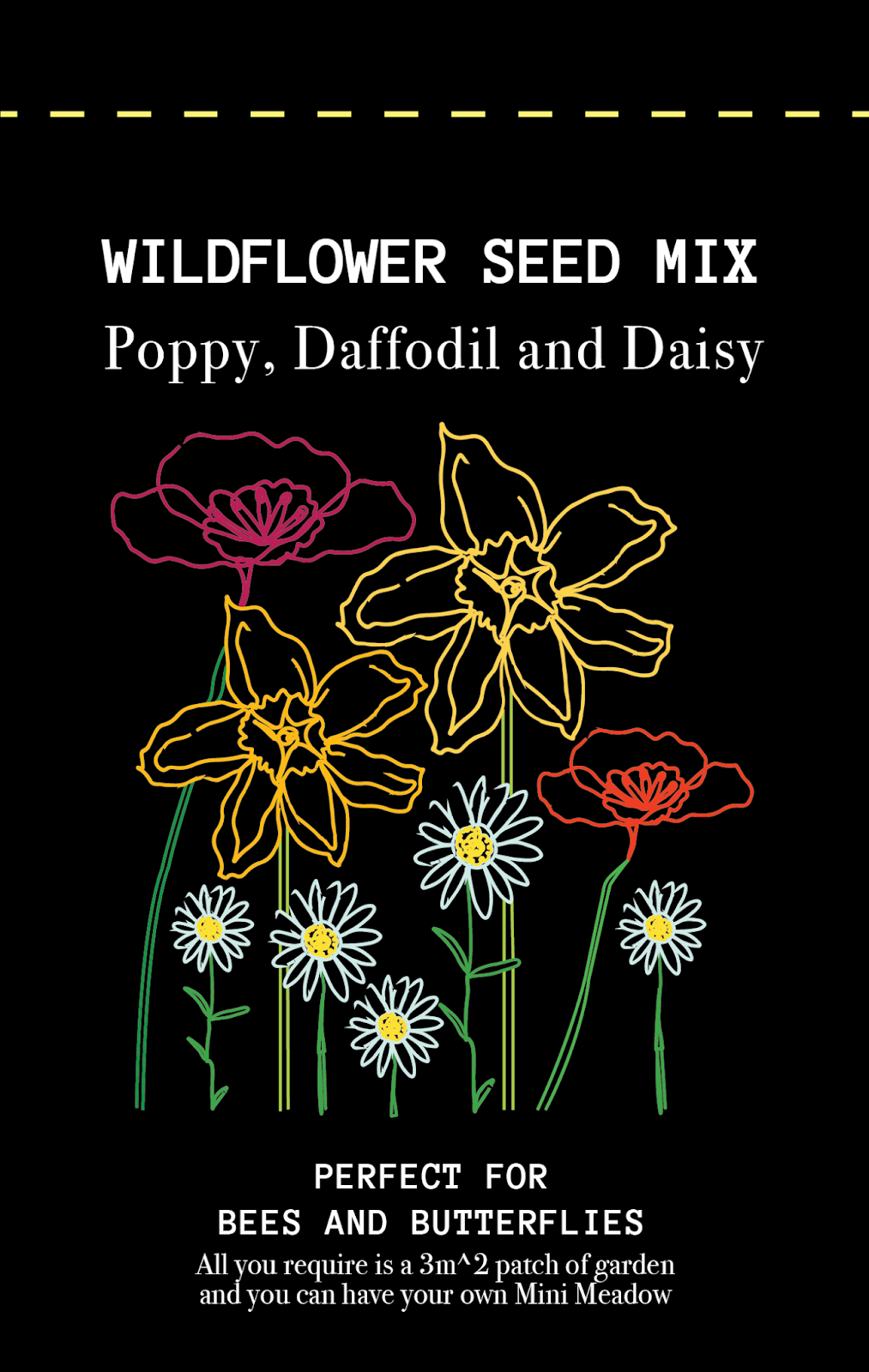


All above are variations of designs for the front of the packet, I had to try a few different layouts to see what worked. I used a black background and white text and decided on just featuring poppies, daisies and wild daffodils, as these images were most successful in my opinion. I also edited the images to allow me to have the flowers themselves the colours they should be, with the stems green in contrast. The front cover features 'perfect for bees and butterflies' as the growth of these flowers will encourage bees and butterflies to be in your garden to thrive and pollinate. The package also says 'All you require is a 3m^2 patch of garden and you can have your own Mini Meadow!' as I think it is important for potential buyers to know they don't need massive amounts of garden space to grow these beautiful flowers.


Above are the different variations I tried for the back of the packet, the text is what I found on the Grow Wild UK website for sowing wildflowers:
Follow these steps:
Choose a fine Spring or Autumn day when the soil is neither too wet nor too dry.
Dig over the soil with a fork or spade and break up or put aside large clumps. Remove weeds so the wildflowers don't have any competition, and any large stones.
Rake the soil so it's fine and crumbly - lumpy soil may bury seeds; if it's too hard, roots will be unable to penetrate the ground.
Ideally, leave your prepared soil for about two weeks so any dormant weeds or grasses that come to life can be removed before you sow your seeds.
Scatter your wildflower seeds over the soil by hand - a little at a time for an even spread.
Top tip: to make spreading easier, mix seeds with a small amount of dry play sand so you can see where you've sown them.
Rake the soil again - gently - to just cover the seeds with a very thin layer (1mm) of fine crumbly soil.
Seeds need sunlight, so be careful not to bury them or they won't grow.
Very gently, water the whole area using a watering can, taking care not to wash your seeds away.
Label the area with your plant markers (you could make your own!) and don’t forget to include the sowing date.
I added a dotted line so that the user knows where the rip open the packet without breaking it and the seeds spilling everywhere. The flowers on this side of the packet are along the side, leaving more space for the text. I experimented with using a white square and black text, to see if it made the instructions easier to read, but found that it was no more legible than keeping with the black background and white text. At this point it was just about which looked better and fitted with the style of the front of the packet. I used my peers for feedback and created a poll on my design Instagram to see what people preferred - I mocked the design onto a pouch to get a better feel for how the packaging would look in real life. As this product is hypothetical - I am not going to produce a physical mock as this would be a waste of materials and resources and not very sustainable. However a digital mockup can show perfectly how my proposed product and promotion of wildflowers would look.


The results showed a clear favourite, so I decided on using the black for my final designs.
Tuesday, 12 February 2019
SB8: Initial Ideas
The first step in creating something for this exhibition to create awareness about wildflowers/fungi was to decide on some visual elements. I decided to stick with wildflowers, rather than complicating the brief with the two different plants. Below are some initial continuous line drawings I did, they feature betony, daisies, lily of the valley, poppies and wild daffodils.


From here I scanned in all of these drawings and converted them into vector drawings using Adobe Illustrator. I used different effects with image trace, some of the drawings have thicker strong/ complete lines - with others lighter and broken.


I then thought about how all of these drawings of flowers could come together to produce one image. I did a bit of experimenting - see below. I used different colour combinations and layouts to try and produce a piece of artwork that could be hung in an exhibition space, celebrating the beauty of wildflowers.


Monday, 11 February 2019


Subscribe to:
Comments (Atom)