Showing posts with label ougd503sb2. Show all posts

Wednesday, 21 March 2018

503 Module Evaluation

This has been the most challenging module I have completed so far on the course, saying this it has also been one of the most enjoyable. This is for a few reasons but primarily the fact that we could choose what briefs we would like to respond to giving me the freedom to build my portfolio in areas I am most interested in having a career, such as: packaging design, pattern design and artwork. The early stages of this module involved searching all of the usual sites for the competitions such as D&AD, YCN and Student Starpack designs, I then selected which ones I thought would be relevant to my development as a designer and also decided which ones would be suitable to be day, week or major briefs. In the end I settled on the luxury range of tea being my substantial brief as I am highly interested in packaging design, a big tea drinker and felt I could really experiment with layout and illustration within the brief. This brief didn't involve as much research as some of the others as I believe different types of design require more depth, whereas others are more about the end product being aesthetically pleasing; in contrast the secret 7 inch involved a lot of research and context to develop a conceptual piece, with this I learnt that research is really essential for getting started on some briefs, getting creative block is normal and sometimes it takes a few days of researching to start to get an idea, with this knowledge I know in the future I have to allow contingency time. This module also gave me more confidence in posting my work onto my design Instagram account, this was the only way to enter the Papergang competition and the hashtag allowed me to connect with other designers that have the same interests and styles. Time management was a big part of this module, I am slowly getting better and I found it easiest to work on one brief at a time, sticking with it until final outcome before moving onto the next brief, trying to juggle is confusing and you end up forgetting stages or ideas you had. I felt I handled the work load quite well, allowing myself enough time to be happy with the outcome for all the briefs and being proud of how much I had achieved in comparison to the result of previous modules. One thing I am eager to build on is stepping out of my comfort zone and I did this with the collaborative, however with all of the other briefs, whilst building my portfolio and answering briefs I was interested I stayed within my strengths, for the next module I would like to push myself to design in different ways and styles, the last thing I will comment on is my lack of engagement in critiques, compared to last year I was active and had a lot of feedback which I found really useful I haven't received as much this year, for the next brief I will make sure I get as much as I can at the different steps of the process.

Time spent on briefs:

Secret 7 inch - 2 weeks
27  Club - 2 days
Penguin Books - 2 weeks
Tea - 1 month
Papergang box - 1 week
Collaborative LFW Street Style Look Book - 1 month

503 - SB2 - LOOKBOOK Production

When it came to the production of the booklet we had to rearrange the order of the booklet to make sure that the double sided pages printed in the right order. We also had to add in an extra few pages to make the front and back covers so that the look book contents started on a double page spread. There was also a few issues when it came down to the stock we had chosen, we decided on digigreen silk however were informed that the suppliers were having a hard time getting hold of it so instead settled on Gloss 270gsm, which isn't ideal as we had planned for the other however it still worked out well and the images printed nicely onto this stock. There was no issues with printing the cover onto tracing paper, as well as the illustration pages on acetate and the one illustration page on some pink coloured stock we brought with us.

Below are some examples of the binds spoken about in research:


We are going with the third one, this means that all of the pages can be printed double sided however just a5 size, the paper will then all be stacked together making it easier for the inserts to be slotted in, all of the pages will then be sewn together using different colours to represent the individuality and vibrancy seen inside of the look book by the wonderful street style at LFW.

There was a few issues when it came to printing, as the file sizes for the photograph links in indesign were so large it took a long time to send to the printer and our print slot was late in the day, in the end we had to leave it to print over night and when we came to collect, there were a few pages missing. At this stage in the project we couldn't afford price or time wise to print the publication again so worked with what we had. Some of the illustrations matched other pages such as the coloured pattern nicely layers over the contact sheet style spread. The binding process went well and we used two different coloured threads to brighten the publication up. The tracing paper front and back covers also added a high quality finish.

Tuesday, 20 March 2018

503 - SB2 - LOOKBOOK Final Outcome & Evaluation

Overall I really enjoyed this brief, given the freedom to create our own based on our interests allowed us to really experiment within our individual strengths. We struggled at first to divide the roles up, wondering whether they were substantial and also wanting to work on certain areas, in the end it worked out well, I was more interested in the layout design and Hannah was confident with production methods, we both contributed to aspects such as illustrations and stock choice. Something that I would change if given the chance would be the time management of this project, it was difficult to juggle it whilst we both had a few other briefs going on, in the future I would definitely assign time every week to this kind of work rather than just doing it when we could both fit in as it became a bit of a rush to finish at the end. I am happy with my contributions to this brief, the layout works well in theory and on screen, representing the street style and high fashion seen as London Fashion Week, however when it came to production there was a few issues to do with the file and a few pages didn't print, making the order and spreads different to how they were planned, however we made the best out of a bad situation and reordered adding the inserts in other suitable places.


Monday, 19 March 2018

503 - SB2 - LOOKBOOK Development Critique

We decided to have a critique with our peers to discuss which illustrations were best suited for use in the book, below are the options illustrated by both me and Hannah, the easiest way to go about deciding is to go around and ask everyone which they prefer, tally it up as the illustrations are all pretty similar we don't need any in depth advice just a simple choice.


L: 5
R: 6


L: 8
R: 3


L: 1
  R: 10

Thanks to the help of our peers we have now decided on which illustrations will be printed onto acetate/coloured stock and inserted into the publication. 

Sunday, 18 March 2018

503 - SB2 - LOOKBOOK Illustrations

I designed the below based on features that stand out in the photographs. We thought adding in some fun and quirky illustrations would be a perfect way to represent the street style seen, whilst keeping the layout minimal and professional, personalities and unique style shines through with the illustrations. 


We are going to have a critique with some of our peers to decide which ideas suit the style of the book more. More considerations on the order of the pages will also be made in terms of separating the acetate and coloured stock inserts.

503 - SB2 - LOOKBOOK Development

After designing the initial layout I decided to print out a mockup to get a feel for the order and layout, to see if it works well as a publication and I was happy with the result, see below. From this point I involved Hannah, to hear her thoughts on the layout, we agreed it didn't need any work fundamentally but could do with a few added extras to make it more unique and suited to the style of the street wear.


We went through the book and added notes where extra pages could be added, with a small idea. This includes illustrations on acetate that would be over the left hand page. With this in mind when it comes to printing I will have to swap these two pages over, to ensure when flicking through the book the acetate will fall over the correct side. 


We believed this layout to be enough on its own without making it busier/more complicated.


We decided to go for adding an extra page every other double page spread and so this was the next one it fell on - the image below. Another illustration will be added above this on acetate.


Again this page is conveniently already too busy for any extras. 


For this one we thought a pattern around the image could work well, again on acetate, however after further discussion and ideas/ brainstorming we are going to use a coloured stock that matches her coffee cup, print a pattern on both sides and cut out the middle to reveal the image on either side. 


With this we decided to stray from illustrations and simply add some coloured stock to emphasise the colour pop in the ladies earrings. 


After all of these considerations me and Hannah separated to draw out some initial ideas for illustrations.

We have also chosen to use the 'tie bind' which mean the book won't be folded and therefore won't need arranging into spreads; this acts as an advantage as it means that we can experiment with different stocks and materials such as acetate without making the book too thick to close.

503 - SB2 - LOOKBOOK Initial Ideas (Layout)

For the title page I wanted to create a title that was inspired by the LFW branding itself so went for a bold typeface - Industry Inc 'Base' For the main title with 'inline stroke' for the smaller 'street style' text. The typeface is bold, stands out and reveals what will be inside the look book. I also felt it was essential to include near the bottom a credit for Eva to make everyone aware it is the LFW Street Style through her eyes/camera.


This layout uses negative space to draw attention to the details the man is wearing such as the necklaces and headwear.


I felt these three photographs complimented eachother nicely, with the individual shots of their unique style layered and then one of the two embracing as friends over the spread.


For this spread I went for a contact sheet style layout to really emphasise the multiple layers and detail this lady was wearing in the two different outfits. 


I felt both of these close up photographs should be full bleed and take up a page, focusing on their colour chooses and accessories. They are in contrast with eachother to show two different styles that can be achieved whilst wearing a beret style hat.


This double page is vibrant with colours and patterns, similar to a layout idea earlier it shows the women individually and then also in conversation together. 


This layout really draws on negative space to attract to the middle photographs in which the woman's personality and style shines through.


This double page spread really draws attention to the well thought out outfit, the different accessories and even makeup choices all brought together to style this look. 


Again with these photographs I wanted to really zoom in and show the separate accessories used to create a look for this woman. 

503 - SB2 - LOOKBOOK Initial Ideas (Production)

Hannah did some more research and experimentation for the production of our publication:

Japanese Bind
I chose to experiment with a Japanese bind due to how extravagant and decorative it looks compared to the other binds, which is appropriate for some of the fun and weird designs that are showcased at London Fashion Week. I  also folded a piece of paper around the spine of the look book which could act as a 'label' again drawing references to the clothes in the fashion shows. I think this design would look nice however one issue is that the book can't open to the edge of  the book due the stitching of the bind being 3cm in from the edge. Although this poses no major problem, it would make it feel like the book wasn't opening properly, which takes away from the 'clean' high fashion aesthetic.

One consideration with this bindis that the paper isn't folded and instead individual pages would be stacked on top of each other. This would effect the pagination of the design and could be a strength or weakness, depending on which stock is chosen in the end. For example, it might be a good choice if using a really thick stock or a material such as acetate as it's difficult to fold whilst making it shut flat.


Sewn Bind 
This bind is supposed to replicate the stitching used to stitch clothes, however I did the stitch too loose in the mock up. I kept the label again and feel like with this stitch it would strengthen the concept of it being a clothes label. I feel like this stitch could work very effectively, however I would like to try the stitch using a real sewing machine so that it's looks more realistic, plus I'd apply the stitch to the fold in the book and not where it is on the mock up.

If the stitch was applied to the fold in the book, similar to a classic saddle stitch, then this would be perfect for if we choose to create a book with the classic folded organisation. This is likely if we select a thin/medium stock.


Tied Bind
I made this bind up and it simply threads multiple pieces of thread through holes a long the edge of the bind to tie the book together. Similar to the Japanese bind, this is created with stacked pieces of paper and not a fold. My idea for this bind would be to have the content of the colour minimal and monochrome, and then use multicoloured pieces of binding or clothing thread to bind the book which would represent the contrast and expression of creativity in the fashion show. It would also show the diversity of some of the designers taking part in the show, from the typical high fashion brands to some of the more conceptual designs from the likes of Central Saint Martins.
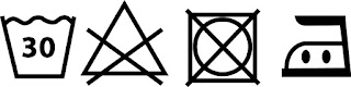

Label
As the previous bind mock up shows, we have an idea to include a clothes label around the edge of the book to reference the content of the book. To ensure that it is clear that it is a label, I have adopted some of the symbols used to communicate the washing instructions of clothes on the label and re-drawn them in illustrator.