Monday 31 October 2016

Studio Brief 02 - Typeface Development 01

Below you can see the start of my creative process, trying out different outlines, line strokes, serifs, brackets and shapes. I could develop some of these ideas further and create further sheets which I will certainly do. I like the extreme contrast between two strokes on the second ones down, it is really exploring the weight contrast seen in bodoni, in a more stripped down way, I want to try this tracing over the actual typeface to see what results I can achieve. Some of the results below are a little too quirky but I think there could be something in the bottom left A it certainly gives off the mystic and magical vibe.


Sunday 30 October 2016

Studio Brief 02 - Typeface Research

I have decided to research more into the typeface Bodoni as it is the most probable option and it would be really useful to have some more background information, such as the influence, how it was created and what it is generally used for.

Bodoni is known for being used in fashion labels, magazines and high end brands. At least Bodoni or something very similar such as Didot (the typeface Bodoni was based from).


I read an interesting article on eyemagazine.com speaking of the use of type in the fashion industry through the times.


From this it is clear that there is definitely something about the type face that screams class and money. It is used widely in fashion magazine spreads, covers and posters because in bigger sizes it is very aesthetic. I did some primary research and looked through popular magazines such as VOGUE and ELLE and found that most if not all fashion and beauty brands being advertised on the spreads used a serif font, often one very similar to Bodoni, this further cemented my idea of creating a typeface for this purpose, however I wanted to create something slightly more decorative - one that is more decorative and solely for display font rather than being used for body text too.


 In contrast to these traditional and highly classy looking typefaces used for the high end brands and in magazines I also looked at other magazines to make sure serifs aren't just used widely in the media. As the images below show they aren't, lifestyle and cultural magazines etc tend to use sans serifs for a more contemporary and 'down with the kids' look.


Friday 28 October 2016

Studio Brief 02 - Typeface Design (Crit feedback)

For the crit I had the two initial rationales for the fonts I had chosen to explore on my screen and left a few questions for people to answer in order to gain insight into other peoples views on the word majestic & my font options.


The questions I left were;

  1. Should I take a challenge and transform Helvetica or stick with Bodoni?
  2. What words do you relate to majestic?
  3. What would you us a typeface described as majestic for?
I want to ensure that the idea I have for the purpose of the typeface makes sense and people think similarly. 


I agree with the comment about Helvetica being different to repurpose, most brands that use it want quite a neutral look, with the target market being broad however a majestic typeface will be used alot more selectively and therefore I believe a serif is definitely a better option.

I think it will be really interesting to explore the existing features of Bodoni and enhance, along with manipulate them to fit the purpose.

The visual sketch by the adjectives of a little crown is exactly what I think of myself when someone says majestic so I will explore this idea further.

All of my feedback agrees with the idea of it being used for a title, decorative purposes as supposed to big blocks of text, so with this in mind I can play around with the thin and thick strokes as the readability doesn't have to be as essential as if it was being used for large bodies of text. I am going to create the typeface in lowercase, although most titles are in upper I think lower has a lot more potential to be majestic and intricate, in comparison to uppercase; however I may produce a select few letters in Uppercase to demonstrate.

From here I am going to start developing ideas and sketches, being both extreme and subtle within the typeface and free hand. I will sketch the obvious such as glyphs including crowns and jewels etc the stereotypical and see what I can get from that as usually experimentation is valuable and real ideas can be drawn from it.

Studio Brief 02 - Typeface Design (Study Task)

We did a few short tasks before our crit to get our minds going and creative thought processes before finalising what questions we wanted to ask our peers.
  1. Use a 3 by 3 grid to express your chosen adjective in a pictogram
  2. Note down your word and other relevant words and pass 4 places to your left, when you get a sheet use a 5 by 5 square to express their chosen adjective
  3. Pass to the left once and draw the letter A in 10 different styles to express their chosen adjective.
Although at first I thought this task was a bit pointless in terms of having not a lot of time to draw really bad (in my opinion) sketches using mainly diagonal, horizontal and vertical lines I found the final task really useful in exploring the meaning of words and how they can be interpreted in the smallest quirks and features of type.


Having not a lot of time for this task and restraints I drew the first things that came into my mind - a crown, a high heel shoe, money, cocktail glass, pearls and the British flag. I believe these are all things you'd relate to class, high fashion, and hierarchy.


This one is quite self explanatory of what the person was thinking, tradition and magic.


These are the results from someone drawing an A in a majestic style, I will definitely take inspiration from these results.


Finally these are the A options I did for someone else's' word, thinking about being isolated and alone I tried to use the shape, weight and layout to portray this.

Tuesday 25 October 2016

Studio Brief 02 - Typeface Design (Rationales)

Rationale 01 - Bodoni

I am going to go with Bodoni font for my first option to create a majestic typeface. Bodoni is described as 'Didone' - a genre of serif typeface that emerged in the late 18th century and is particularly popular in Europe. The typeface is also known as modern because they were new designs rather than updated versions of Roman or Renaissance letter styles. 

The font is characterised by unbracketed and narrow serifs. With the serifs having a constant width along their length. I feel as though a majestic typeface should be more flowing and assertive, showing authority and it is something to be followed and taken notice of. Because of the contrast in thick and thing strokes, particularly the thin strokes, some digital versions of Bodoni are said to be hard to read, therefore it is generally used as display font but Bodoni Old Face is optimised for smaller points.


Initial thoughts on what personality the typeface should convey -
  • Regal - belonging to a monarch
  • Dignified - knows what it is doing, classic & taken seriously
  • Elevated - superior, formal and literally raised 
  • Hierarchy - hi·er·ar·chy - a group of persons or things organised into successive ranks with each level subordinate to the one above (this could be how the different weights are described)
In terms of the anatomy of the type the cap height should be long to make an impression and the x height just above half way up the cap height.
I would like to add brackets to the serif to give the typeface a more grand and flowing feel with the terminals coming to a point.

Rationale 02 - Helvetica

The second font I am looking at for option is Helvetica, seen as the main purpose of this typeface is to be neutral and have not a lot of personality it is like a blank canvas for creating a majestic typeface.


I would definitely add serifs to the glyphs as this it what you think of when you say majestic, traditional and old style. Helvetica was one of the most popular typefaces in the 20th Century and countless companies and brands have used it is their display font, some with subtle changes and some with very big changes, this shows how versatile the typeface is, what it is capable of.


Monday 24 October 2016

Studio Brief 02 - Typeface Design Initial research 02

Traits and personality you get from the different typefaces:

Garamond:

Traditional, readable, timeless, delicate and elegant. The garamond we know in modern times is interpretations of fonts that were inspired by drawings which were modeled after the punches of Claude Garamond (In traditional typography, punchcutting is the craft of cutting letter punches in steel from which matrices were made in copper for type founding in the letterpress era.) Prior to Garamond's work, the practise of type face design was to try and achieve a replica of a scribe's handwriting; making him the first to make letters that would read better when printed.


Some popular books have been set in Garamond - Harry Potter novels and Dr. Seuss books, as well as being used for Googles original logo and Abercrombie & Fitch's logo. Obviously a very interesting typeface with a rich history and still very relevant to this day however can't say it fits my adjective very well, a big thing that it is so widely used as body text typeface which isn't what I want to create.

Caslon:

Credible, homely, friendly and pleasing. Designed by William Caslon in the 1700's one of many Caslon typefaces but often referred to as Caslon Old style. Caslon's typefaces were popular in his life time and beyond, and after a brief period of eclipse in the early nineteenth century remain common, particularly for setting printed body in text and body. This could be an option as it is has potential with the serifs used and the Q for example does look quite majestic, the rest can be manipulated.


Baskerville:

Classic, transitional, delicate and traditional. Baskerville is the resuly of John Baskerville's intent to improve upon the types of William Caslon. Increasing the contrast between thick and thin strokes which made the serifs sharper. The typeface was the culmination of a larger series of experiments to improve legibility which also included paper making and ink manufacturing. Baskerville is also an option for me to consider.
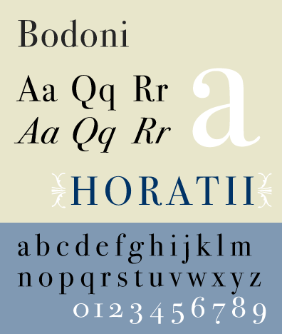


Bodoni:

Modern, classic, elite and high attention to detail. Designed in the late 18th Century, Bodoni was hired by Duke Ferdinand of parma, a noted patron of the arts, to establish a premiere royalty press. The concern - printing of the highest quality not for the masses, but for the aristocracy. He relied heavily on the recent designs of Didot, creating a revolutionary Roman style which was very different to anything seen before. The attention to detail in the typeface is really something to take in and the quality was not something that could be matched by anyone else in his day. Modern typefaces aren't perhaps the most readable of styles, they are most visually distinct making them perfect for Display type design.
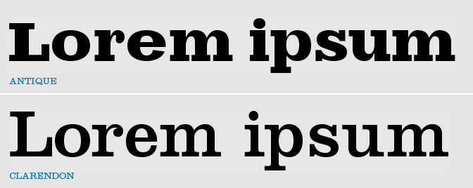


Clarendon:

Graceful, striking, hand craftsmanship, slab serif. It was created by Robert Besley in 1845, inspired by the typeface Antique - one of the original slab serifs. 


Besley added bracketed serifs giving it the ability to work better inline of a body of text. It also gave it a more approachable and soft feel. It became very popular in its time period and because of that we quickly associate it with turn of the century England and the old west in the USA; for this reason I don't think it would be suitable for a Majestic Display font.


Times:

Traditional, trustworthy, serious and legible. Times New Roman gets the name from British Newspaper 'Times of London'. In 1929 Monotype were hired to create a new text font. Monotype had to license the design to it's rival Linotype because it used their typesetting machines. Since then Monotype has sold the font as 'Times New Roman' and Linotype has marketed its version as 'Times Roman'. Seen as this type was specifically made for body text I don't think it would work with my adjective as a display font design.


Helvetica:

Neutral, adaptable, serious and aesthetic. Helvetica is a sans serif grotesque typeface and is one of the most popular typefaces in the modern world. It was based on Akzidenz-Grotesk created by Berthed around 1898. Original typeface was designed by Max Miedinger and Eduard Hoffman in 1957 Switzerland.


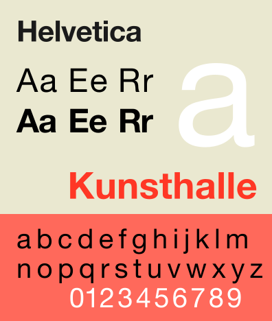
It is used for many famous logotypes and as a brand identity typeface - in many variations as the typeface is so neutral it can be manipulated to give out any kind of message you want and is good for companies with broad target markets and range - this was the aim, for the typeface to give out no meaning at all itself. It’s original name was Die Neue Haas Grotesk however it was renamed in 1960 to Helvetica (Latin for Swiss) so it was more marketable worldwide. Fun fact: it remains legible when in motion, one reason it’s popular for signage and automaker and airline logos. I think that this choice for majestic could be a good challenge, to take something so neutral and transform it would be interesting and seen as it is used for display type design a lot it would work.


Studio Brief 02 - Typeface Design Initial research 01

We were introduced to our new studio brief, following on from studio brief 01 it is based on typography, with 01 we designed our own logotypes however with this we will be creating a whole typeface based on our chosen font and conveying an adjective that we choose.


'Based on one of Müeller-Brockmanns classic and lead typefaces, create your own bespoke typeface, which should effectively communicate your chosen adjective.
  • Garamond
  • Caslon
  • Baskerville
  • Bodoni
  • Clarendon
  • Berthold (doesn't feature below don't have on system)
  • Times
  • Helvetica
  • Univers (doesn't feature below don't have on system)
Essentially you are repurposing individual shapes (letterforms) to work together in endless combinations in a harmonious, consistent sequence.' 

Possible adjective options:


  • Scattered
  • Majestic
  • Abstracted
  • Fierce
  • Petite
  • Mammoth
Out of all of these I think the most interesting results will come from the adjective Majestic so I have decided to go forward with this - typing it out in the typefaces I could.


Sunday 23 October 2016

Studio Brief 01 - Evaluation

Logotype Evaluation:

The brief was to design a series of logotypes for a rebrand of my given company - a company made up by myself based on a random word given to us. I started by doing research into my word ‘Moonless’ and the typefaces that we could use to create the logotype. I was only allowed to experiment with type, scale, spacing, contrast, alignment, shape and colour - this was restrictive as most coffee companies use illustrations in their branding as I discovered from my research. My target audience was students and young professionals on the go, the coffee shop would be somewhere people stop off quickly on the way to elsewhere rather than a comfortable place to sit around in. Originally I had the idea of  an independent coffee shop, who’s coffee is that good you don’t need to add milk ‘as dark as a night without the moon’ a loose connection I made because I wanted a more original idea for the word rather than for a night club or something easily relatable. However as I went forward with the design process I felt a chain coffee shop was more of suitable brand for what I had created, perhaps because of the use of the circle and simplicity of just the M representing the whole company - it is something you can see sticking out on a sign in the high street which I find a success. In my other designs with just the word I think the simplicity of the changes in the glyphs such as shortening the ‘l’ and cutting off the top of ‘M’ along with close kerning were effective enough to create a company identity.


 I believe the logo does portray what I was aiming for however if I was to continue to work on this project I would create some physical mock ups on cups, think about how the sign would work in the real word, whether it would be painted or printed. Explore the use of moons to create the o’s more maybe making different shapes for different seasons, or different colours. Overall I think this has been a successful brief however I could have done with a bit more development on my initial ideas to create a more varied and distinct response to the brief.

Studio Brief 01 - Logotype (Final Crit)

Today we had our final Crit for studio brief 01 - Logotype, just to bring it back full circle this was the brief we got:


Produce a series of logotypes for a rebrand of your given company.

The given company name being 'Moonless':
"Being without a moon or moonlight"

Using only type, experiment with scale, stroke, spacing, contrast and alignment to interpret your company. You should consider the following:


Who is the company?

A coffee/tea house or cafe


What do they do?


Sell really good quality mid range hot drinks


Who is the target audience?


Students/young professionals on the go


Where will the logo appear?


Coffee cups, food bags, signage and receipts etc

I went into the final crit with my ideas and reasons for having them, given on the previous blog post - development. My initial proposal was ' My target audience is young professionals and students on the go - looking for a cheap alternative to a chain coffee house, and friends and family coming together for a catch up and bite to eat and drink.' However I changed this slightly and in the end was aiming it towards just people on the go rather than somewhere cosy for a catchup - talking about this now I realise that is more of a coffee house chain vibe as an independent shop is usually warm and welcoming to people sitting in for hours.

Initial feedback was that it wouldn't look out of place with competitors and you could imagine it on the high street which is exactly what I was going for, it has to look in place and be inviting, not some random signage that doesn't look professional.

People said that it maybe looked a little too fast food ish / like a corporate chain which I completely understood, this was in response to this design:


Which I think has something to do with the fact I used a circle in the logo, just like Starbucks and Costa Coffee. So I took this on board and as I said earlier I probably should have changed my aim to it being a chain coffee shop to rival previously mentioned Starbucks and Costa Coffee.


My peers and tutor commented on this option how they liked the simplicity of the M and the O's how I used the simple letter form manipulated to create something completely different.


Some really liked the use of the M as an L, linking the word together even though it is on two different levels, the simple elongation of the M gives the logotype an interesting aspect.


It was also said that these options looked a lot less corporate than those that include a circle or just use the M.

All of this feedback was very informative and will help me in the future, we have been told to draw a line underneath this project now and focus on the next one introduced to us so I will communicate what more I would have done in the following evaluation.

Wednesday 19 October 2016

Studio Brief 01 - Logotype Development

After getting feedback from my peers in the group I continued to work on my logotype, experimenting with different kerning, upper/lowercase and incorporating the circle logo I created. I put the logos I believed most successful into context using mock ups:


So this features the simple logo using Futura, I extended the M glyph to act as the letter L which I thought worked well to keep the word flowing even though it is on 2 different levels. I also used the Moon shapes created out of the letter O's, I got very positive feedback from the crit about this feature so continued to use it. Although I like the way this one looks on the mug, it isn't really the feel I'm going for, the brand identity is supposed to present somewhere you stop by on the go. I think the darkness of the brown is too inviting and comforting, its sending the message come and relax here.


I tried the logo on a take out cup and in black to see if that made the difference however I think it made it too unapproachable, I could possibly try different colourways depending on the season:


This is something to consider and from here I can ask opinions in the final crit of what people think looks more suitable for a mid range coffee shop for students and young professionals on the go.


I then looked at this logo and thought it is more suitable for what I am trying to put out there - somewhere contemporary, simple and affordable that does good quality coffee/tea. I am very open to feedback on this, I want to know what vibe people get from the colours used and the simplicity of just the M, is it enough for people to identify the company.


I tried this logo on two different sized cups and I think it works really well on both of them - matching the cap lid to the colour I think brings the product all together, with the lighter brown being more practical that the dark in the way that it looks more appealing to drink from rather than a dark lid- if you look at most cup lids they are a very light colour or even white.


Monday 17 October 2016

Studio Brief 01 - Logotype (Interim Crit Feedback)

After my initial crit I went ahead and experimented more with using the Futura typeface for my logotype. I also started to add colour to the designs to see if that added positively to the personality, I left a few questions along with a sheet of selected designs for people to view and answer:


As you can see from the feedback sheets I got a lot of differing views on my logotypes, I will take all of this feedback on board and continue to experiment mainly with kerning and putting the logos into context to see which ones actually fit; to produce 5 or more different options for the Moonless Coffeehouse.


Friday 14 October 2016

Studio Brief 01 - Logotype (Group Crit Feedback)

At the point of the crit I had done a lot of research into other companies - those that would be my competitors and decided on two different typefaces I would try and play around with.


This is my given word in the 6 different typefaces we were given, I think the first two options - Garamond & Bodoni look too mystic and fairytale like. The middle two being the most suitable - Century & Futura. Times Roman to me lacks character for a logotype it is more of a body of text option, and Helvetica is too neutral, with no strong characteristics.


Feedback:
  • An independent coffee shop to me says wine evenings, book launch parties etc, the logotype should be sophisticated and slick
  • The O's look a bit weird like eyes
  • Could you not think about maybe a tea house rather than coffee? It seems to go better
  • The 'n' must be on the same line as 'moo'
  • Think about a more rustic look
  • Consider tea leaf readings, palm reading etc
  • Afternoon tea cafe? High end bookings in London? There is a big audience for that
  • There is defiantly something in the Futura type a the bottom - the use of moons for the O's works well, experiment further with this typeface
I took all of this feedback on board and will work further with the Futura typeface rather than the Century as it gives a more contemporary feel, relevant to the target audience - younger generation. I think this crit could have been more beneficial if I had some direct questions to ask, but from it I learnt that the experimental O's in the Century typeface weren't working.

Wednesday 12 October 2016

Studio Brief 01 - Logotype (Research)


For this brief we were given a random word out of a hat, with the task of creating a brand/company with the word as the name. The finished product will be a logotype using one of 6 typeface choices we were given. 

Definition of moonless: lacking the light of the moon

Initial Ideas:
Independent jewelry shop
Night club
Coffee Shop

First known use of the word: 1506

Popularity: Bottom 30% of words

Things I need to think about when researching competitors branding are personality - impact - concept.


I am going to go with coffee shop as I believe this to be the least obvious, but interesting option and have started looking at companies such as Starbucks, Costa Coffee, Pret A Manger, Caffe Nero and also independent coffee shops in Leeds and Liverpool. The idea behind naming a coffee shop Moonless is the saying 'Black as midnight on a moonless night' the coffee and tea used in this cafe will taste that good there will be no need to add milk for flavour. My target audience is young professionals and students on the go - looking for a cheap alternative to a chain coffee house.

The first thing I looked at was the actual logo that they use, along with the signage and branding, how they all relate to each other and what colours and typefaces they're using, along with any symbols featured in their logo. I will analyse a few of the logos for known chain cafes and sandwich shops etc on the high street and pull comparisons then look at independent shops.


I read an article on thedrum about how Pret is using design to tell brand stories and a sentence really stood out to me: "But Pret really hasn’t. It still feels bold, it feels proud and it feels as ‘Pret’ today as it did yesterday. Quite a challenge." Spoken by James Cannell. This stood out to me because he highlighted that although some packaging, uniforms and other things have changed over the years the brand identity hasn't; it is still bold as ever and inviting customers in.

So with this logo you can see clear similarities to the Starbucks logo - mainly being that it is circular and include the name of the company around the inside of the shape - with an illustrative image in the centre. The costa symbol is a more obvious one just being coffee beans but I guess it is straight to the point with what it specialises in. The colour used, obviously red in terms of psychology is associated with warmth and positivity - relevant to a hot drink cafe, somewhere friends and family gather to socialise. 'Red is energising' 'It is also strong-willed and can give confidence to those who are shy or lacking in will power' all of these colour qualities are cleverly transferred onto Costa, coffee containing caffeine is known for giving people energy and revitalising those tired whilst busy working away - giving people confidence to carry on and get work done after a short coffee break - or when meeting friends or new people giving people the confidence to be talkative and comfortable.

There are a few similarities in terms of colours used in these logos - mainly red and green. I will definitely take notice of this as it seems to work largely in the coffee house company world. I also noticed alot of the logotypes are in a bold font - it makes you take notice and jumps out at you on the high street - something it has to do with all of the competition around. Another similarity found in Pret, Starbucks and Costa is the use of a circle, the logotype either within it or in a circular shape.


This is an independent coffee shop on Bold Street in Liverpool, at first the shop front was a fun painted type, however they have since rebranded with a san serif uppercase typelogo. The new logo is more refined and professional, making it look more like a legitimate shop.
This research so far has been very informative for me, I am now going to look into the different typefaces that are available to us, focusing on the serifs - although a lot of my research shows the use of sans serifs I want to create the impression of an established known brand:

Garamond- Serifs are influenced by calligraphy.
Bodoni- Highly influenced by geometry, it is a display type - ornate & complex.
Century- Specifically designed for the magazine century - each glyph has it's own characteristic.
Futura- Form follows function, no contrast between weight, basic typeface.
Times Roman- Specifically designed, text typeface favourite.
Helvetica- Neutral typeface, rounded sans serif, large x height, no distinguished feature.

I'm going to experiment mainly with Century as I believe the fact that every glyph has its own characteristics goes nicely with the idea that everyone's order in a coffee shop is different.
I will also experiment with a sans serif - Futura just to get a feel for the two different types, to see which works better for the letters and the personality I'm trying to get across.