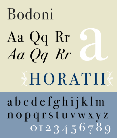
Rationale 01 - Bodoni
I am going to go with Bodoni font for my first option to create a majestic typeface. Bodoni is described as 'Didone' - a genre of serif typeface that emerged in the late 18th century and is particularly popular in Europe. The typeface is also known as modern because they were new designs rather than updated versions of Roman or Renaissance letter styles.
The font is characterised by unbracketed and narrow serifs. With the serifs having a constant width along their length. I feel as though a majestic typeface should be more flowing and assertive, showing authority and it is something to be followed and taken notice of. Because of the contrast in thick and thing strokes, particularly the thin strokes, some digital versions of Bodoni are said to be hard to read, therefore it is generally used as display font but Bodoni Old Face is optimised for smaller points.
Initial thoughts on what personality the typeface should convey -
- Regal - belonging to a monarch
- Dignified - knows what it is doing, classic & taken seriously
- Elevated - superior, formal and literally raised
- Hierarchy - hi·er·ar·chy - a group of persons or things organised into successive ranks with each level subordinate to the one above (this could be how the different weights are described)
In terms of the anatomy of the type the cap height should be long to make an impression and the x height just above half way up the cap height.
I would like to add brackets to the serif to give the typeface a more grand and flowing feel with the terminals coming to a point.
Rationale 02 - Helvetica
The second font I am looking at for option is Helvetica, seen as the main purpose of this typeface is to be neutral and have not a lot of personality it is like a blank canvas for creating a majestic typeface.
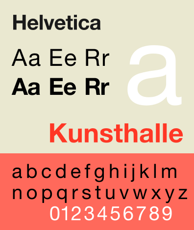
I would definitely add serifs to the glyphs as this it what you think of when you say majestic, traditional and old style. Helvetica was one of the most popular typefaces in the 20th Century and countless companies and brands have used it is their display font, some with subtle changes and some with very big changes, this shows how versatile the typeface is, what it is capable of.
No comments:
Post a Comment