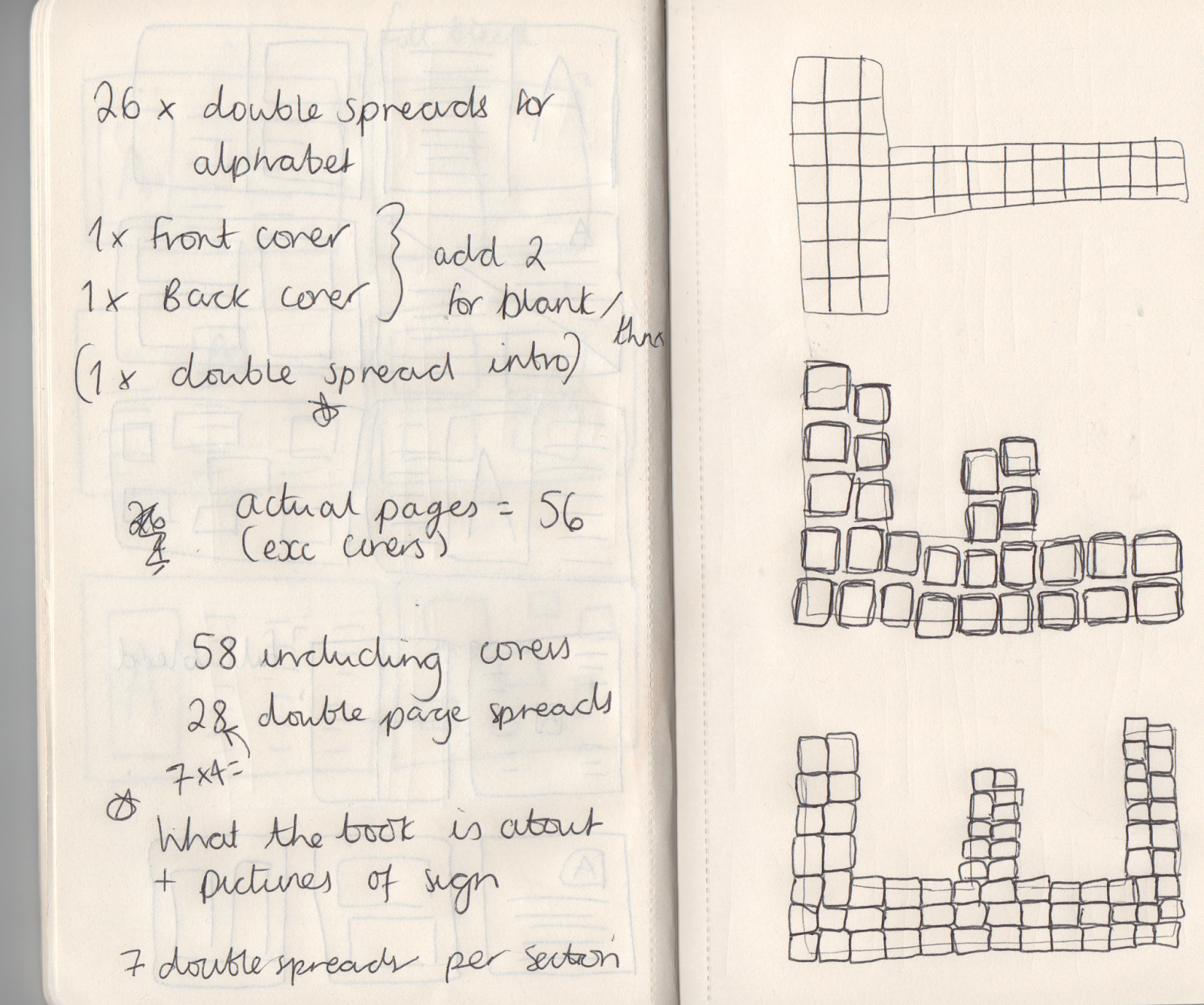
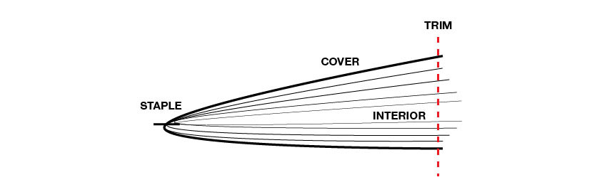
Monday 30 October 2017

SB2 Initial Ideas

The brief: Create an immersive and engaging screen based user experience for a media of your choice, this could include; website, app, streaming service, etc.
Before undertaking this brief you should identify the following;
  • The client
  • The problem
  • The target audience
  • The overarching aim of the project (what are you trying to achieve)
The role of the communications: Deliver a world class digital experience that engages the audience, how can you maximise the potential of digital devices?

Considerations: Must be global — Digital formats are viewed on a global scale, this must inform your approach and design decisions.
Use mixed media — A combination of image, audio and video should be considered in your design strategy.

Ideas:
  • A website for myself 're.beccalouise'
  • 'Borrowmydoggy' app
  • Petclubs website update
  • Scan flower/plant for identification and care information app - also tracks the plants u own and warns u when u need to water

Wednesday 18 October 2017

SB1 Production

I encountered a few problems when it came to the production of the booklet. Once I had all of the pages laid out correctly with all the information and pictures of correct quality I had to add in a few more pages so that I had the correct number of spreads to print the booklet with the right settings for a saddle stitch. I decided on a saddle stitch in the end as it is the cheaper and faster option and as they are to be mass produced and sold for relatively cheap this was the best option. I added pages to the 'I' section which worked well in the end as it gave more chance for individuality. Another issue I had was the stock choice, I wanted a glossy cover with a matte inside however those types of stock weren't available for double sided printing. I settled with another stock of 120gsm as I was informed any thinner wouldn't have been ideal with image clarity and leaking to the other side however now considering this it would have been a good idea and in with the Glasto feel of recycling etc. With the paper stock being rather thick it caused issues for binding and cutting, the end product is a good shape and size with neat ends however some of the photos towards the start and end aren't full bleed whereas in the middle they are because the creep wasn't calculated properly.


Friday 13 October 2017

SB1 Development 02 - Document Setup/ Layout

I added the amount of pages I thought I would need for the document, along with facing pages option as they will be designed as a spread. I typed in the dimensions for the crown sized book then set the margins.


I added a larger margin for the inside so that no content would be cut off in the binding process. I then added 4 columns to help create a grid to stick to when designing. 


As you can see above I later added horizontal ruler guides worked out by dividing the page up. I also included a master page layout to help me place the letter illustrations and text to the pages. The plan is to alternate the info and photographs from spread to spread which is why the master layout is on both sides. The photographs added will either take up the whole page or it will be split into two.


Above is a selection of the layout I have gone with - showing the information on left and right, as well as photographs taking up the whole page/ two photos. I am happy with the layout of the photographs however i am going to reconsider the layout of the letters and information as it doesn't look right just yet.

Thursday 12 October 2017

SB1 Development 01 - Illustrations

Illustrations of A-Z


I started off by tracing the shape of the letter A with small squares of different colour ways in the same shade (pink) the first one i produced was very rough and took a while but allowed me to realise they need to be neater and more uniform.


As you can see above after the first A i used the same block of squares but changed the colours for each letter tracing the letters underneath in a more neat manner. I also utilised the ruler tool to make sure all edges were straight and even. The first few letters went through around 3 drafts before I got the hand of it and made them all look a lot more uniform. 


See above the alphabet up to H when the colour pattern starts to repeat itself again, i used the colours found in the sign however not in the same order as it has been known to change some years and i want this guide to be relevant whenever. The only colours not featured are lilac, dark green and the different shades of blue as I had already varied the colour ways too much for there to be much difference.


SB1 G.F. Smith

G . F Smith offers paper products, special makes and highly bespoke services tailored specifically to the needs of the creative industries. Our specialist team works to a level of craft and customisation and degrees of flexibility that are almost impossible to replicate. 

The range of additional services we offer exists because of long relationships with and understanding of the needs of working designers. From the preparation of exquisitely hand-made dummies and samples to the adaptation of paper for optimised digital printing, the work of our skilled staff matches the exceptional standard of our papers.


 Above is their complete paper collection 


Above an example of foiling


Above an example of embossing


Tuesday 10 October 2017

SB1 Initial Ideas Critique

In this crit I presented my idea for the A-Z guide of Glastonbury to inform and enlighten people about the music festival. I discussed the size the guide will be, what it will include (information, photographs and illustrations) and asked for help with how it could be produced. Some of the feedback I got is below:
  • Consider experimenting with aspects of the festival in the production such as using tent material as the cover, or perhaps use patchwork to keep inline with the sign theme
  • Have the book so it can stand on its side in the shape of a tent and include page holders at each corner to act as guidelines
  • Don't focus too much on the Glastonbury branding
I appreciated the feedback and will definitely consider the feedback however believe the publication would be too expensive to produce using anything other than paper, the target audience are not going to want to spend a lot of money so the cost must be kept down. 

I also thought the comment on staying away from the Glastonbury branding was unjustified as I explained the relevance of the sign and why I am using it - diversity and the best view of the whole festival, this is the only aspect of the festival design I am playing on and even that I have reimagined in my own illustration.

Monday 9 October 2017

SB1 Production Research & Study Task 04

Saddle Stitch:

Advantages of Saddle Stitching
  • Least expensive of all binding options
  • Fast
  • Widely available, as most printers saddle stitch in-house
  • Lies relatively flat
  • Special gatefolds and foldouts are possible
  • Can use a self-cover or a separate cover
Limitations of Saddle Stitching
  • Longevity. The wire stitching takes its toll on the paper and is not recommended for pieces intended for heavy use.
  • Limited amount of paper variations within the piece. For example, if you are stitching two 16-page forms together to create a 32-page self-cover brochure, and you want pages 3 and 4 to be red paper, then pages 1 though 8 and 25 through 32 will also be red paper. (There are other ways of configuring this 32-page brochure of course, but the idea here is that what happens on the front side of that form will also affect the back side of the form.)
  • No printable spine
  • Thickness limitations. Documents thicker than .125 to .25 inch may require another binding technique.
  • May require special design adjustments for creep, especially small formats with high page counts
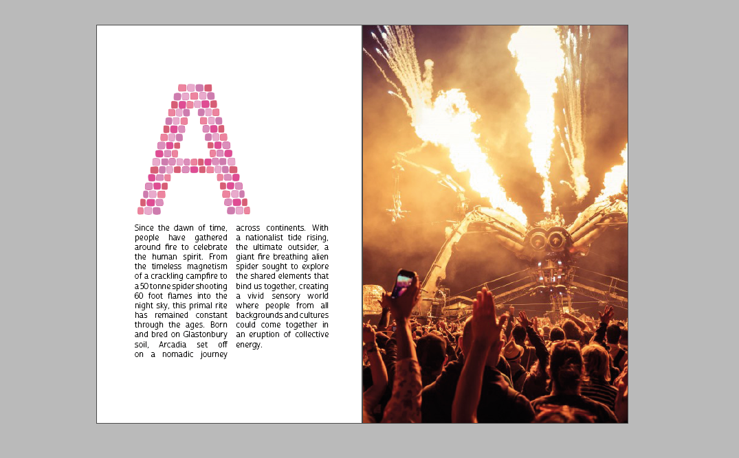
  • I have decided to use a perfect bind rather than a saddle stitch because after research it seems most suitable for the publication I am making. 
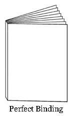

Perfect bind:

Perfect binding is commonly used for catalogs, directories and paperback books that have a higher page count. Pages are glued together at the spine with a strong, flexible glue. The cover is wrapped around the glued pages, and the brochure or catalog is then trimmed to its finished size.


Advantages of Perfect Binding
  • Overall valuable look and appeal
  • Printable spine
  • Longevity
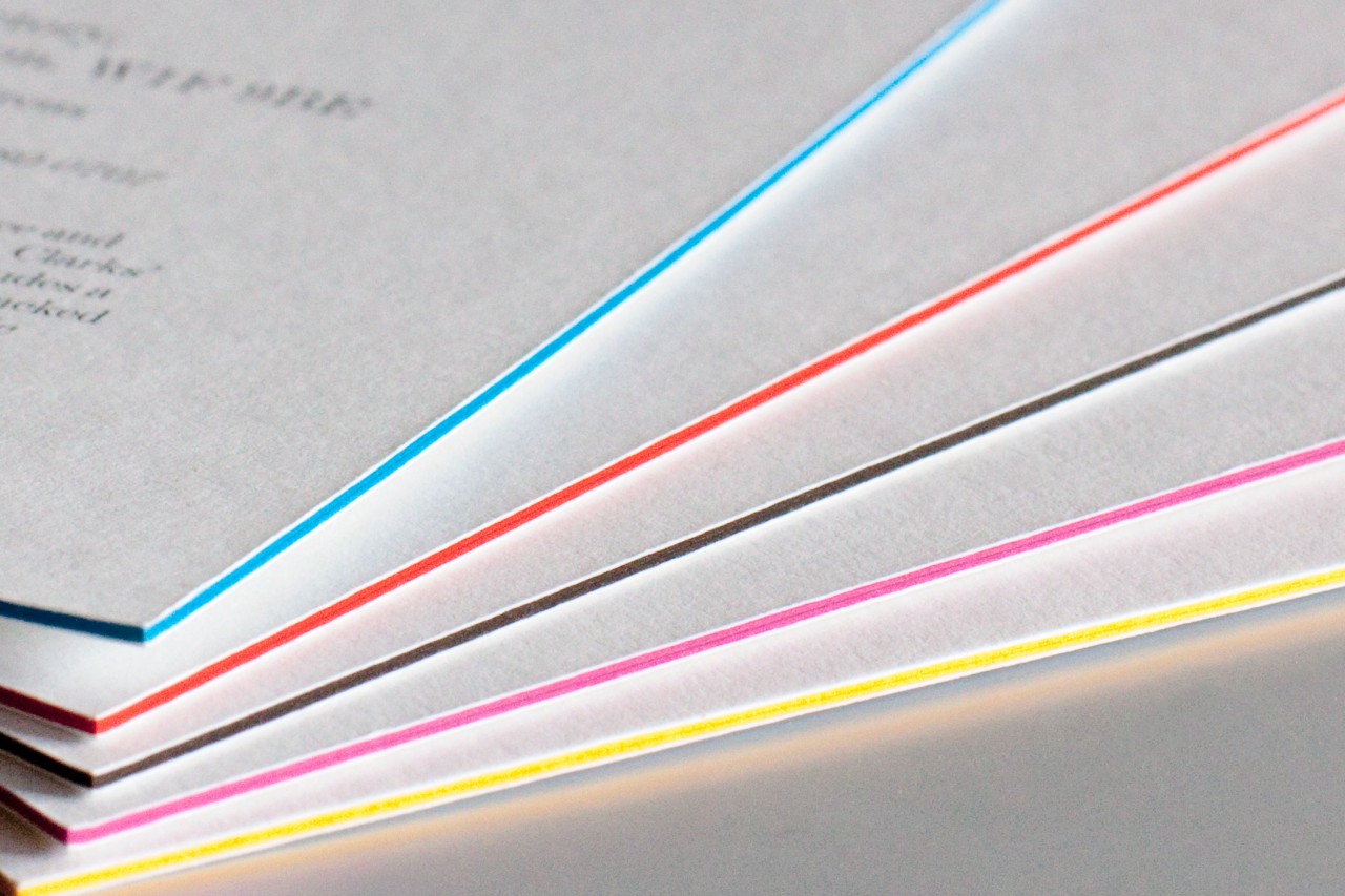
  • Ability to creatively interleaf pages. Use a variety of paper weights, colors and finishes nearly anywhere you like.
Limitations of Perfect Binding
  • Does not lay flat. You lose design space in the gutter area. (I will have to consider this when setting up the margins for the document so that all (or the most important part of a photo) content is visible 
  • Not suggested for applications in which hands-free reading is important (e.g., cookbooks or instruction manuals) 
Paper sizes:


Above are the standard sizes for books, it is not necessary to stick to these dimensions however they are useful to know and also utilise as considerations for printing have already been considered in the sizes.  


I cut out 11 of the sizes from the smallest to imperial as at this point I knew I wouldn't be needed a publication of that size. I then laid them all out and considered which size I would like to use. I decided on Crown (80v) as when portrait a double page spread would be able to be printed on a piece of a4 - keeping the cost of printing down as well as it being pocket/ small bag sized for travel.

Finishes and specialist techniques

Duplexing:
Bonding two different stocks together to act as one page with different textures or colours on each side


Foil Blocking:
Coloured foil is pressed into the stock using a foil stamp


Embossing/Debossing:
Embossed refers to a raised surface and debossing refers to an indented surface.


Die-cutting:
A design is cut out of the surface using a metal die.

Laminate:
A plastic coating heat-sealed onto a stock to provide a crisp finish and a liquid resistant surface. 

Varnish:
A colourless coating which can be applied similarly to spot colours. Varnish layers are often identified to the printer on a separate file using black to identify the varnish.

Printing and alignment

Black or 'registration' black 
In offset lithography, black is one plate in the printing process (the K of CMYK)
Registration black is achieved by printing on all four plates, so will cost more. 

Lithography:
This printing process uses plates (one for each colour) and ink is applied on the basis that oil and water repel each other. The ink from the plates is 'offset' onto a rubber printing surface before being applied to the paper.
- High-end publications that require attention to detail

Web:
Ultra-high volume printing often onto huge rolls of paper. Often uses flexography (relief) or rotogravure (intaglio- ink is inset into an engraving). 
- for newspaper printing most commonly

Bleed:
'Full Bleed' images must be printed beyond the margin limits to ensure that white edges don't appear after trimming

Crop Marks:
Crop marks communicate the trim regions. 

Tipped-in page:
A page that is printed separately but bound along with the other pages. Tip-ins can use different formats or different stock to the rest of the pages. 

Tip-on: 
Added content glued to a page or cover 

Colour management

Good colour management ensures the accuracy of colour reproduction between different equipment and processes in print production.

Gamut: 
RGB, CMYK and hexachrome (CMYKOG) 
Gamuts describe how accurately particular systems can reproduce certain colours - RGB can reproduce approx. 70% of colours that the human eye can see (but only on screens)
If you use colour outside the printing gamut then the closest equivalent will be used which may change the overall design. 

Colour profiles:
Pre-defined in relation to specific printing equipment and stock.
Pre-set colour profiles differ in Photoshop, Illustrator and InDesign as they assume different print requirements for each package. 

Coated/Un-coated:
Paper coating provides a certain surface quality but can affect how ink is absorbed - how sharp the image will appear. 

Process Colour:
CMYK - in offset lithography colours are applies using the CMYK gamut applied using half-tone dots.

Spot Colours:
  • Spot colours must be defined in a colour to be printed lies outside the working gamut system.
  • Spot colours must be defined within the image file (swatches) and in any conversations with the printer.
  • Spot colours can be defined using the Pantone colour system as a reference - the Pantone codes will not look the same on screen as they do in print so use printed reference.

Sunday 8 October 2017

SB1 Initial Ideas

I am going to create a publication that will educate and guide through the festival. I want the guide to be small in size so that it would fit in small bags or pockets therefore I need to explore what dimensions and shape would work for the content.


Above I sketched some quick thumbnails to see what type of layouts would work with portrait, square and landscape size papers. Out of all the options I believe the portrait options would work best, the shape of the photographs I have for content would work,  either as full size images bleeding off the page or two pictures above and below each other to maximise space used. 


Above is the planning of the document that I will have to set up on InDesign to start with as a draft, changes can be made later if necessary. On the other side of the page are some initial sketches - I plan to create an alphabet in capital letters inspired by the Glastonbury sign that will be used to show what letter you are on in the guide. I did 3 different designs based on the sign to see what style fits best in terms of the patchwork and how it is organised. I believe either the E or F look the most authentic so I am therefore going to develop a mix of the two digitally. 


Above is a quick mockup of how the guide would be structured when printed out, it will be a number of small sections gathered together and attached using perfect bind with glue. This is the best method as the guide itself is going to be quite a few pages so a classic saddle stitch wouldn't be strong enough. 

Friday 6 October 2017

SB1 Publication Layout Research

As the book is an A-Z guide, the standard layout that makes sense to use is a double page spread including the letter, information and pictures. Generally the letter itself is large so as soon as you're on the page it is visible and obviously as they are used to teach children the alphabet it has to be memorable - bright colours and bold font. I want to pull from this kind of design in the ways that suit the purpose of the book, as well as turning the 'children learn the a-z' type of book into something teenagers and adults want to buy.


Above is the pages for the letter B from 'Dr Seuss' ABC' it features large type size and only two different colours of text - to differentiate between upper and lowercase without the page being too busy. I think that the minimal design works well as it includes only what is necessary so that it is easy to understand and doesn't test children's attention span. For my guides target audience being teenagers and adults of all ages and from all backgrounds, it has to be easily understood in terms of large clear text however can include more than what would be for children. I also want to include photographs to further support the text context. As Glastonbury is such a diverse festival I want to show this through use of colour and vibrancy through the guide.

figure 1


figure 2

As I spoke about on the Glastonbury research blog I don't want to take much from the actual design of the festival other than the use of colour. Therefore I will be looking elsewhere for guidance on things such as type and layout. As the main focus of the festival is music I will look at music publications and posters that are current now and aimed towards both young people and adults in venues around the country. From personal experience I know that most genres of music are appreciated by both old and young as I have similar interests to my parents therefore the music industry style is hitting all audiences. Above are some examples of publications and posters listing and discussing up and coming artists, I feel the style of all the design works very well to attract attention whilst keeping it minimal and easy to read.

Figure 1 - Out of all the research above this is my favourite as it is straight to the point, it clearly states the name of the promotor, the date of the seasons and then neatly lists the acts in a bold sans serif typeface that is very easy to read, especially against the pale pink background. I believe the subtle use of colour works well without having very bright colours shouting in your face however as I do want to communicate diversity and fun in my guide it would not be a suitable technique for me. 

Figure 2 - Thinking about how I want to use colour this poster is a good one to consider, there is a clear use of multiple colours however it doesn't seem to busy as it is all in the background, with clear white and black text. For the layout of the guidebook I will consider adding bursts of colour in ways that aren't too distracting. 


After looking at music related design I decided to go back to the A-Z theme and look at a the layout design of a book I have called 'The A-Z of Visual Ideas'. I believe this to be relevant as it is an a-z guide for adults, giving tips advice and ideas. Similar to the Glastonbury guide it's purpose is to help and inspire people to open their eyes and be experimental, doing new things and pushing boundaries - like going to a festival for the first time or going to new areas to listen to music out of your normal genre and trying new food in one of Glastonbury's many independent vendors. The design is clean and concise, with the major focus on photographs to back up the text which is the lesser component to the pages. The letters of the alphabet are considerably larger than the copy text and include a smaller example of something that will feature on the page.