I am going to create a publication that will educate and guide through the festival. I want the guide to be small in size so that it would fit in small bags or pockets therefore I need to explore what dimensions and shape would work for the content.


Above I sketched some quick thumbnails to see what type of layouts would work with portrait, square and landscape size papers. Out of all the options I believe the portrait options would work best, the shape of the photographs I have for content would work, either as full size images bleeding off the page or two pictures above and below each other to maximise space used.
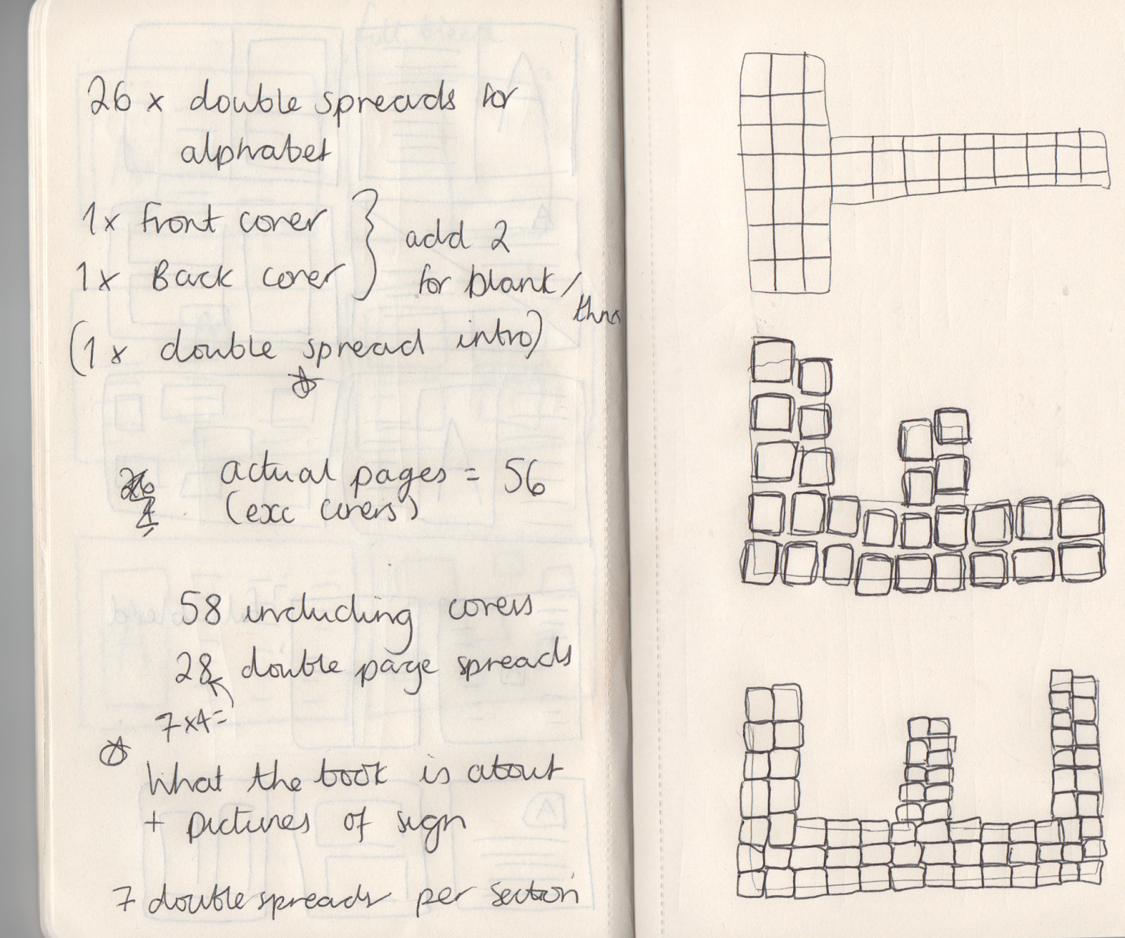
Above is the planning of the document that I will have to set up on InDesign to start with as a draft, changes can be made later if necessary. On the other side of the page are some initial sketches - I plan to create an alphabet in capital letters inspired by the Glastonbury sign that will be used to show what letter you are on in the guide. I did 3 different designs based on the sign to see what style fits best in terms of the patchwork and how it is organised. I believe either the E or F look the most authentic so I am therefore going to develop a mix of the two digitally.


Above is a quick mockup of how the guide would be structured when printed out, it will be a number of small sections gathered together and attached using perfect bind with glue. This is the best method as the guide itself is going to be quite a few pages so a classic saddle stitch wouldn't be strong enough.
No comments:
Post a Comment