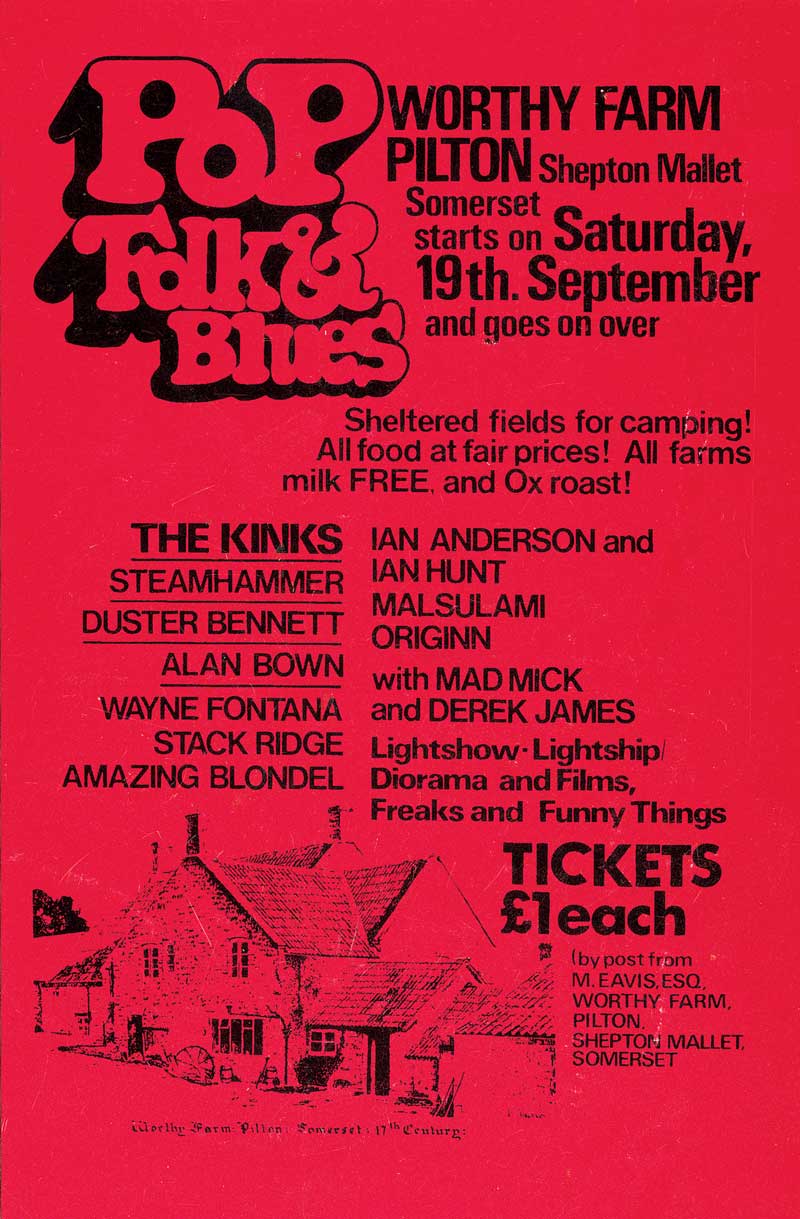
The first Festival was held on the day after Jimi Hendrix died, over a two day period and before long “word had got around”. It was the Blues festival at the Bath & West Showground that had inspired Michael Eavis to begin a festival of his own although on a smaller scale.
Acts to appear included: Marc Bolan, Keith Christmas, Stackridge, Al Stewart, Quintessence
Attendance: 1,500.
Price: £1 including free milk from the farm.
2017
A truly vintage year for the Festival, as the sun shone and Radiohead, Foo Fighters and Ed Sheeran all delivered superb Pyramid headline sets, while Jeremy Corbyn attracted a huge crowd for his speech, and David Beckham stopped off in Pilton on his way to the Festival to open the village’s new social housing.
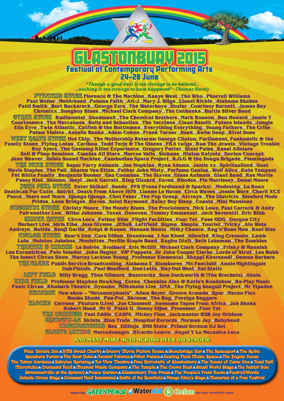
Conveniently I have attended Glastonbury myself twice, in 2015 and 2017 (Line up pictured below)

Apart from the history of the festival there is not much more general research I need to do, as I have the text that will be included in the book I don't have to source information nor do I have to research what the festival is about, the layout, what is there or what it is like as I have been twice myself. The research that will be more important is about design and layout to create the book.

I would very much like to incorporate the Glastonbury sign in the design of the book. The rainbow colours show exactly what the festival is about - accepting everyone and everyone being different, however everyone being there for the same reason- to have a good time. The feeling of being at Glastonbury is that everyone wants to be there and anyone would help you if you were stuck. As well as the sign itself meaning a lot, it's location is a very special one, from the top of the hill you can see the whole of Glastonbury festival and it looks the size of a town. You can't grasp the size until you sit on that hill and look out.


As for the actual design of the festival itself I have done some research on Collateral design such as programmes, lanyards and tickets and discovered it changes every year. I don't really want to pull design from the festival itself as it could be seen as a rip off, my goal is to communicate the festival itself through the guide rather than the promotional and information material it creates every year. Below are some examples of the ever changing designs and ideas for the programmes and other design work such as line up posters that are released a long while after the tickets are put on sale - this in itself shows the power and demand of the Festival (it sells out before line up is released - as it is so much more than just the headliners). I want to show in the guide the other things to do other than just sit at the pyramid stage for the whole weekend.

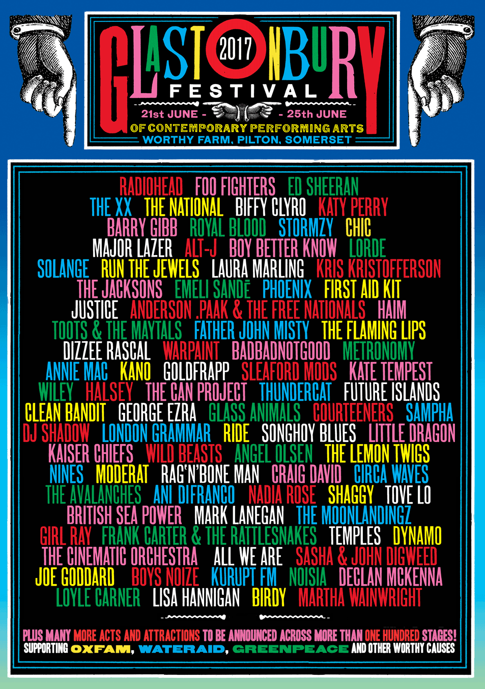
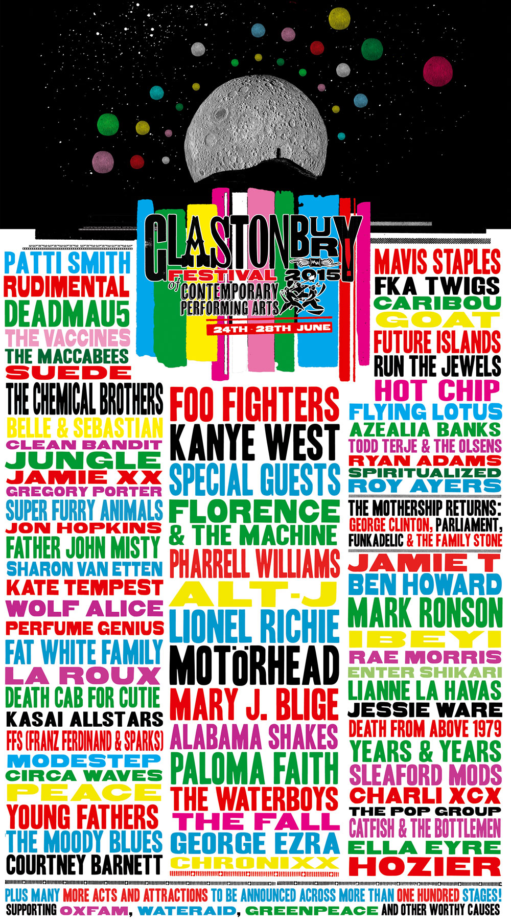

The only general running theme is the use of colour, all of the designs are almost a rainbow of vibrancy and celebration. I will take this from the designs and use it throughout the guide.
No comments:
Post a Comment