WWF came into existence on 29 April 1961, when a small group of passionate and committed individuals signed a declaration that came to be known as the Morges Manifesto.

Logo - The inspiration came from Chi-Chi: a giant panda that had arrived at the London Zoo in the year 1961, when WWF was being created. Aware of the need for a strong, recognisable symbol that would overcome all language barriers, WWF's founders agreed that the big, furry animal with her appealing, black-patched eyes would make an excellent logo. The first sketches were done by the British environmentalist and artist, Gerald Watterson. Based on these, Sir Peter Scott, one of those founders, drew the first logo, and said at the time... "We wanted an animal that is beautiful, is endangered, and one loved by many people in the world for its appealing qualities. We also wanted an animal that had an impact in black and white to save money on printing costs." The black-and-white panda has since come to stand as a symbol for the conservation movement as a whole.
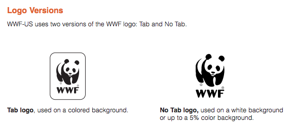
I was only able to find the brand design guidelines for the US WWF they are as follows:


Helvetica is the only typeface named in this brand book however to create an app more than one font must be used to differentiate and stand out especially given the topic. After looking at the website again I noticed that Georgia is used for subtitles and quotes, with a sans serif for body text.

No comments:
Post a Comment