Album artwork


Typefaces

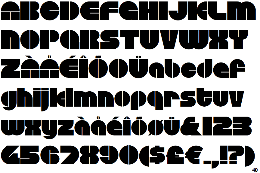
Blippo one of the earliest of the 1970s Bauhaus-inspired phototype faces, Blippo was designed in 1969 by Joe Taylor for FotoStar, as part of their Facsimile Fonts range. It was inspired by Burko and named Blippo Black by Joe's boss, Robert Trogman. [Joe Taylor, Bob Trogman]
Disco - Geodezyx NF - A 1960s/early 1970s typeface of unclear origin. Various digitizations including Disco (Softmaker, B&P, Brendel), Disandat (Brendel Informatik & SoftMaker, 1990–93), Outland (FontBank, 1990–93, used for the sample), Discotheque (WSI, 1993), D730-Deco (Softmaker, 2002, all pretty similar), and Circular Saw (SWFTE, 1995).
Geodezyx NF (Nick’s Fonts, 2008) is a commercial version by Nick Curtis, who mentions Disco as his source. It appears to be less authentic in some details.
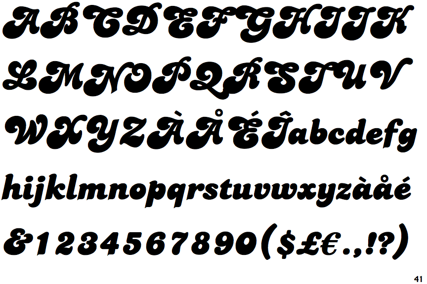
Alan Meeks designed the Candice typeface in 1976. A groovy swirl of a font, Candice looks like an ice cream sundae topped with whipped cream. Candice is often seen on album covers, and has come to be associated with innumerable party hits from the 1970s. One thing is for sure: Candice is a child of it's times - flashy, lively, and fun!
Harry - Originally designed by Marty Goldstein (and C.B. Smith) and published by VGC in 1966. Harry is named for Goldstein’s father. The 1972 VGC catalog shows 6 styles; Thin, Plain, Heavy, Fat, Obese Squeezed, Obese.
Revived by Steve Jackaman and Ashley Muir as Harry Pro (ITF/Red Rooster, 2010), adding 4 new styles to the original 6 [MyFonts], resulting in 5 weights each in regular and condensed (“Squeezed”) widths.

ITC Neon Based on Prisma. No proper digital version currently available.
Colour palette
The colors of the seventies were pretty drab in comparison to those of the psychedelic sixties. The country was recovering from the turmoil of the Vietnam War, and the desire for peace and calm was reflected in the dark wood and warm earth tones of the period.
Avocado Green and Harvest Gold were important colors (especially in appliances), and were frequently mixed with toned-down versions of sixties orange. Primary colours, often seen in the more futuristic pieces of the period (such as molded plastic furniture), added a playful element to the overall palette of the decade.


No comments:
Post a Comment