Although I had intended on completing the full thirty logos to better my logo skills, as well as encouraging myself to complete briefs in a quick time - to make snap decisions and not dwell on research for too long before getting stuck in. I have decided to finish the brief at number 10, the main reason being prioritising other work, and feeling as though 10 goes at this was well enough and I have gained from the brief what I set out to do. I have 10 quick responses to 10 different briefs and have learnt to carry out research a lot faster, as well as making design decisions faster if there are strict timings. I also feel as though my other briefs are teaching me these things in different ways, I have managed to get a lot more confident producing logos throughout the briefs. I am happier with some of the outcomes than others, which I replicates how I will feel when I become a graduate, clients and projects aren't always going to be right up your street and it is important to make the best out of a bad brief. This however was difficult with some of these, as there was minimal information and inspiration. I am happy with more than I am not with though, and have learnt to experiment with different typefaces and colour schemes I wouldn't usually work with.
Tuesday, 11 December 2018
Monday, 10 December 2018
SB6: 10 - Anchor
Clothing line for the nautical lovers, products produced with recycled boat sail material
Features the iconic shape of an anchor
Colour outside of blue
Logo will be used on t-shirts, polos, pants, tags, all other types of apparel
Text is not required unless logo is part of the text
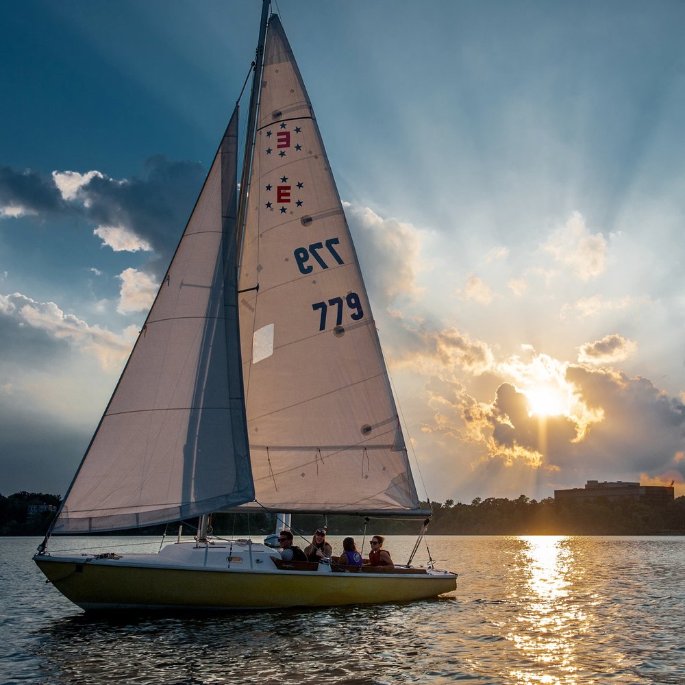
I decided to start by doing some visual research into all things nautical.
I also had a search to see if there are clothing lines out there already in existence for nautical lovers.
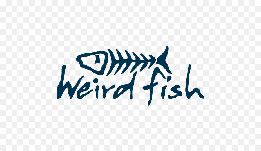
This company has gone for the obvious blue. This is the only company I could find that have a clothing line at the moment explicitly inspired by nautical.
I experimented with different styles of drawing to create anchor shapes, I did this using a drawing tablet and Adobe Illustrator.
I decided that the two styles above are the best of the bunch, they are fun and imperfect rather than being rigid and same old. As Anchor don't want the predictable blue, I played around with different colour combinations and shades.
I decided that the green and purple worked best as a colour combination, both colours are close to blue on the colour wheel and could be associated with the maritime and nautical theme. Using one line that is thicker than the other makes the simple anchor drawing on its own, look more like a logo.
Adding the rope gives the logo another layer that will help it be more memorable to customers. Above and below is further experimentation with different line weights and colours, I wanted to make sure that the final design was the best option and experimenting with small details was the way to do this.
Below is the final logo, I am happy with how it turned out and am confident that I creatively thought outside of the box with a brief that had a number of constraints.
Sunday, 9 December 2018
SB6: 09 - Paint ™
'But we think it is too bland'
'Open to a text based logo - or one that has an icon'
Sherwin Williams Paint
PANTONE Colour
The new logo must communicate that the app is capable of matching any colour, the company name does indicate that the apps purpose is related to paint however visually doesn't stand out on the market. I am going to add a lot more colour and use the logo name within an icon or some shapes.
experimenting with different typefaces and manipulating them to look more like a logotype than just some text.
i tried to make a gradient using illustrator in the shape of a circle, adding a black outline and the paint type. i thought that this worked well, however looks a bit old in style, a more broken up and clearly defined rainbow of colours would look better.
this is the result i came to when trying to make a more modern colour wheel, one that doesn't look so wordart-esque. i am a lot happier with this to use for the logo, it is also a lot more vector friendly and would look better on the different platforms it would be used on.
above is the final design, the colour wheel works well with the boldness of the logotype. the use of black outlines also fit with the style of the logotype and help the logo as a whole stand out and hold its own against others.
Saturday, 8 December 2018
SB6: 08 - Sparked
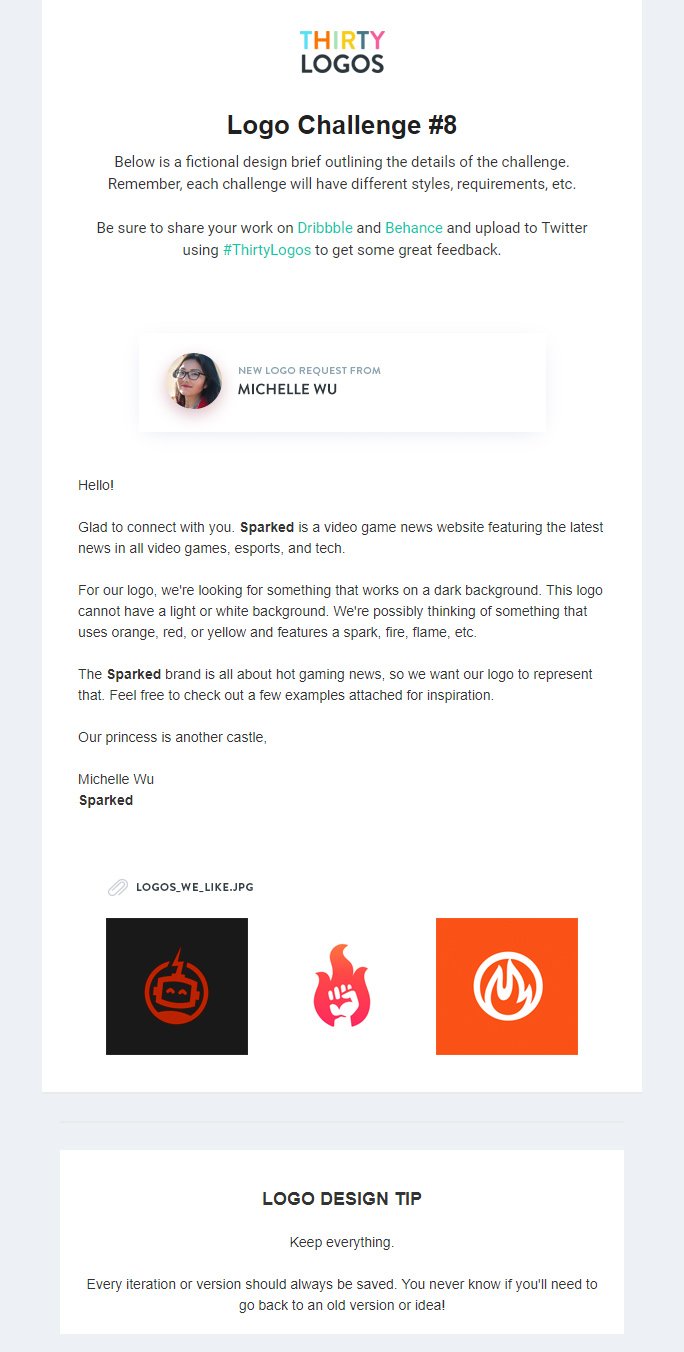
Logos they like:
Orange, white, red and black. Featuring flames, circles, robot, spark, hands (power), fire.
Sparked do not want a light/white background and the logo must work with a dark background. Sparked is about hot gaming news
I started to experiment with game controller silhouettes and flames - the logos that Sparked like were simplistic shapes so I have gone with that style. I also tried out using their name with a flame however decided against using it, the name is a bit too long for a short and concise logo.
I went forward with developing the simple controller and flame idea, the games are new and hot and the news the company delivers is hot off the press.
Using the original controller shape and second flame as aesthetically these work best together, I decided on a simple yellow and orange colour scheme - the gradient was interesting however on a dark background the simple two tone looks better.
I wanted the logo to be slightly more recognisable and interesting that just two icons in a circle, so decided to bring the flame out of the circle, showing that the flame can't be contained and is really radiating out of the controller.
Above is the final logo design, it works well with a black background and at a quick glance tells the viewer the company is tech/game focused and the flame signifies the hot news aspect.
Friday, 7 December 2018
SB6: 07 - Austin Run
Charity logos:
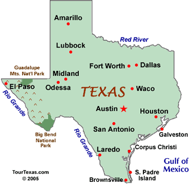
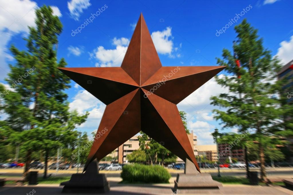
Austin:
It could feature the Texas state shape, a landmark that represents Austin, something that represents running, or even just a text logo.
Here I experimented with different ideas in terms of colour, typeface and icons used.
I felt that the logo including the Texas state shape was the strongest design, and decided to change the typeface to something more neutral and legible - Helvetica Bold. The colours I use are a nod to the American flag.
I further developed the final design to include a running man icon in the Texas map, this enables the viewer to understand the logo without even having to read the text - however this is included with the 'charity run for autism' as clarification.
Subscribe to:
Comments (Atom)


