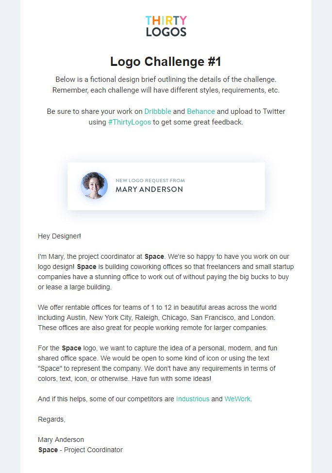
Key words:
Personal, modern, fun, shared
An icon or the word "space" to represent
Competitors:
Wework
'When we started WeWork in 2010, we wanted to build more than beautiful, shared office spaces. We wanted to build a community. A place you join as an individual, 'me', but where you become part of a greater 'we'. A place where we’re redefining success measured by personal fulfilment, not just the bottom line. Community is our catalyst.'
Industrious
'Whether you’re just starting out, growing your business, or entering new markets, our thoughtfully-designed spaces and hospitality-driven workplace experiences bring out the best in your teams. Our flexible lease terms and national network help you grow on your own terms.'
The two competitors logos are very different from each other, with wework using a serif font for their logotype and simplifying/ shortening to 'we' to create an icon using a circle. Industrious takes another approach, using all caps and a more modern sans serif and an illustration above to create an identity.
Initial ideas:
As the brief says they want a 'modern' logo I am going to use a sans serif typeface, with an icon - to represent the personal, yet shared workspace.
The icon I designed is a square, as I thought this would send peoples mind to working environments, including desks etc. The idea behind the design is the two smaller squares are using the bigger square as a workspace, they have their own personal space in within the bigger square but are also sharing it in a fun environment.
I tried out a lot of different sans serif typefaces and felt the one above worked the best with the logo. Making the lines in the logo thicker Impact typeface works well, I do however think there is a typeface that would work even better, with the logo slightly smaller above the text.
This is the variation I have decided on, the typeface is Helvetica Neue - condensed bold, with a 350 tracking. The icon lines are at 6 point, to fit the style of the condensed bold. I felt that the icon is more effective being smaller above the text as it acts as more of an icon rather than the whole logo being an image. As the competitors logos are black and white, I thought it would be appropriate for the Space's to be, it can be rolled out to all platforms and colour can be added if needed but for the classic logo I felt black and white pushed the professional aspect of the business.


No comments:
Post a Comment