'But we think it is too bland'
'Open to a text based logo - or one that has an icon'
Sherwin Williams Paint
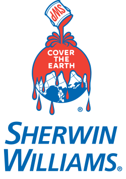
PANTONE Colour

The new logo must communicate that the app is capable of matching any colour, the company name does indicate that the apps purpose is related to paint however visually doesn't stand out on the market. I am going to add a lot more colour and use the logo name within an icon or some shapes.

experimenting with different typefaces and manipulating them to look more like a logotype than just some text.

i tried to make a gradient using illustrator in the shape of a circle, adding a black outline and the paint type. i thought that this worked well, however looks a bit old in style, a more broken up and clearly defined rainbow of colours would look better.

this is the result i came to when trying to make a more modern colour wheel, one that doesn't look so wordart-esque. i am a lot happier with this to use for the logo, it is also a lot more vector friendly and would look better on the different platforms it would be used on.

above is the final design, the colour wheel works well with the boldness of the logotype. the use of black outlines also fit with the style of the logotype and help the logo as a whole stand out and hold its own against others.
No comments:
Post a Comment