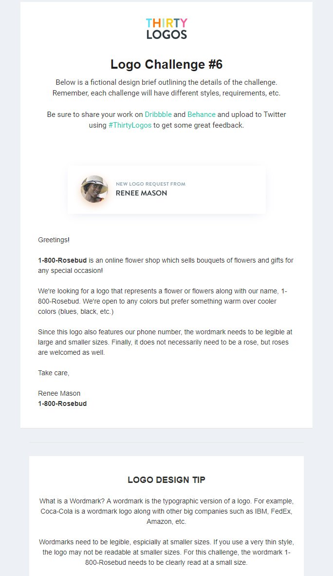
prefer warmer colours
include text 1-800-rosebud
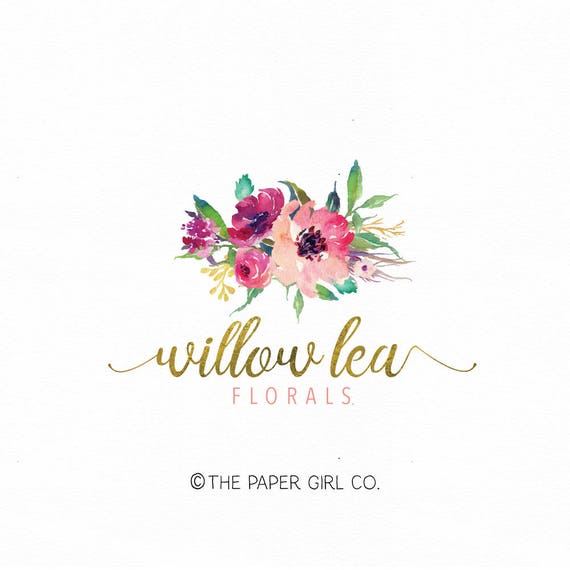
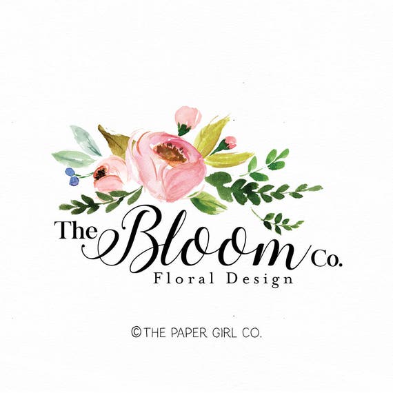
Other florist logos:
These logos include fancy serif typefaces that suit the names of the companies. They also feature flowers, with the greenery but important to note not just one flower. Florists tend to specialise in bouquets so it is important to communicate that. These logos are very illustrative, a lot more than the other examples I have looked at for thirty logos before, this is inline with the handmade feel and personal touch that sending flowers is.
For the typeface I used Krungthep, I liked the way the 00 include the line through the middle, to distinguish them from being the letter 'o'. It is bold and legible, even if the logo was reduced to a very small size. The illustration uses pinks and reds, as the company wanted warm colours, this is the focus, I added a bit of green to represent the stems of the flowers as most great bouquets have splashes of this colour in them.


No comments:
Post a Comment