Charity logos:
Austin:
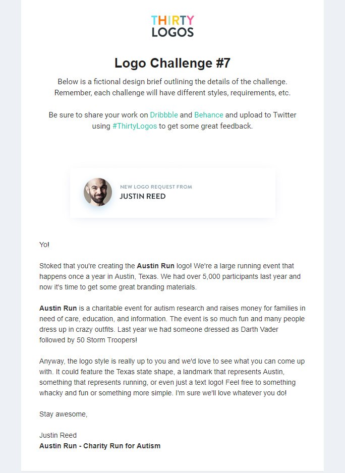
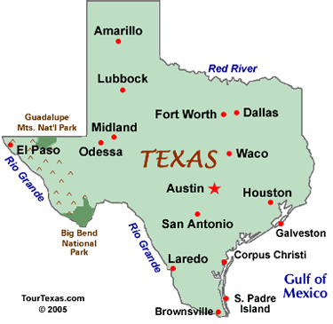
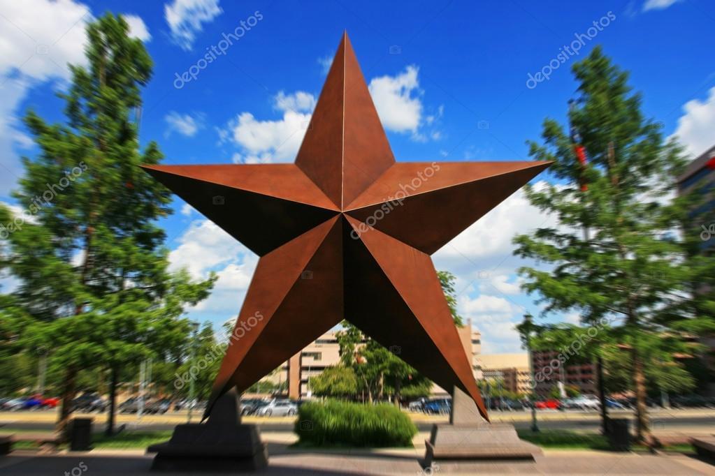
It could feature the Texas state shape, a landmark that represents Austin, something that represents running, or even just a text logo.
Here I experimented with different ideas in terms of colour, typeface and icons used.
I felt that the logo including the Texas state shape was the strongest design, and decided to change the typeface to something more neutral and legible - Helvetica Bold. The colours I use are a nod to the American flag.
I further developed the final design to include a running man icon in the Texas map, this enables the viewer to understand the logo without even having to read the text - however this is included with the 'charity run for autism' as clarification.


No comments:
Post a Comment