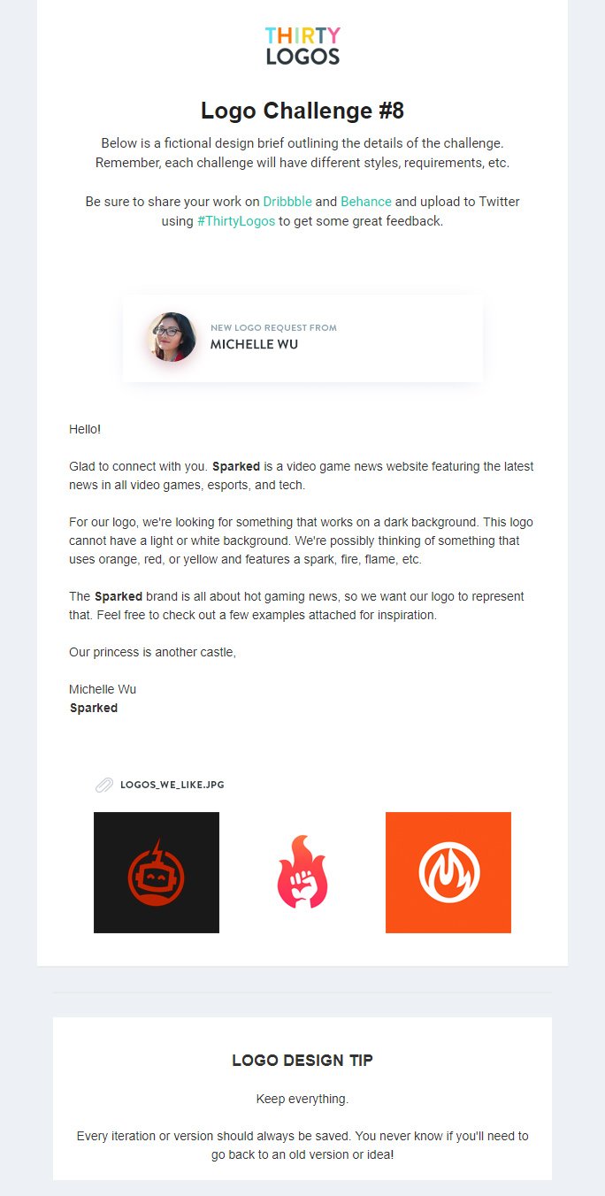
Logos they like:

Orange, white, red and black. Featuring flames, circles, robot, spark, hands (power), fire.
Sparked do not want a light/white background and the logo must work with a dark background. Sparked is about hot gaming news


I started to experiment with game controller silhouettes and flames - the logos that Sparked like were simplistic shapes so I have gone with that style. I also tried out using their name with a flame however decided against using it, the name is a bit too long for a short and concise logo.


I went forward with developing the simple controller and flame idea, the games are new and hot and the news the company delivers is hot off the press.

Using the original controller shape and second flame as aesthetically these work best together, I decided on a simple yellow and orange colour scheme - the gradient was interesting however on a dark background the simple two tone looks better.


I wanted the logo to be slightly more recognisable and interesting that just two icons in a circle, so decided to bring the flame out of the circle, showing that the flame can't be contained and is really radiating out of the controller.

Above is the final logo design, it works well with a black background and at a quick glance tells the viewer the company is tech/game focused and the flame signifies the hot news aspect.
No comments:
Post a Comment