Key words:
Orange, green, other earth tones
No brown
Text based or icon
Coffee bean, plant, grounds, coffee cup
Logos they like:
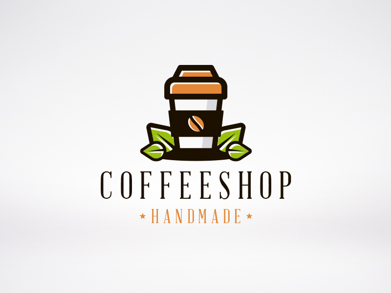
a serif typeface with a high tracking
uppercase text
take out coffee cup with leaves
brown, orange and green

sans serif, uppercase text
b letter using a coffee mug
brown colours
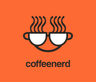
lowercase sans serif
two coffee mugs joint together to create a face w glasses
orange and brown
Initial ideas:
experiment with different colour combinations and icons
the grind
the grind
I am going to use a sans serif typeface as the words 'the grind' look better in a more modern looking style.
Ideas:


Starting off by using the coffee bean as imagery, I experimented with orange and pink, however realised this would be too close to the famous chain Dunkin Donuts brand identity. I also found it difficult to work with the coffee bean due to its shape.

I moved away from the coffee bean and decided to use a coffee cup to house the company name. The light pink works however isn't as bold as some of the logos the client said they liked. For this reason, the final design features a bold burnt red and light brown, whilst also adding uppercase for name.


These are the two final designs, using the same colours but with the ability to switch them around depending on the use they are needed for - menu, signs etc. The typeface is called Krungthep, and I think it suits a coffee shop as it is sans serif however looks strong, stable, reliable and alert.
No comments:
Post a Comment