Jewish Museum Rebrand - Sagmeister & Walsh
http://sagmeisterwalsh.com/work/all/jewish-museum-identity/
As shown below the branding heavily uses IKB as it's primary colour, the use of blue is highly relevant to the Jewish Museum as the Star of David is regularly seen in blue, and the use of IKB really makes it stand out of the crowd, adding a new lease of life to the museum.


Beyonderground Helsinki - Ronny Duquenne
https://www.behance.net/gallery/21374683/Beyonderground-Helsinki


Addrn identity redesign - Call Me Papa
http://appellemoipapa.fr/projet/addrn/


Margot Leveque - Personal business cards and stationary
https://www.behance.net/gallery/35369457/Business-card-ICU-MargotLveque


Aloa Input - Moby Digg
https://www.behance.net/gallery/28078517/Aloa-Input-Mars-etc


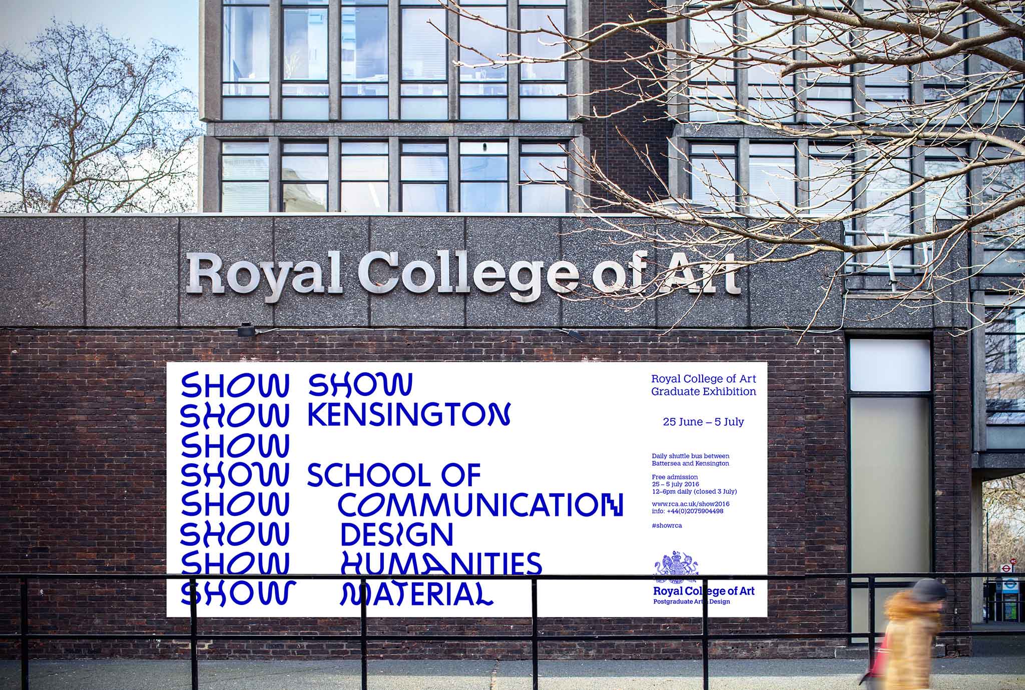
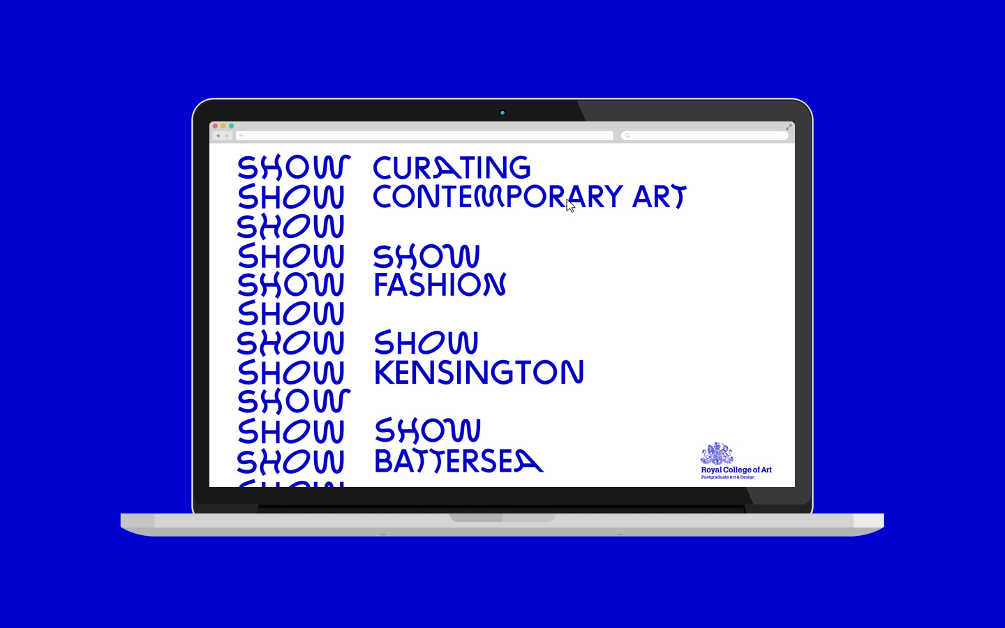
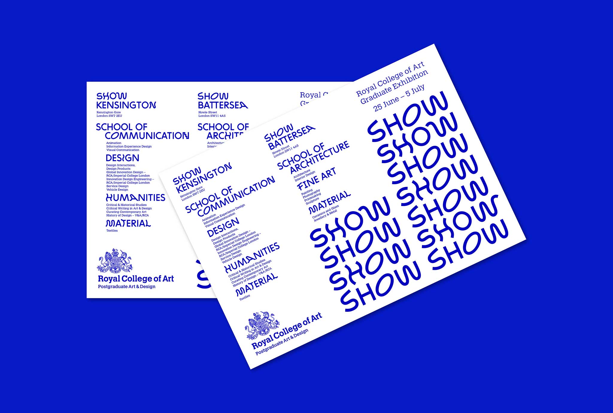
RCA Graduate Exhibition 'Show' - Summer Studio
http://summerstudio.co.uk/royal_college_of_art_SHOW_2016/
Overall I do think in recent years the colour has been used a lot more simply because it is on trend and can give a strong visual impact with just a handful of other colours if any, however this doesn't mean that the designers don't appreciate the depth of the colour. The reason it has come back into fashion is the fact that it does the job, it is vibrant and gets peoples attention.
No comments:
Post a Comment