
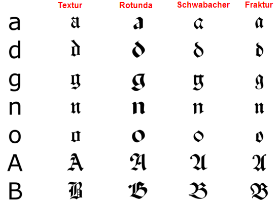
Four major families of black letter can be identified, they were evolved in Western Europe from the mid twelfth century: Textura, Rotunda, Schwabacher and Fraktur. You can really see the difference in the separate typefaces if you consider the 'O'. Blackletters are difficult to read as body text and Roman and Italic faces were easier to print with movable type, for these reasons it became less popular in 1500's with the exception of Germany still using it along with German speaking countries.
Use in modern day
As there were advances in technology and advertising, there were improvements in fonts and blackletter became a lot more eligible and therefore can now be used digitally very easily. It is seen a lot in alcohol brands such as Steinlager below, I believe it used to associate the beverage with german heritage as they are well known for their quality beer. The typeface is also seen a lot in band logos for heavy music, as well as gang style tattoos - revealing a dark side to the typeface.


No comments:
Post a Comment