Saturday 26 January 2019

SB2: Evaluation


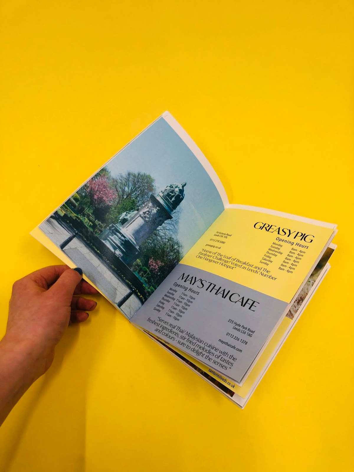
This brief was a great success, in terms of everything apart from what was out of our hands - the production process. The final publication design that I produced answered the brief, the design was geared mainly towards students, however wasn't that edgy/ out there that the general public wouldn't appreciate it. The book was designed at a5, a handy size that could be carried around in someones bag and easily placed around the city in venues and businesses for people to pick up. The patterns I designed were relevant to the style of the publication, and the colour scheme represents Leeds. When I handed the design over to Hannah, she included even more icons to link with Leeds - the owls, which is based on the Leeds crest. 

The publication design is easy to read, holds all the information that someone would need, without bombarding them with facts and other unnecessary page clutter. I was sure to steer clear from too much type, as it could be off-putting, as it was in the city guides that I analysed. Working with Hannah on the publication was a good fit, as she is a lot more comfortable with the production side of things, I prefer to work on layout and digital design. To get the most out of this brief, I decided to produce a website design, in order to further develop my digital design skills. The website was a success and held the same minimal, but useful style of the publication, it imaged Independents as a company who features different cities, with info about each publication printed and a few features of businesses that are in the print. 

The production issues, were out of both mine and Hannah's hands, we left plenty of time to print however it was disaster after disaster, and in the end we couldn't afford to waste anymore time or money on this brief, as we both had other briefs to manage. The lesson learnt from this is to select a trustworthy printer/ producer. From the finished product you are very much able to get a sense of what we were trying to achieve, and you can see this also from the InDesign designs, as well as website designs from XD. I enjoyed collaborating on this brief, and carrying out all of the research and editing it involved. 

Friday 25 January 2019

SB2: Production 02

From Hannah's blog:

I experienced some trouble with the printing process but not because of a mistake on behalf of me or Becca. Despite the document being produced/formatted correctly ready to print, the book was printed with one page missing which threw the whole rest of the pagination off. This happened 3 times with the printer which delayed the production process a lot in the lead up to the deadline.

One issue that we did face and resolve during the printing process was with trying to download the typeface Ivy Mode onto the printer's computer. Eventually, we went back into the InDesign document and expanded all of the type. although this isn't a major problem, it is definitely something I will do from now on before going to print, to save time. 

Printing:
The book was printed onto Olin regular as it's a thin weight, fairly cheap paper that wouldn't be too expensive to produce in a large number. For the cover a thicker stock was chosen; matt 245. The use of a matt stock was fine as there were no high-quality images on the cover. Also, all of the images inside the guide had a colour overlay and slight grain added to them to counteract the quality of some of the photos and to ensure the images looked consistent when printed.

Binding
I selected a perfect bring for the guide as it's 64 pages which means otherwise I would have to use a form of coptic stitch with wouldn't be appropriate for a mass-produced city guide. Due to the size of the book (thickness) the book had to bound with a machine instead of by adding individual glue layers. This is quicker, more effective and provides an industry standard.

This is the book printed in its individual A3 spreads.


The first job involved laying out the pages and making sure none are missing and they're all in the right order. 


The next part of the process involved using the guillotine to chop the edge of the book that will be bound, to the crop marks. This is where the glue will be applied. 


The next step involved measuring the width of the book to figure out how thick the spine needs to be. For more accuracy, we used an electronic measurer which measured the spine width at 15.36mm. 


Once the pages were organised and lined up I handed the book to the technician to operate the perfect binding machine, as it's new equipment and I'm not trained to do it. Once the glue was applied, the publication was left to dry overnight ready to be chopped down to size.


The final part of the production process was cutting down the book and for this, I used the electric guillotine to get better accuracy.


Production Problem
Once the book was correctly chopped down to size, I discovered that the guillotine had cut the publication on an angle and taken off some of the content at the bottom of the page. There was also a white space at the top of the publication, above the crop marks, so it was very clear that something had gone wrong in the binding/cutting process. I took the book back to the technicians in the binding room and they informed me that the book had been bound incorrectly and the pages lined up at the spine on an in an odd way. Because of this, when the publication was cut down based off the cover crop marks, part of the content was taken with it. This was something completely out of my control as I had no reason to believe that the bind would be off. 

Due to the fact that the printing process went wrong so many times and with the high demand of the digital print room leading up to the deadline, there was no time to reprint the book. Had the printing process of gone smoothly the first time, and the book been bound correctly, the publication would've been printed to a really high standard because the rest of the book is really successful. The publications cost £40 to print and at this point, there isn't much that can be done in the way of reproducing it. 

I can't necessarily evaluate what I'd do differently in this situation as the problems in this instance were out of my control. I have however learned a lesson in the way of choosing where/how to print my design. There is always a risk of problems in the printing process when you hand your designs over, however, from now on I will make sure to get a test print produced so I know the publication is going to work out OK, and also would print the book externally (outside of University) If I were to make it again.

Photos of the off bind:
  

Thursday 24 January 2019

SB2: Production 01

Production was Hannah's side of the brief however I tried to be there when she was printing and binding incase she needed any help. We encountered issues with printing right from the start, when we went down to digital print resource for the booked slot, Adobe TypeKit wouldn't sync after multiple tries. This meant that the typefaces we had used weren't available as they don't come standard on the machines used in print. We were able to solve this by going back to the original document and outlining each bit of copy - which took its time and eventually we were able to print however it wouldn't be ready until the next day. This was the first issue we overcame, the next day we went to collect the prints and discovered they hadn't printed in order and pages that were supposed to be opposite each-other were on the back of each other. The front cover was also on it's own rather than with the back cover in a different stock. This happened a few more times until it was finally printed correctly, almost a week after we originally tried. The fault lies with the printer and how it was setup, but these are things that will happen in industry and I was glad we had left time to spare incase of these situations. We used a thicker stock for the front cover, with a standard matte for the inside contents - to make sure it wasn't too bulky to bind. The bind chosen was perfect bind, gluing the edge of the pages using a machine, leaving it over night and then binding with the cover.


Wednesday 23 January 2019

SB2: Web Design Development


I wanted to use a colourful background that excited the user when they landed on it, this colour had to represent warmth, friendliness, caring, low cost, cheerful and creative. After doing a lot of research into different colours meanings, the ones most relevant ended up being - red, pink and orange. The tone I decided on has a bit of each of these in it. 


Once you are on the site, I wanted it to feel contemporary and eye catching, all of the websites I had done research on had either white backgrounds or a drab colour, I wanted this one to stand out and so decided on using a black background with white text (and the occasional use of the peachy hue).


This is the 'home page' as the site is minimalistic, only featuring about and a feature on the current issue published, there is really no need for cluttered pages. 


The about page is very simplistic and will feature a small paragraph about the Independents. All of the pages except the home one will have a header featuring the main pages, with the smaller logo to the right, this is in a different position to the initial wireframes in order to give the content more space on the page. 


The cities page will feature all the volumes published, so far only the Leeds one, there will be a photo of the book. The button underneath allows the user to view the featured leeds page below. 


The featured Leeds page will show a small selection of Independents that are featured in the publication. It gives the user a taste for what to expect if they manage to pick up a copy of the printed version. 


Above is an example of what you will see if you click on one of the featured businesses, each will have their own page including the information that the book holds. 


I added a contact page button, as well as social media links at the bottom right of the pages. 


I simple image traced the social media logos in Illustrator and changed the colour to match the peach shade I had been using. 


I added in the about paragraph.


As well as adding in some contact details. 


At the point of making this website design, the publication is still in the process of being made, so I decided to just use a mock up of the front cover for this specific page. 


I added in the photographs and names of the independents, it was a struggle to get the layout right as all of the images are different dimensions, I didn't want to alter them as you wouldn't then be able to see the whole photograph. 


I experimented with using both black and white text to go over the photographs in these pages, but decided on white, making them legible by turning up the transparency on the images. The layout on these pages differs from the wireframes, I changed it so the header felt more of a header and let the businesses have the page to themselves, the independents logo is smaller in the top left, allowing for the photographs to flood the whole page. 


The only difference in the pages above to the ones just before, is the addition of 'next' and 'previous' buttons, I realised if you got onto these feature pages, you'd have to go back to cities, then discover more, then click on another just to see the next. The flow is a lot better with those options there, you can flick through them all. I also adjusted the setting of the logo on the home page, as there was a slight difference to the landing page, you notice as you go from one to the other. The next step was to go into prototype mode on Adobe XD and get all the links ready to go, below is the finished prototype in video form, clicking through the web design.