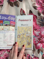
I gathered some city guides to get an idea of what is it out there in terms of guides for tourists, it will be visual research and a guide of what to stay away from. The guide me and Hannah will be making will be contemporary, fresh and interesting rather than the mundane and generic guides that were a popular thing of the past - nowadays people don't use them as much as the internet exists, this is why we need to go in another angle and produce a guide that is nice to hold and aesthetically pleasing, something people would keep in their rooms long after use.
Photograph front page, bold black rectangle over the title, contrasting with the white text.
Large amount of text on each page, some people may not be able to read, a small photograph example.
Travel tips and travel tips in different coloured page, again a lot of text.
Detailed pull out maps of Berlin, handy to have but couldn't really be used as main map, small.
Photograph cover with book name in contrasting orange. A lot of text in columns, broken up by titles and including a photograph of something mentioned in copy.
'With foldout map' info on the front cover, encourages users to buy, text in lists with informative photographs and a few different maps.
A lot of photographs and lists, a lot of information on each page, holding the users attention. Front cover lists what is inside with a free map and guide, as well as a photograph.
A bold front cover that stands out, multiple photographs on the cover and a nice layout on the inside, big titles, photographs and smaller paragraphs of information.
An attractive front cover with a lot of main attractions photographed, big promise with 'best trips'. Inside is colourful with lots of maps and listed information.
Front cover full of photographs but a boring white background, 'New York' off centre. Inside different sections, easy to navigate and a few photographs per spread. Lots of maps inside of the different areas, double page spreads.


No comments:
Post a Comment