To start thinking about how I wanted the poster to look I did some quick thumbnail sketches for layout. From here I considered whether I wanted to go with landscape or portrait, I felt the more interesting to look at is landscape, it isn't often used either by the Museum but is suitable for bus advertisements, billboards and the tube underground.
Ideas for what could be present on the poster:
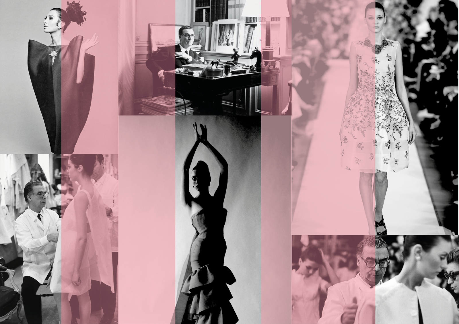
- Photographs of Cristobal himself
- Photographs of some of the work on display in gray scale - as to not give everything away before people visit
- Sketches from his earlier days
- A quote from the website about the exhibition
- Where and when
- The V&A logo
- Illustrations of his work
- Comparison between back then and now

The first idea I experimented with for the V&A poster was to use images of the things on display as well as images of Cristobal Balenciaga with some colour overlay - inspired by the colours used on the website for the exhibition.
I then added some text (typeface similar to the logo) information about the exhibition and the V&A logo. However after consideration I thought the poster looked amateur and didn't suit the usual aesthetic of the V&A posters. The titles are usually larger, with information small and the majority of the page being taken up with imagery/illustration.


The idea of splitting the design in half with two different colours was to represent the old and new seen in the exhibition from his (Balenciaga) early sketches to the designs that are sold now under the creative direction of Demna Gvasalia.

After looking again at previous examples of fashion exhibition poster such as the ones seen below:

I realised that the V&A logo must feature more heavily in the design, so I decided to incorporate it within the swirly line background. The two objects blended together seamlessly and with a change of colour the design came together. I also added more information at the bottom of the poster for people to be more informed, in a row of 4 separate sections using a grid to divide it up dependant on the content - for example the opening date and quote about the exhibition requires more space from a typographic hierarchy point of view. I also included the Balenciaga logo so that people immediately spot what the exhibition is, if a bus is going past someone will identify the V&A logo and the Balenciaga and are able to search for more information later.

No comments:
Post a Comment