Familiarity
It may be tempting to go outside the box with your mobile app UX design, but if users don’t understand how to use your app – they’ll abandon it.
Your app should ooze familiarity. Users should be able to easily predict the next action and what will happen if they tap a certain custom control.
A great user experience design for a mobile app should take the following device-specific nuances into account: Steven Hoober studied the habits of 1.300 mobile users and came to the next conclusions:

Take common gestures into account. Those may vary from platform to platform and on different devices, yet you can stick to the core ones suggested by LukeW:

Don’t forget about the texts too! Use shorter texts prompting instant action e.g. Buy, Register, All Products etc. Keep the important labels short as people on mobile are impatient e.g. Name instead of Full Name. Make sure all the wording is consistent across all app screens.
Simplicity
Clutter is the mortal enemy of any great app design.
Why users abandon apps:
- 62% will not give a frozen/crashed app a second try.
- 47% of users hate slow apps and the majority expects an app to launch in 2 seconds.
- 37% will abandon an app if it doesn’t work as expected.
Marissa Mayer, Yahoo CEO, advises using the two-tap rule. It should take just two taps to do anything you want within an app or web service. The less your users have to think about their next move in the app – the more delightful their experience with your company will be.
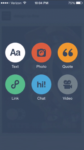
Replace texts with icons whenever possible.
Build an app that accomplishes one goal perfectly, rather than a mediocre one with multiple features. The apps main goal is to store recipes for users and enable them to discover new ones, adding features such as shopping list or meal planning is unnecessary clutter on the app.
There’s a famous quote by Antoine de Saint-Exupéry that says “Perfection is achieved when there is nothing left to take away.” It’s important to get rid of anything on a mobile design that isn’t absolutely necessary, because reducing the clutter will improve comprehension.
Clarity
Meaningful typography: The key here is to balance legibility and space conservation. Don’t blindly copy typefaces from your desktop app and consider choosing simpler versions, which look great in small size. Sans serif and fonts with rounded edges pair well with minimalistic aesthetics and flat design.
Alignments should be used wise as well.
Left alignment for large text blocks as this goes in line with the natural reading rhythms.
Centre alignment for small text blocks e.g. headlines, call-to-actions, navigation texts. This improves visibility and looks more attractive than hanging texts.
Meaningful content: Good copy is essential for an app, however, don’t place all the value into texts. Apps are meant to be interactive, hence consider replacing certain text elements with icons or graphics.
Meaningful layout. Users shouldn’t zoom in to see your key content. All the elements should be distinguishable enough on mobile screens.
Good UI design addresses both of these design problems:
- In order to be useful, mobile apps should be user-centric. Users install your app because they need to solve a problem. Think about what it is your users will be trying to accomplish and focus on their key goals/remove all obstacles from their way.
- You should bring clarity into your UI. There shouldn’t be a room for confusion in your UI.
A simple rule of thumb: one primary action per screen. Every screen you design for the app should support a single action of real value to the person using it. This makes it easier to learn, easier to use, and easier to add to or build on when necessary. One hundred clear screens is preferable to a single cluttered one.
Mobile navigation must be coherent. You should use the proper signifiers (correct visual metaphors) so that the navigation doesn’t require any explanation and make sure that each navigation element (such as icon) lead to the proper destination.
Mobile navigation should communicate the current location. Failing to indicate the current location is probably the single most common mistake to see on apps menus. “Where am I?” is one of the fundamental questions users need to answer to successfully navigate. Indicate what page the user is on, make sure that the user can get back to home page if they decide they don't want to saerch anymore.
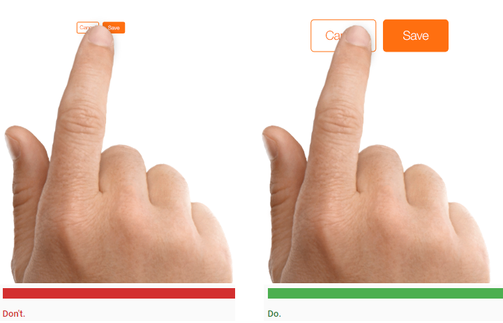
Design finger-friendly tap-targets
Create controls that measure have a size 7–10 mm so they can be accurately tapped with a finger. Such target allows the user’s finger to fit snugly inside the target. The edges of the target are visible when the user taps it. This provides them with clear visual feedback that they’re hitting the target accurately. Also ensure that there is good amount of spacing between tap targets.
A rule of thumb for mobile: text should be at least 11 points so it’s legible at a typical viewing distance without zooming.
It’s extremely important to have enough contrast on mobile: users might be outdoors with low contrast on the screen because of lighting.
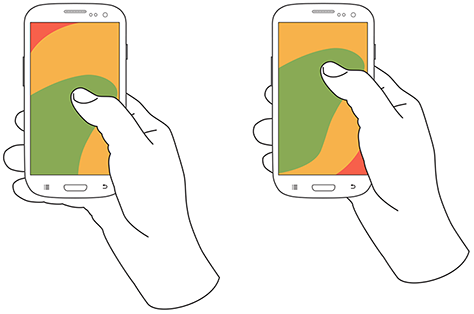
Comfort zones for a person’s one-handed reach on a smartphone. Image Source: uxmatters
Green indicates the area a user can reach easily; yellow, an area that requires a stretch; and red, an area that requires users to shift the way in which they’re holding a device. Hand positions and grip should influence the placement of controls on a mobile design:
It’s important to place top-level menu, frequently-used controls and common actions to the green zone of the screen, because they are comfortably reached with one-thumb interactions.
Place negative actions (such as delete or erase) in the hard to reach red zone, because you don’t want users to accidentally tap them.
Minimise Need For Typing
Add more pages for flows such as signing up, adding personal and card details so that the user doesn't see it as daunting and give up.
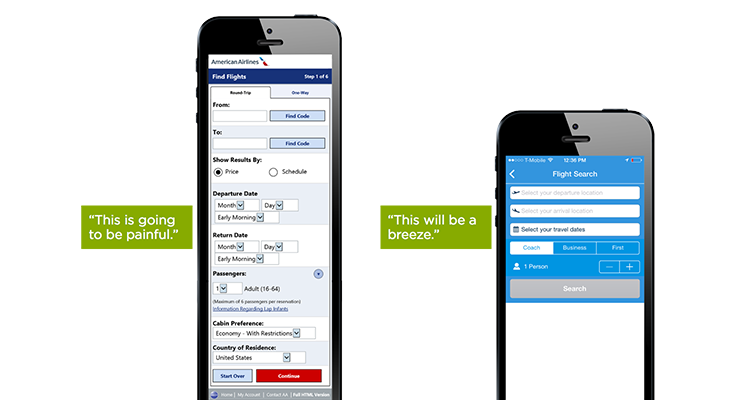
Keep forms as short and simple as possible by removing any unnecessary fields.
Test your design
Used the Adobe XD plugin option to test how the app looks and feels on an actual iPad.
No comments:
Post a Comment