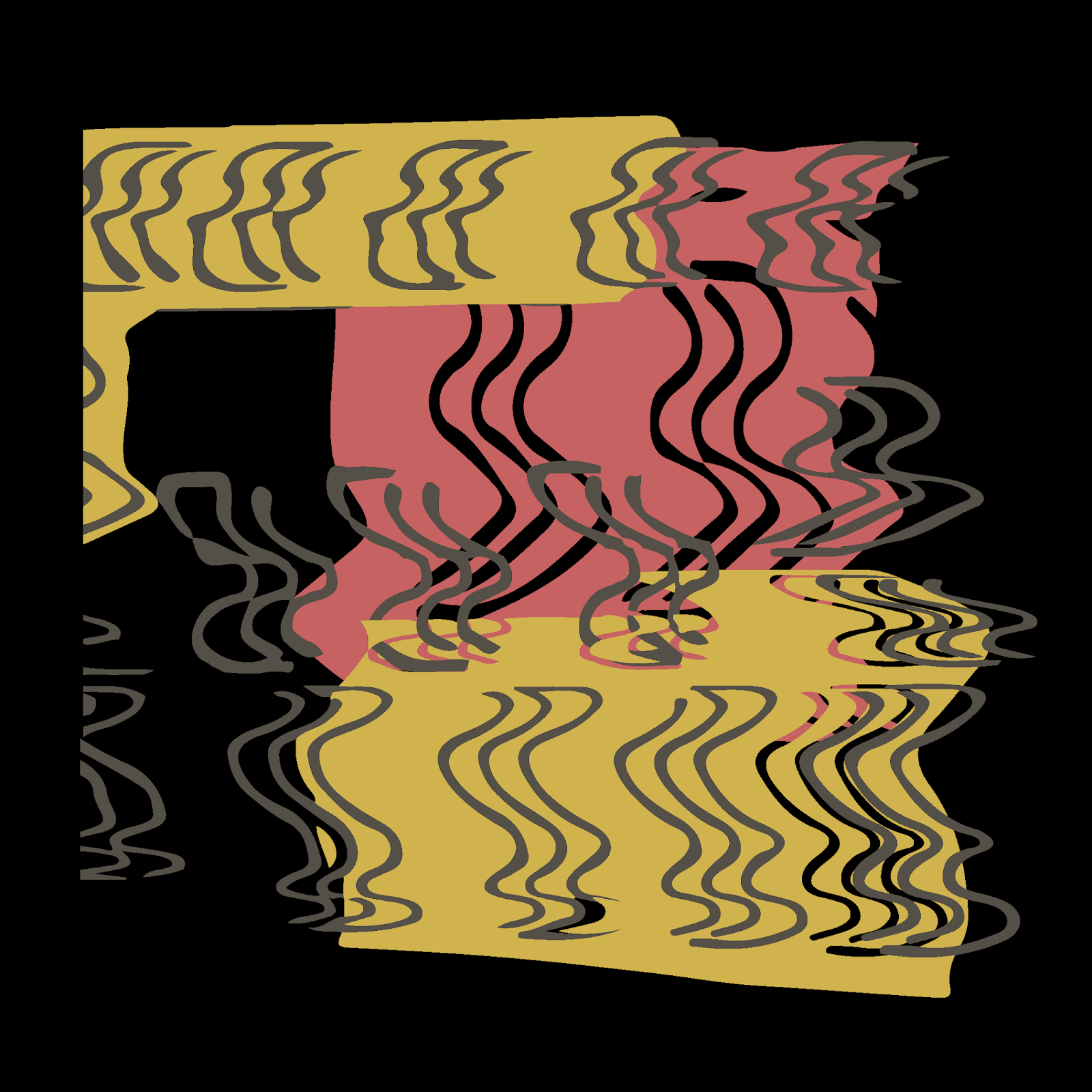
To start developing the artwork I went into illustrator and added some of the colours relevant to signs used for 'slow' as well as rectangles and then used my graphics tablet to create some waves that are symbolic of slowing down in pace, as they get further and further apart from one and another. I think this was a good starting point and then decided to print it off, scan it back in to get that 70s poster aesthetic as well as some more interesting movement with the slowness lines.


I then took the scans back into illustrator and converted the lines and colours with image trace into vectors to create the below variations. I decided the lighten the colours as the bright red and yellow together are a bit too vibrant for the subtle yet intriguing cover I am trying to design. The scanned pieces gave some really interesting lines and squiggles to work with and added dimension to the piece.


After looking back at my original research I think that I have drawn inspiration from the sleeve artwork I had looked at whilst adding some originality. I think that all of the different options are strong however have 3 favourites so have decided to make mock ups for a bit of context and to help me decide which is the most successful.


I think personally that the first sleeve of the three would look the best alongside the other sleeves at the exhibition. The black background is a bit too dark for the overall look and the last one is a bit too busy looking, as well as the colours being a bit wishy washy with each other. Therefore I have chosen to submit the first one, I believe the colours involved in the design work well with the background colour and each other. The fact you can still see elements and layout from the initial design is wonderful as the design process has flowed very naturally into something worth showing, with minimal input from elsewhere (even the tone of pink was picked up from scanning in the original). The decision to lighten the tones works well yet they still have the same meaning, along with the wavey lines for slowness - a sign some one needs help. The artwork is full of subtle meaning.
No comments:
Post a Comment