
 |
| Guess the vessel |
 |
| Dragon |
 |
| Whose horse? |
70s Record Sleeves
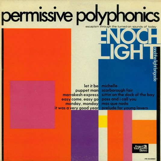
Enoch Light and the Light Brigade: Permissive Polyphonics (1970)
Big band leader and unlikely innovator Enoch Light pioneered the gatefold sleeve in the 1950s, a full decade before Sgt Pepper. Known for brassy versions of modern standards, this album cover reflected a progressive sensibility. This late career example updates Blue Note-style typography with a splash of modernist colour. Permissive Polyphonics had a modernist look
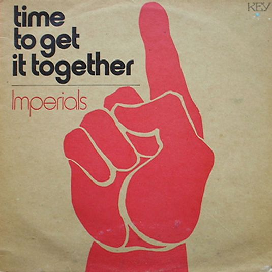
The Imperials: Time to Get it Together (1971)
Flicking through their output, the album cover for Time to Get it Together seems like an anomaly for The Imperials, with design and typography that’s much more radical than the music inside. (If you’re unfamiliar with them, they sound a bit like a Christian version of the Bee Gees.) A surprisingly radical cover for the unsurprising group

Faust: IV (1973)
In a decade readily identified with flamboyance, the minimalist album cover for krautrock group Faust's fourth offering prepares you for the difficult, contrarian music inside. Several versions exist, but the key image is always the same; two columns of blank musical staves. A bold mission statement and a striking cover. This album cover for Faust features blank sheet music
 Sex Pistols: Never Mind the Bollocks, Here’s the Sex Pistols (1977)
With Vivienne Westwood’s styling, Malcolm McLaren’s marketing and Jamie Reid’s graphic design, we often forget that The Pistols were essentially a 12-bar rock band with sweary lyrics. Their one and only studio album benefits from an album cover that captures the combination of brash, trash, outlaw chic that made them famous for 15 minutes and influential for much, much longer. Bold and brash, just like the Sex Pistols themselves
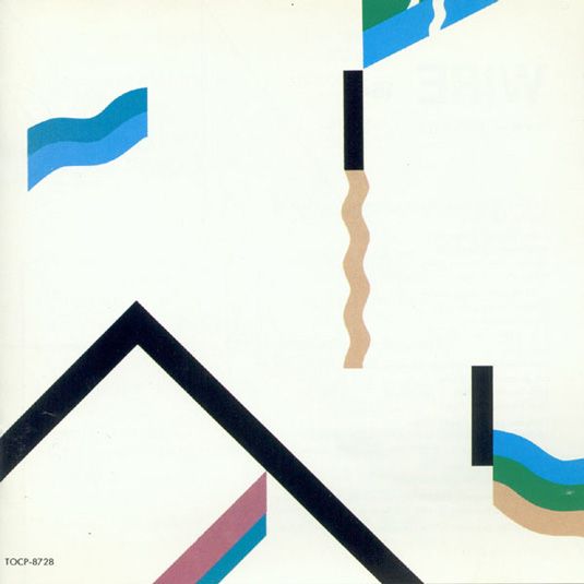
Wire: 154 (1979)
Art rock never went away. The experimental core of Kraftwerk, Can and Floyd was smelted by punk, and Wire came out the other side. 154 is a jarring, at times ethereal entry in their early catalogue, with a sleeve that recalls Joan Miro and other modernist painters. Again, this is an album cover without type that says everything you need to know about its content. A modernist cover that speaks volumes about the music inside
I have selected these pieces of artworks as examples for 1970s design specifically as I like the block colour graphics used, in different ways to represent the type of band, as well as the type of album and music style. None of the sleeves are overly detailed or intricate however i believe this to make them more intriguing, and with the whole idea of secret 7inch to intrigue the buyer about what they are buying this is the perfect style.
No comments:
Post a Comment