In the crit i presented the research i had so far and spoke about why i chose the genre and how interesting i believed it to be. There was no one in my critique group who knew about the disco demolition day so this made me think about what percent of people who listen to the genre actually know what happened. Through researching i have found possible reasons for the demise of disco but there is no clear reason as disco did continue after that day in 1979.
A lot of the genres in my critique group were to do with politics at the time and therefore a lot more serious, with the aim of making people aware of what is going on, or with influence from different countries. I believe the purpose of disco is genuinely just for people to enjoy and dance to as it started in urban nightclubs, with popularity and good times became mainstream.
Saturday, 24 March 2018
Friday, 23 March 2018
505 - SB1 - Disco Research
A musical style originating in the early 1970s. It began to emerge from America's urban nightlife scene, where it had been curtailed to house parties and makeshift discotheques from the middle of the decade onwards, after which, it began making regular mainstream appearances, gaining popularity and increasing airplay on radio. Its popularity was achieved sometime during the mid-1970s to the early 1980s. Its initial audiences in the U.S. were club-goers, both male and female, from the African American, Italian American, Latino, and psychedelic communities in Philadelphia, Chicago, San Francisco, and New York City during the late 1960s and early 1970s. Disco can be seen as a reaction against both the domination of rock music and the stigmatization of dance music by the counterculture during this period. Several dances styles were also developed during this time including the Bump and the Hustle.

key disco artists


Fashion in the 1970s was about individuality. In the early 1970s, Vogue proclaimed “There are no rules in the fashion game now” due to overproduction flooding the market with cheap synthetic clothing. Common items included mini skirts, bell-bottoms popularized by hippies, vintage clothing from the 1950s and earlier, and the androgynous glam rock and disco styles that introduced platform shoes, bright colors, glitter, and satin.


dance moves -
The bump was dance style in 1970s. It was introduced in 1974. Bump , Hustle and Watergate are popular dance style in 70s. The lyrics were "We love the bump; everybody bump; gotta do the bump." The dance had a goal to lightly "bump" hips on every other beat of the music. There was no need to have a partner. The dance could become more athletic bumping Hip to hip in full knee bend up to a standing position. Intimate, bumping hip to backside, low bending, etc. The Bump" was played by The Commodores on Machine Gun album. KC & the Sunshine Band, Kenny(UK band) and many others picked up on the rhythm and "The Bump" became a worldwide dance craze in the summer of 1975.
The Hustle is a catchall name for some disco dances which were extremely popular in the 1970s. The 1977 movie Saturday Night Fever showed both the line and partner forms of hustle.
key disco artists

demise of disco
The disco era continued into the early 80s before a strong anti-disco sentiment developed among rock fans and musicians, particularly in the United States. Disco was criticized as mindless, consumeristic, overproduced and escapist. The slogans "disco sucks" and "death to disco" became common. Rock artists such as Rod Stewart and David Bowie who added disco elements to their music were accused of being sell outs.
legs McNeil, founder of the fanzine Punk, was quoted in an interview as saying, "the hippies always wanted to be black. We were going, 'f**k the blues, f**k the black experience'." He also said that disco was the result of an "unholy" union between homosexuals and blacks.
reasons for the death of disco
- In the late 70s, bars, pizza parlours clubs and pubs across the country were being transformed into discos. It was every where at the time; there was disco christmas, disco star wars, disco duck and all other sorts of ridiculousness.
- All the big stars of the 60s and 70s were doing disco tracks too: Rod Stewart, Dolly Parton and Paul McCartney just to name a few. It was invasive. People were just sick of it, and it had reached a point beyond gimmicky.
- Disco Demolition Night, which was held at Comiskey Park — the former home of the Chicago White Sox — on July 12, 1979, is commonly sited as the event that ended the rise and started the fall of disco music. Now referred to as the day disco died, it was planned by Steve Dahl, a local disc jockey who was laid off by WDAI when the station made the format change from rock to disco. He was quickly hired by rival rock station WLUP and began promoting the event.
- In 1979, the music industry in the United States underwent its worst slump in decades, and disco, despite its mass popularity, was blamed. The producer-oriented sound was having difficulty mixing well with the industry's artist-oriented marketing system. Harold Childs, senior vice president at A&M Records, told the Los Angeles Times that "radio is really desperate for rock product" and "they're all looking for some white rock-n-roll". Gloria Gaynor argued that the music industry supported the destruction of disco because rock music producers were losing money and rock musicians were losing the spotlight.
"So, disco never really went away – it’s just that it’s always meant different things to different people in different places at different times, and has slipped in and out of favour depending on which aspect is highlighted. Having lost its cool following the post ‘Saturday Night Fever’ feeding frenzy of the late 70’s, a bandwagon which, unfortunately, has provided the mainstream symbolism ever since, it was always on the back foot. For many years its cheesier connotations were emphasised whilst its sheer creativity and versatility was circumvented. The ‘Disco’ the media portrayed and, to a large extent, still portray, isn’t the Disco that survived.
Disco was soon declared dead by the triumphant rock establishment, but it simply went back underground and, throughout the early 80’s, flourished away from the mainstream glare having re–invented itself as ‘dance music’. This was a real hybrid age from which all the subsequent club–based music fermented. Rather than abate, Disco mutated, and when Frankie Knuckles made his famous quote about House music being ‘Disco’s Revenge’ the term reclaimed some of its former credibility, at least in more underground circles, with its rehabilitation completed during more recent times through sampling, record digging, re-editing and modern spin-off genres like french house, garage house, nu-disco, future beat, boogie funk etc." - reddit
In the 1990s, disco and its legacy became more accepted by music artists and listeners alike, as more songs and films were released that referenced disco. Examples of songs during this time that were influenced by disco included Deee-Lite's "Groove Is in the Heart" (1990).

70s style and fashion
Fashion in the 1970s was about individuality. In the early 1970s, Vogue proclaimed “There are no rules in the fashion game now” due to overproduction flooding the market with cheap synthetic clothing. Common items included mini skirts, bell-bottoms popularized by hippies, vintage clothing from the 1950s and earlier, and the androgynous glam rock and disco styles that introduced platform shoes, bright colors, glitter, and satin.
1970-72
hippie look - decade begin with continuation of the hippie look from 1960's, popular fashion included tie dye shirts, mexican peasant blouses, ponchos, capes, military surplus clothing, frayed jeans, midi skirts, ankle length maxi dresses. There was a lot of indian, native american and floral patterns.
Accessories included chokers, and those made from natural elements such as wood, shells, stones and feathers.
glamour look - the hippie look was widespread, however it was not adopted by everyone. Many women still continued to dress up with more glamorous clothes, inspired by 1940s movie star glamour. Other women just adopted simple casual fashions, or combined new garments with carefully chosen secondhand or vintage clothing from the 1930s, 1950s and 1960s. More simple early 1970s trends for women included fitted blazers (coming in a multitude of fabrics along with wide lapels), long and short dresses, mini skirts, maxi evening gowns, hot pants (extremely brief, tight-fitting shorts) paired with skin-tight T-shirts, his & hers outfits, and flared pants. Pastel colors were most commonly used for this style of clothing. Rust, tangerine, copper, forest green, and pistachio became more popularized from 1973 onwards. Sweaters were a huge often outfits being judged entirely by the sweater. This fragmented into more styles, such as sweater coats, sweater dresses, floor-length sweaters, and even sweater suits.
Glamorous women's accessories of the early 1970s included cloche hats or turbans, pearl earrings, necklaces, and bracelets, feather boas, black-veiled hats, clogs, wedgies, cork-soled platforms, and chunky high heels. Golden chains, gold-button earrings and rhinestone clips started to become popular again in 1973 after several years of homemade jewelry. In the early 1970s boots were at the height of their popularity, continuing onward from the mid 1960s. Women had boots for every occasion, with a wide variety of styles being sold in stores for affordable prices.
1973-76
casual looks - by 1974, the T-shirt was no longer considered underwear, and was by then made in elaborate designs such as slogans, sports teams, and other styles. Around the same time the looser, more flowy shirts of the early 1970s had given way to fitted tops. By the mid 1970s, the hippie look had completely disappeared, although casual looks continued. In the mid 1970s women wore sweaters, T-shirts, cardigans, kimonos, graphic T-shirts and sweaters, jeans, khakis, gauchos, workmen's clothes, and vintage clothing. Around 1976, casual fashion adopted a Parisan peasant look. This included capes, turbans, puffy skirts and shirts with billowing sleeves.
In the mid-1970s, accessories were generally not worn, adopting a minimalistic approach to fashion akin to that of the 1950s. Small leather shoulder bags were worn by women everywhere, and popular shoes included Mary Janes, knee-high boots with rounded toes, platform shoes and sandals, Birkenstocks, and loafers. Despite the lack of accessories, the mood ring was a big fad in the mid 1970s.
active wear - clean-cut, all-American active wear for women became increasingly popular from 1975 onwards. The biggest phenomenon of this trend was the jumpsuit, popular from 1975 onwards. Jumpsuits were almost always flared in the legs, and sleeves varied from being completely sleeveless to having extremely long bell-sleeves. Other sportswear trends included tracksuits, tunic shirts, crop tops, tube tops, sweatshirts, hip-huggers, low rise pants, and leisure suits. This continued into the 1980s. Accessories were less of an importance during this time, but two very desirable accessories included sneakers and tennis headbands.

tailored styles - as the divorce rate rose and the marriage rate declined in the mid-70s, women were forced to work in order to support the nuclear family. The progressive addition of women to the work force altered shopping styles and fashion. Working women shopped on weekends and in the evenings. Feminized men’s business suits such as tailored jackets, midi-skirts, and fitted blouses were their go-to choice as to “dress for success.” Starting in 1975, women's semi-formal wear became more tailored and sharp. This included a lot of layering, with women wearing two blouses at once, multiple sweaters, pants underneath tunic dresses, and jumpers worn over long, fitted dresses. The 1970s also featured some of the most scandalous dresses worn publicly in American history up to that point.
 |
| cher, 1974 |

Other clothes worn in this style include suede coats, peacoats, blazers, cowl-neck sweaters, pencil skirts, backless dresses, extremely low-cut dresses, palazzo pants, tube dresses, evening gowns, jacket dresses, and pinstriped pantsuits. Women's dresses in the mid 1970s were dominated by pastel colours, but Asian patterns were also common.
1977-79
relaxed look - in 1977, fashion became more baggy. This caused much controversy, as women with trim figures bemoaned not being able to flaunt them while heavier women complained the looser clothes made them look even larger. To make up for this, it became fashionable to show more skin. This resulted in shirts being unbuttoned, sleeves being rolled up, and tops being strapless, see-through, and lacy. Shiny satin and gold colors were also used to make up for the lack of tighter clothing. Styles became curvier in 1978, with shoulder pads, tighter skirts, and narrower waistlines. The silhouette that resulted was an inverted triangle, it was positively received by the general public. By 1977, pants were only flared slightly and sometimes not flared at all.
Accessories included scarves, gold jewelry, flowers, ankle boots, 1940s style hats (often tilted), skinny and wide belts, spike-heeled sandals, mules, ankle-strapped shoes, waist cinchers, and obi wraps. Colour had almost completely faded from fashion in the late 1970s, with earthy tones like browns, light blues, tans, grays, whites, and blacks making a comeback. The frenzy for boots had cooled down by the late 1970s, but they remained popular, especially in the winter. They became less flamboyant by that point in time, and they mostly came in black, brown, or burgundy.
one-piece swimsuit - in 1977, American actress Farrah Fawcett popularized the one-piece swimsuit which in turn launched the trend for the maillot. This was, when it resurged in the 1970s, a sexy, tight swimsuit, with deep neckline and high-cut legs, worn by young women and girls in lieu of the bikini, although it did not entirely replace the latter. This continued into the 1980s.

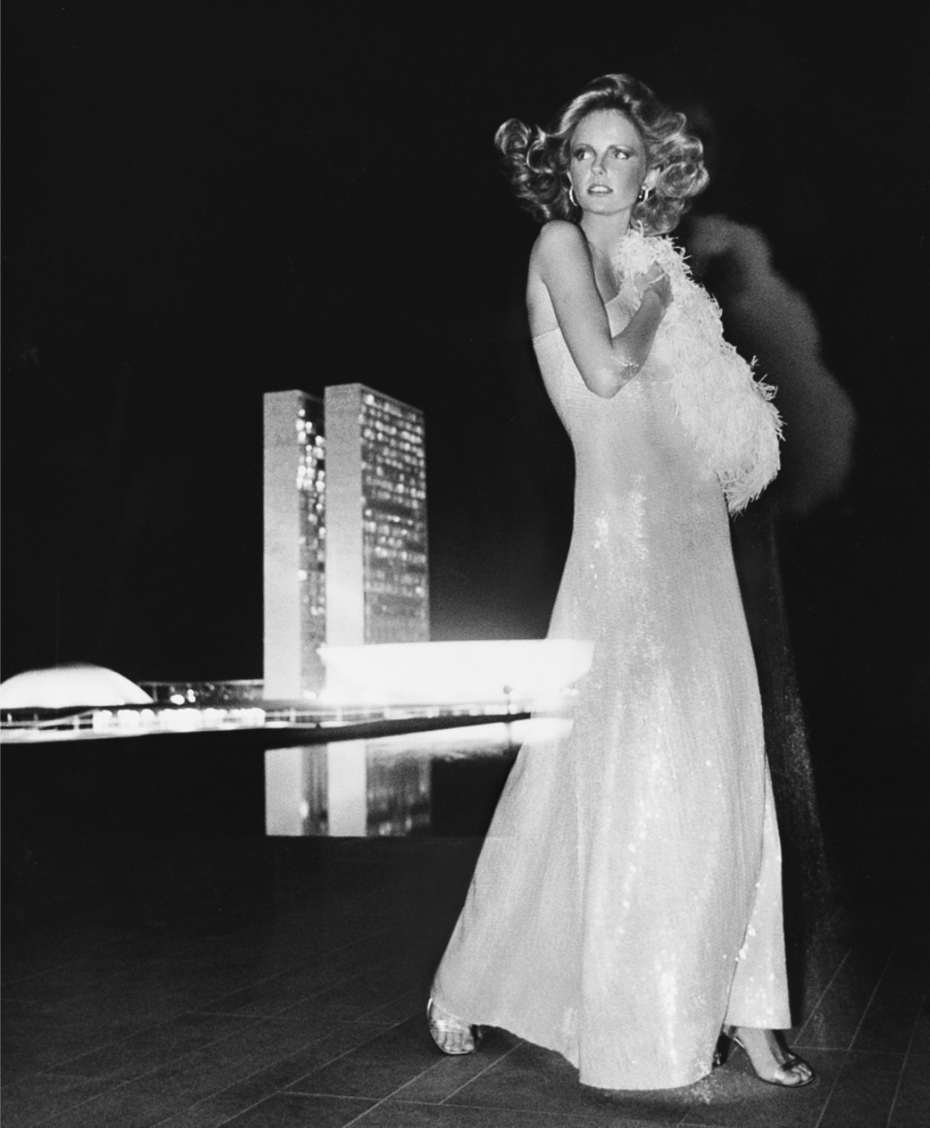
disco look - disco fashion was generally inspired by clothing from the early 1960s. Disco clothes worn by women included tube tops, sequined halterneck shirts, blazers, spandex short shorts, loose pants, form-fitting spandex pants, maxi skirts and dresses with long thigh slits, jersey wrap dresses, ball gowns, and evening gowns. Shoes ranged from knee-high boots to kitten heels, but the most commonly worn shoes were ones that had thick heels and were often made with see-through plastic.
top 70s models -
 |
| lauren hutton |
 |
| Cheryl Tiegs |
 |
| Margaux Hemingway |
Thursday, 22 March 2018
505 - SB1 - Lo-fi House Research
Lo-fi house is an 'underground' genre of house that is fairly recent, only goes back to around 2016. It is a movement as most of the artists in the genre have comical names and use artwork that isn't the best designed, almost as a joke.


"A gritty sound; it's heavy on bass, yet built from simple synths and samples. With the tight range of tape's natural EQ and a thick cassette-hiss crackle"
"It’s certainly a welcome return to dance music’s more rebellious side, after year’s of overly produced house music, the genre’s telltale lo-fi aesthetic certainly makes for more interesting music. Whether it’s going to become the new sheep house remains to be seen. At the moment lo-fi is still the preserve of bedroom producers and DIY labels, but can almost guarantee that some unscrupulous major label executive is rubbing his hands at the idea of releasing something called ‘Lo-fi Anthems 12’."
Mall Grab
Mall Grab is a 23 year-old producer from Newcastle, Australia. Now based in London, England.
Heavily influenced by the working-class steelworks of his hometown, his music explores the roots of house and techno - keeping things stripped back and minimal, yet atmospheric.
Ross From Friends
“I suppose subconsciously it could be seen as a reaction to this hi-fi soundscape which we’re living in, where every producer is striving toward perfection,” Ross From Friends, one of lo-fi house’s key names, said in an interview last year. “It’s kind of like [people are saying], ‘We’re going to stick with the old school and keep it analogue and not have anything over 10,000 Hz audible in our music.’ I do it because I’ve gained a real love for the old school sound, where it really just sounds worn-out and knackered, and it’s got a lot of character. Everything’s very crushed and compressed.”
I read that you spent six months writing ‘(Talk To Me) You’ll Understand’, with the aim of making something you really love. It’s been something of an underground hit, amassing over a million views on YouTube. How does it feel to see so many people connect with something you’ve poured yourself into emotionally? - mixmag
It is actually, genuinely, so very rewarding. I put so much love and compassion into that track, and crafted something that was really emotionally relevant to me, while also trying to define what my sound is as well in one fell swoop. To know that a massive amount of people really understand that as well as me is so refreshing. For a lot of the time I was making that track it was a fairly insular process; I wouldn't really speak to anyone about it or show anyone it, aside from little clips, and they'd just be like "cool, whatever". Having the online community to share it with, and hearing people open up and say it's touched them in some kind of deep way, almost spiritually, or just enjoying the track, is amazing.

DJ Seinfeld
Armand began making music in Edinburgh at the suggestion of a respected friend. Time spent experimenting with music and exploring the possibilities contained within his laptop was cathartic relief from the grind of finishing his studies. Later returning to his hometown of Malmo, his interest in making music would intensify thanks to encouragement from his old school friends and a the looming spectre of a 9-5 lifestyle. A move to Barcelona and the end of a relationship resulted in extended sessions watching the classic American sitcom and the music made to reflect that appeared under the name DJ Seinfeld.
DJ Boring
Australian born, London-based musician Tristan Hallis sent ripples through the underground house music community with the release of his single ‘Winona‘. A vinyl aficionado and notoriously friendly dude, DJ Boring’s signature stripped-down sound has become somewhat of a blueprint for an emerging sub-genre of house- a raw distorted music that stands as a stark contrast to musical elements of the commercial club scene.
Artwork

505 - Studio Brief 02 - Product, Range and Distribution
Examine graphic design outputs relating to social, political and ethical change. Aim to increase your awareness of historical examples plus contemporary practice that is responsive to 21st Century issues. Be sure to note the interrelationships between medium, message and distribution. You should then produce a body of research work that explores the connections between these concepts and their respective design outcomes prior to your own practical and conceptual exploration of possible products, ranges and methods of distribution that may be suggested by your preferred content or, indeed, those that reflect your own ideologies, concerns and/or ambitions.
This brief is in two parts -
Part 1: Based on the introductory sessions develop a practical, visual and contextual investigation of a specific subject (an issue). You should aim to develop research from a range of primary and secondary sources in order to fully explore the opportunities for informed creative development. Your research and development of this part of the brief should be documented on your Studio Practice blog and will be presented as part of your interim concept pitch.
Part 2: Devise and develop a body of practical work that both distils your knowledge of an identified issue and demonstrates your ability to tap into the market potential for socially, politically and ethically-driven design. This output should still work within the broader creative and professional contexts of graphic design but could be based around ideas of awareness or protest. Examples of potential deliverables include (but are not limited to):
Your contextual research, critical observations and reflective evaluations should be documented on your Studio Practice blog and summarised within reflective content that supports your design submission. Your response should explore the relationship between product range and methods/media of distribution as well as specific audiences, contexts and appropriate tone of voice.
This brief is in two parts -
Part 1: Based on the introductory sessions develop a practical, visual and contextual investigation of a specific subject (an issue). You should aim to develop research from a range of primary and secondary sources in order to fully explore the opportunities for informed creative development. Your research and development of this part of the brief should be documented on your Studio Practice blog and will be presented as part of your interim concept pitch.
Part 2: Devise and develop a body of practical work that both distils your knowledge of an identified issue and demonstrates your ability to tap into the market potential for socially, politically and ethically-driven design. This output should still work within the broader creative and professional contexts of graphic design but could be based around ideas of awareness or protest. Examples of potential deliverables include (but are not limited to):
- materials relating to an issue-led campaign (this could be one affiliated to an established organisation or a more ‘guerilla’ approach)
- a poster series
- a booklet/publication/manifesto
- a web/digital platform
- placards, banners or a set of badges
- a range of products or merchandise that communicate your identified core message
Your contextual research, critical observations and reflective evaluations should be documented on your Studio Practice blog and summarised within reflective content that supports your design submission. Your response should explore the relationship between product range and methods/media of distribution as well as specific audiences, contexts and appropriate tone of voice.
505 - Studio Brief 01 - Micro-Genres of Music
Your task is to thoroughly research a micro-genre of music from this website. This research should be extensive, with the intention that you become an expert in the genre. This micro-genre will become the focus for the design and production of a new piece of work to be publicly exhibited.
Design an object that celebrate (or critiques) an aspect of genre's specific characteristics: political, aesthetic, production methods, audience demographic, key intentions or its connection to place.
In what sense do these micro-genres help us understand some wider issues about the society that created them?
Your design objects will be exhibited in the Level 4/5 exhibition at the end of May.
I have decided that it would be most interesting for me and I could produce the best outcomes by looking at music genres that I listen to myself. The main genres I listen to are:
- dance/ electronic
- hip hop/ rap
- techno
- disco
- alternative r&b
- neo soul
- lofi house
Out of these genres I believe the most interesting would either be:
disco it has tonnes of history and stories, and it has recently made a come back with the younger generations
lofi house it is an upcoming genre with a lot of exciting new djs
I also believe both of these genres are correctly defined and any artist described as either would be accurate and you would know what to expect. Whereas with genres such as hip hop, or dance/ electronic the genre is so broad and artists so many they could be falsely defined and what you hear doesn't sound anything similar to the next artist. Disco is defined by the movement and the time in which the music came out - like a trend, and lofi is defined by the actual production and sound of the music.
how we understand music genres
505 Jack Grafton Workshop
One day workshop
- Selection - pick a shop, bar, market stall or piece of advertising that interests you, but could be presented more engagingly.
- Brainstorm - Collect your thoughts on a large sheet of shared paper. Forget reality for now, in a perfect world, with no constraints, how could it be enhanced to add value for the user to create a memorable and relevant experience.
- Prototype - Where does your idea live? How can you quickly communicate your concept? How could you best show your concept working, in the shortest space of time? Instructional video? A fragrance? A demo?
- Pitch - 2-5 mins per group to explain and pitch your idea to the rest of the class.
Research
As a group (Myself, Neve, Josh and Lizzie) we visited the University of Leeds Student Union to see what services are provided and how seamless and fast they are, whilst there we noticed some advertising screens that were being used to advertise food outlets that could be seen from the screens - seems pretty pointless.
Initial ideas
We had a think about what they could be repurposed for and decided on using it for the buying of tickets for events held in the union as well as society nights. We then thought about how this would work - logging on with your university account and perhaps buying through PayPal, then thinking about how this makes life easier - you don't have to go through people you know texting or meeting up to buy paper tickets you can simply buy directly from the platform e.g. SeeTickets and your ticket will be printed there and then. The screens could also respond to your interests on Facebook and Spotify etc to suggest similar events and societies you may be interested in.
Development
From here we decided to think about technology that doesn't quite exist yet to push the boundaries and be more creative - we thought it was be interesting if you could experience 20 seconds of a night out or gig in order to determine whether it is for you - seeing after movies of nights out is always misleading as it makes the night look really good, and with a gig you could really enjoy the music but when it comes to the live event the crowd may be too aggressive. This idea could be carried out by using a VR headset as well as the temperature of the room being adjusted and smells let out. Taking it a step further we thought of other things that could be experienced in shop set up 'Sensory samples'. You could go on your own as an individual or a group and experience snippets of events/gigs/adventure days/sports and dates which we believe is something to go forward with.
From here we decided to think about technology that doesn't quite exist yet to push the boundaries and be more creative - we thought it was be interesting if you could experience 20 seconds of a night out or gig in order to determine whether it is for you - seeing after movies of nights out is always misleading as it makes the night look really good, and with a gig you could really enjoy the music but when it comes to the live event the crowd may be too aggressive. This idea could be carried out by using a VR headset as well as the temperature of the room being adjusted and smells let out. Taking it a step further we thought of other things that could be experienced in shop set up 'Sensory samples'. You could go on your own as an individual or a group and experience snippets of events/gigs/adventure days/sports and dates which we believe is something to go forward with.
The likes of tinder and bumble are quick ways to find people you may want to date however there are endless stories of when people actually meet up their match not looking quite like their photos - this could be solved by allowing the user to see their potential matches through VR in a date setting, you can hear their voice and see them in 3d so there are no nasty surprises.
Production
We decided to make a short video to demonstrate the concept, you flick up and down depending on whether you want to match with someone. While you can see them their interests are floating around so that it is all visual, perhaps even their 'anthem' is playing in the background, you can hit a 'bio' button and hear their voice, the scene is where they would take you on a date and you can see some of their Instagram photos floating around. We filmed some of our peers for a few short clips showing the swiping motion, we also filmed one student for a longer time to show what would happen when selected - the information pops up around. We then put all of the clips together in Premier Pro and further edited in After Effects allowing 'blank' screens to be placed in between each person in order to remove the floor from the footage to create a more professional/ accurate representation. We then added the icons around Sophie and some information such as her height and age - the placement was based off the current placement in Tinder.
Feedback
Josh and Neve then presented out idea to the class, explaining our initial ideas and concept and Jack believed these were communicated well with the end video created. A lot of people also had the view that it is a good idea and isn't actually that far off being the next step for apps like Tinder and Bumble. There was questions on how it could be even more immersive to which I suggested the person could be sat where they would take you on a date. Overall I really enjoyed the workshop as it got us thinking into the future and also gave me the opportunity to work with people I usually wouldn't. I'm happy with our final outcome given the time restraints we successfully portrayed our ideas from the initial brainstorming.


505 - SB1 - Graphic Design in the 70/80s
Some graphic design produced in the 70s:
I LOVE NY
 |
| 1976, milton glaser |
Glaser’s original crayon sketch done in the back of a taxi is now in the Museum of Modern Art’s collection. New York state’s economic development office moved in to copyright the famous logo about a decade after its introduction, by which time it was everywhere from T-shirts to shot glasses (above.) Today, the state prosecutes unauthorised uses of the logo, even as it draws a healthy revenue stream from licensing it. Meanwhile, creator Milton Glaser has yet to see a cent from any of it. Told the campaign would only run for a few months, Glaser did his work pro bono and refused to copyright it. The thinking was that if the logo was free to everyone, it would become part of the city’s iconography.

Montreal 1976 Olympics

“Amik,” a black beaver with a red strip featuring the 1976 Games logo, was the symbol of the Montreal Olympics. A national competition was held to name the mascot. Amik means beaver in the Algonquin language. The red stripe represents the ribbon used for winners’ medals. Official Olympic mascots were introduced in 1972 for the Munich Games, where a colourful dachshund was chosen.
Wednesday, 21 March 2018
503 Module Evaluation
This has been the most challenging module I have completed so far on the course, saying this it has also been one of the most enjoyable. This is for a few reasons but primarily the fact that we could choose what briefs we would like to respond to giving me the freedom to build my portfolio in areas I am most interested in having a career, such as: packaging design, pattern design and artwork. The early stages of this module involved searching all of the usual sites for the competitions such as D&AD, YCN and Student Starpack designs, I then selected which ones I thought would be relevant to my development as a designer and also decided which ones would be suitable to be day, week or major briefs. In the end I settled on the luxury range of tea being my substantial brief as I am highly interested in packaging design, a big tea drinker and felt I could really experiment with layout and illustration within the brief. This brief didn't involve as much research as some of the others as I believe different types of design require more depth, whereas others are more about the end product being aesthetically pleasing; in contrast the secret 7 inch involved a lot of research and context to develop a conceptual piece, with this I learnt that research is really essential for getting started on some briefs, getting creative block is normal and sometimes it takes a few days of researching to start to get an idea, with this knowledge I know in the future I have to allow contingency time. This module also gave me more confidence in posting my work onto my design Instagram account, this was the only way to enter the Papergang competition and the hashtag allowed me to connect with other designers that have the same interests and styles. Time management was a big part of this module, I am slowly getting better and I found it easiest to work on one brief at a time, sticking with it until final outcome before moving onto the next brief, trying to juggle is confusing and you end up forgetting stages or ideas you had. I felt I handled the work load quite well, allowing myself enough time to be happy with the outcome for all the briefs and being proud of how much I had achieved in comparison to the result of previous modules. One thing I am eager to build on is stepping out of my comfort zone and I did this with the collaborative, however with all of the other briefs, whilst building my portfolio and answering briefs I was interested I stayed within my strengths, for the next module I would like to push myself to design in different ways and styles, the last thing I will comment on is my lack of engagement in critiques, compared to last year I was active and had a lot of feedback which I found really useful I haven't received as much this year, for the next brief I will make sure I get as much as I can at the different steps of the process.
Time spent on briefs:
Secret 7 inch - 2 weeks
27 Club - 2 days
Penguin Books - 2 weeks
Tea - 1 month
Papergang box - 1 week
Collaborative LFW Street Style Look Book - 1 month
503 - SB2 - LOOKBOOK Production
When it came to the production of the booklet we had to rearrange the order of the booklet to make sure that the double sided pages printed in the right order. We also had to add in an extra few pages to make the front and back covers so that the look book contents started on a double page spread. There was also a few issues when it came down to the stock we had chosen, we decided on digigreen silk however were informed that the suppliers were having a hard time getting hold of it so instead settled on Gloss 270gsm, which isn't ideal as we had planned for the other however it still worked out well and the images printed nicely onto this stock. There was no issues with printing the cover onto tracing paper, as well as the illustration pages on acetate and the one illustration page on some pink coloured stock we brought with us.
Below are some examples of the binds spoken about in research:


We are going with the third one, this means that all of the pages can be printed double sided however just a5 size, the paper will then all be stacked together making it easier for the inserts to be slotted in, all of the pages will then be sewn together using different colours to represent the individuality and vibrancy seen inside of the look book by the wonderful street style at LFW.
There was a few issues when it came to printing, as the file sizes for the photograph links in indesign were so large it took a long time to send to the printer and our print slot was late in the day, in the end we had to leave it to print over night and when we came to collect, there were a few pages missing. At this stage in the project we couldn't afford price or time wise to print the publication again so worked with what we had. Some of the illustrations matched other pages such as the coloured pattern nicely layers over the contact sheet style spread. The binding process went well and we used two different coloured threads to brighten the publication up. The tracing paper front and back covers also added a high quality finish.
Tuesday, 20 March 2018
503 - SB2 - LOOKBOOK Final Outcome & Evaluation
Overall I really enjoyed this brief, given the freedom to create our own based on our interests allowed us to really experiment within our individual strengths. We struggled at first to divide the roles up, wondering whether they were substantial and also wanting to work on certain areas, in the end it worked out well, I was more interested in the layout design and Hannah was confident with production methods, we both contributed to aspects such as illustrations and stock choice. Something that I would change if given the chance would be the time management of this project, it was difficult to juggle it whilst we both had a few other briefs going on, in the future I would definitely assign time every week to this kind of work rather than just doing it when we could both fit in as it became a bit of a rush to finish at the end. I am happy with my contributions to this brief, the layout works well in theory and on screen, representing the street style and high fashion seen as London Fashion Week, however when it came to production there was a few issues to do with the file and a few pages didn't print, making the order and spreads different to how they were planned, however we made the best out of a bad situation and reordered adding the inserts in other suitable places.


Monday, 19 March 2018
503 - SB2 - LOOKBOOK Development Critique
We decided to have a critique with our peers to discuss which illustrations were best suited for use in the book, below are the options illustrated by both me and Hannah, the easiest way to go about deciding is to go around and ask everyone which they prefer, tally it up as the illustrations are all pretty similar we don't need any in depth advice just a simple choice.


L: 5
R: 6


L: 8
R: 3


L: 1
R: 10
Thanks to the help of our peers we have now decided on which illustrations will be printed onto acetate/coloured stock and inserted into the publication.
Sunday, 18 March 2018
503 - SB2 - LOOKBOOK Illustrations
I designed the below based on features that stand out in the photographs. We thought adding in some fun and quirky illustrations would be a perfect way to represent the street style seen, whilst keeping the layout minimal and professional, personalities and unique style shines through with the illustrations.


We are going to have a critique with some of our peers to decide which ideas suit the style of the book more. More considerations on the order of the pages will also be made in terms of separating the acetate and coloured stock inserts.
503 - SB2 - LOOKBOOK Development
After designing the initial layout I decided to print out a mockup to get a feel for the order and layout, to see if it works well as a publication and I was happy with the result, see below. From this point I involved Hannah, to hear her thoughts on the layout, we agreed it didn't need any work fundamentally but could do with a few added extras to make it more unique and suited to the style of the street wear.


We went through the book and added notes where extra pages could be added, with a small idea. This includes illustrations on acetate that would be over the left hand page. With this in mind when it comes to printing I will have to swap these two pages over, to ensure when flicking through the book the acetate will fall over the correct side.


We believed this layout to be enough on its own without making it busier/more complicated.

We decided to go for adding an extra page every other double page spread and so this was the next one it fell on - the image below. Another illustration will be added above this on acetate.


Again this page is conveniently already too busy for any extras.

For this one we thought a pattern around the image could work well, again on acetate, however after further discussion and ideas/ brainstorming we are going to use a coloured stock that matches her coffee cup, print a pattern on both sides and cut out the middle to reveal the image on either side.


With this we decided to stray from illustrations and simply add some coloured stock to emphasise the colour pop in the ladies earrings.

After all of these considerations me and Hannah separated to draw out some initial ideas for illustrations.
We have also chosen to use the 'tie bind' which mean the book won't be folded and therefore won't need arranging into spreads; this acts as an advantage as it means that we can experiment with different stocks and materials such as acetate without making the book too thick to close.
Subscribe to:
Comments (Atom)